Inside Kelly Clarkson’s NYC Talk Show Set
Explore the NYC set’s walnut walls, music nook, layered textures, audience layout, and practical ways to adapt its musician-lounge mood at home.
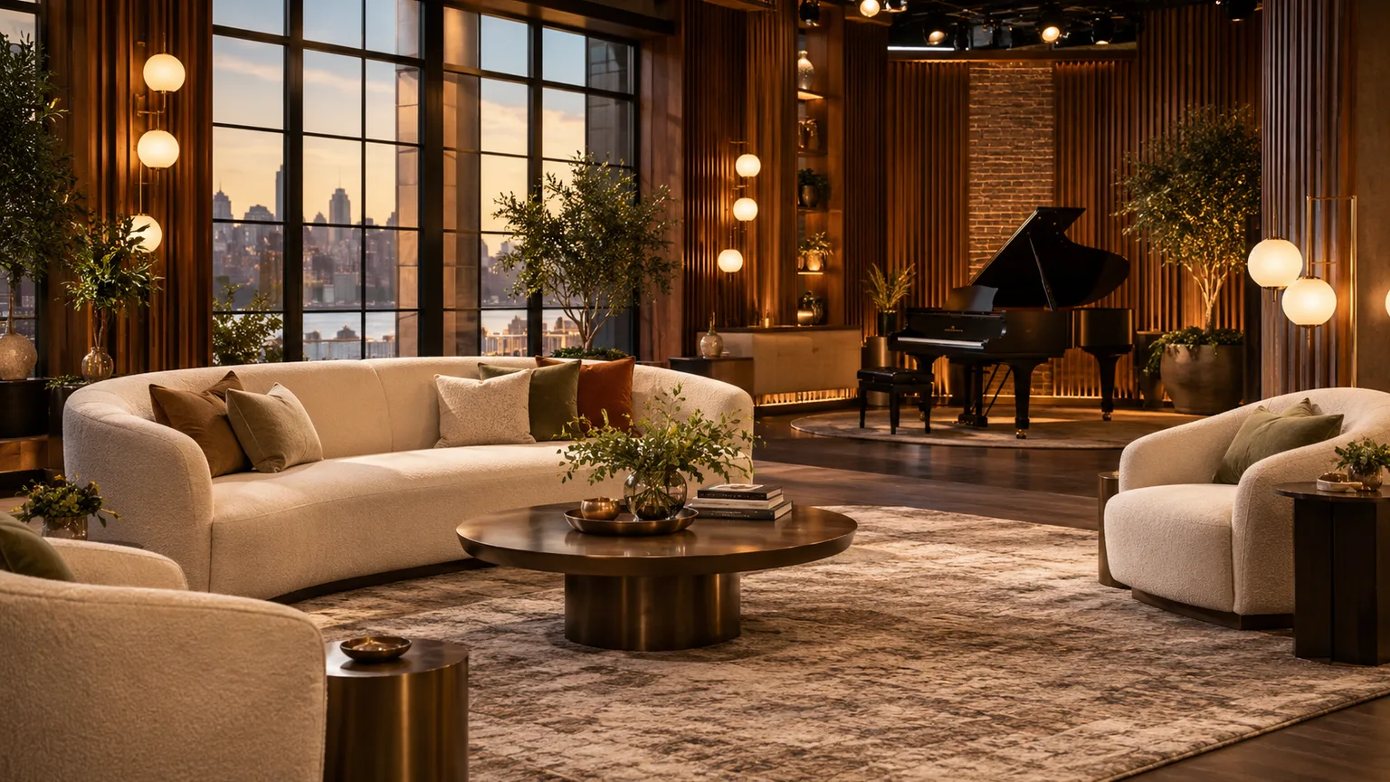
Kelly Clarkson’s New York studio was designed to feel less like a distant stage and more like a musician’s lounge where a conversation can turn into a song. The details that carry that mood are not just decorative: the band is part of the room, the audience sits around the action, and a small piano nook makes an intimate performance feel natural rather than staged. Walnut-toned slats, brick, rugs, records, and layered light soften the technical setting without disguising that it is a working television studio.
The set is also a useful design case study for a home. You do not need theatrical lighting, a built-in stage, or a wall of records to borrow its character. The more transferable ideas are simpler: give a room one clear social center, mix a few contrasting textures, make personal objects visible, and leave enough breathing room for the space to feel welcoming instead of overdesigned.
What Changed When the Show Moved to New York
For the show’s fifth season in 2023, production moved from California to Studio 6A at 30 Rockefeller Plaza in New York City. Production designer James Pearse Connelly developed a new environment for the historic studio, and Hudson Scenic Studios engineered and fabricated the set around the building’s existing structure and infrastructure. The result took cues from an urban recording studio while preserving the easy, conversational tone that had become part of the program’s identity. Hudson Scenic Studios identifies the project as an intimate, city-inspired recording-studio environment; NewscastStudio’s design coverage documents the layout decisions and how Connelly adapted the previous visual language.
That background matters because the set was not created as a living-room makeover. Studio 6A had to accommodate interviews, performances, audience seating, camera positions, entrances, lighting equipment, and the musicians’ instruments within a smaller footprint than the show’s previous space. What reads on screen as a relaxed room is therefore the visible surface of a carefully choreographed production environment. The most interesting design lesson is not “copy this couch”; it is “make the room’s different activities feel connected.”
The Three Design Jobs the NYC Set Had to Solve
The studio had to hold multiple kinds of energy at once. An interview needs a calm conversational center; a musical performance needs space and focus; and an audience needs clear views and a sense that it belongs to the event. If one zone overwhelms the others, the room feels either like a theater with a talk show at the front or a lounge that cannot support a performance.
Bring the audience close without making the room feel like a theater
NewscastStudio reports that Studio 6A’s updated audience arrangement wraps along two sides in an L shape, including a mezzanine, instead of relying only on conventional rows facing a single stage. The redesign increased the planned audience capacity from roughly 150 to at least 200 while bringing more people closer to the action and improving sightlines. Connelly’s reported design reasoning emphasized audience eye lines and the host’s connection to the crowd, not simply the number of seats. NewscastStudio describes how the revised footprint gave the show more depth for camera views as well.
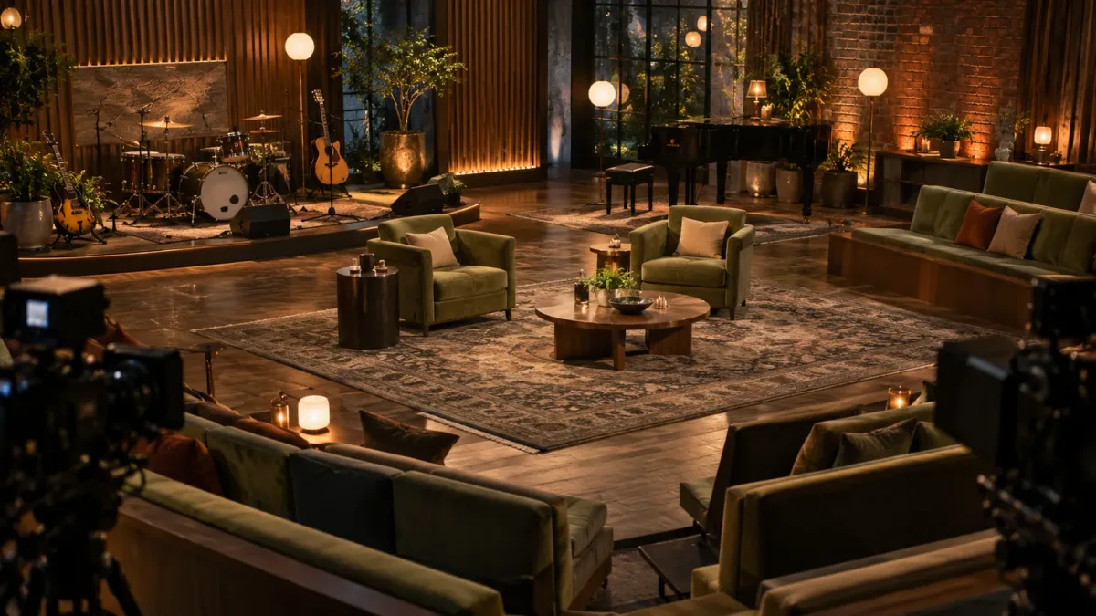
AI-generated concept image of a wraparound audience layout; it is not a photograph of the actual studio.
That is a sophisticated space-planning problem, but the core idea works in an ordinary room: people feel included when they can see one another and the focal point without twisting around furniture. A sofa facing a television can be comfortable for viewing, yet it is not the only layout that supports conversation. Angle one chair toward the sofa, keep the coffee table low enough not to block faces, and avoid putting the “best” seat with its back to the doorway or fireplace. The goal is not to recreate stadium seating at home; it is to create useful sightlines from the places where people actually sit.
Keep music inside the conversation
The band, known as Y’all, was part of the set’s permanent arrangement in New York rather than being moved offstage during interviews. The fabrication account describes a rolling, steel-framed platform built to support drums and instruments, with integrated wireless control for its lighting so it can shift as the show’s needs change. That flexibility lets one environment support a conversation, a performance, and the transitions between them without pretending each moment needs an entirely different room. Hudson Scenic Studios
At home, “keep music in the room” can mean a keyboard that is ready to play, a guitar on a stable stand, or a record player placed where it can be used. It does not mean displaying every instrument or accessory you own. Leave space around anything functional, route cords safely, and avoid placing delicate equipment where drinks, direct sun, or heavy foot traffic can damage it. A music corner succeeds when the instruments are both visible and genuinely accessible; if you have to move three decorative objects before playing, the setup is only a photo prop.
The Materials That Create a Musician’s-Lounge Mood
The set’s character comes from a mix of hard architecture and soft furnishings. Hudson Scenic names walnut-slatted walls, scenic brick, and LED lighting integrated into the scenery; the broader design story also includes layered rugs, upholstery, vinyl records, and a piano nook. Together, those details suggest a recording room that has been lived in rather than a polished corporate set. The materials supply visual depth, while the seating and rugs counter the formality of a stage.
Walnut slats balance brick and softer finishes
Vertical walnut-toned slats give the eye a steady rhythm and a warm surface, while brick adds variation and a slightly industrial note. A room with only dark wood can feel heavy, and a room with only brick can read as cold or unfinished; putting one beside the other creates contrast without requiring a loud color scheme. On camera, the slats also provide a patterned background that reads clearly at a distance. The set’s slatted treatment and hidden LED integration were specifically engineered for this production, so a home version should be treated as visual inspiration rather than a DIY specification. Hudson Scenic Studios
To bring the same balance home, choose one dominant surface and one counterpoint. If you have dark wood furniture, use a lighter wall, warm off-white upholstery, or a rug with enough pale area to keep the room from closing in. If the room already has exposed brick, temper it with fabric, a soft lamp shade, or a comfortable upholstered seat. Repetition is more convincing than buying one item in every “music-room” material: two walnut notes and one brick or metal accent feel considered; walnut, faux brick, distressed leather, neon, and instrument-shaped décor can quickly become a theme restaurant.
Records and instruments tell a personal story
Vinyl records are more than retro shorthand when they belong to the people who use the room. NewscastStudio reports that the set uses real records as part of the shelving and that its design draws on recording-studio details, including references to speakers and boom boxes. This gives the decor a biography: music is not a generic motif, but the actual work and taste of the host and band. The set’s identity comes from repeating that story across materials, architecture, and activity rather than relying on a single logo wall. NewscastStudio
For a home, a small display of records, a framed set list, a favorite instrument, or a few album sleeves can provide the same personal signal. Edit the collection so it has a clear edge and can be dusted, stored, and changed. If sleeves are displayed, keep originals away from direct sunlight and heat; framed prints or inexpensive reproductions are better for a bright wall. Keep speakers where they can function, and do not block ventilation around audio equipment with stacks of books or fabric. Personal objects work best when the room still has open surfaces and ordinary storage.
Why the Band and Piano Have Permanent Places
One of the set’s strongest moves is that it treats performance as a normal part of the room’s life, not a special event that requires a complete reset. A dedicated corner with a baby grand piano offers a more intimate visual and musical register than the larger band area. The contrast between ensemble and solo performance gives the show more than one scale of energy: the room can support a full-band moment, but it also has a quieter pocket for voice and piano.
That idea translates to homes with far less equipment. A piano or keyboard can anchor a nook, but a reading chair, craft table, or instrument stand can play the same role if it represents an activity you return to. Place the anchor where it has usable light and enough clearance to operate, then orient nearby seating toward it without making every chair point in the same direction. The room feels more generous when its secondary activities are visible but do not compete with the main conversation zone.
For a musician, practical placement comes before styling. Measure the instrument and its bench, account for the path to sit down, and leave a safe route past cables and pedals. Keep windows, radiators, and damp exterior walls in mind for wood instruments and pianos, which can be affected by strong sun, temperature swings, or moisture. If a full instrument is not practical, use a small keyboard that stores neatly, a music stand, or a compact shelf for a few well-chosen records. The principle is the same: make the creative activity part of the room instead of hiding it in a box.
Lighting Creates Mood and Camera-Friendly Separation
The New York set combines visible decorative light with production lighting that has a different job. Hudson Scenic describes LED tape integrated into the slatted walls, while NewscastStudio reports that the design team adjusted scenery to make room for backlighting that helps the host stand apart from the background. The architectural glow makes the set feel warm to viewers; controlled key and back light help people read clearly in a television image. Those are related goals, but they are not interchangeable fixtures.
In a living room, build light in layers instead of relying on one ceiling fixture. Use a general source for safe movement, a reading or task lamp where someone needs to see, and one or two softer accent sources to emphasize a wall, shelf, or art. Put light near different heights—table, floor, and wall—so the room is not lit from a single flat plane. If the room is used for video calls, test the camera from the actual seat: a bright window behind you can turn your face into a silhouette, while a lamp reflected in glasses or a screen may be distracting.
Do not install concealed LED tape behind wood slats just because it appears in a professionally fabricated set. In a home, poorly diffused strips can show individual hotspots, create glare, or make a wall look like a gaming setup. If you want a similar line of light, use a product with a diffuser and compatible dimmer, hide the diode points from seated eye level, and follow the manufacturer’s electrical and mounting guidance. For a renter, plug-in lamps and a dimmable floor lamp are easier to adjust and remove.
A Restrained Color Palette Keeps the Set Airy
Warm wood, brick, dark accents, and rich textiles can all sit in the same room without making it gloomy if there is enough visual relief. Light upholstery, pale curtains, open space around furniture, and controlled highlights keep the palette from becoming an uninterrupted dark band. A useful home translation is to pick one deeper anchor—wood, a sofa, or an accent wall—then repeat two lighter values and one small accent color. This echoes the set’s layered quality without copying a television palette literally.
Test color and fabric in the room’s actual light before committing. A charcoal curtain that looks dramatic in a sunny showroom may absorb too much light in a north-facing apartment; a warm beige may turn yellow under an amber bulb. Put sample swatches next to the wood, rug, and upholstery at different times of day, and consider what the room looks like with the lamps on at night. Curtains also have a practical role: measure the window, decide whether you need privacy or light control, and hang panels so they clear radiators and do not drag where people walk.
What to Borrow—and What to Leave on a TV Set
Borrow the set’s planning logic: layered materials, meaningful music details, several kinds of light, a clear gathering zone, and a secondary spot for an activity. Borrowing does not require custom benches, scenic brick, a full band platform, or lighting embedded in the walls. Those are production tools built around camera angles, audience count, changeovers, and technical constraints. A home that copies them without needing them can spend money while making the room harder to use.
This distinction also matters for sound. A large rug and curtains can make a room feel softer underfoot and visually warmer, and soft furnishings may reduce some hard-surface reflections. They do not make a room soundproof or turn it into a recording booth. If you are recording vocals or instruments, first listen for the actual problem—room echo, noise from outside, or sound traveling to another room—because each has a different fix. Add dedicated acoustic treatment only when the use warrants it; for a casual music corner, better furniture placement and a rug may be all you need.
A Home Translation That Works in a Real Room
Start with a job, not a shopping list. Decide whether the room should be best for talking, listening, playing, or watching a screen, then make that activity easy before adding the style cues. Decorilla’s named-designer music-room case study shows one way to combine a music display, lounge seating, rugs, and a usable creative area; its project is an example rather than a universal formula, but it illustrates why furniture and storage should be planned together. Decorilla
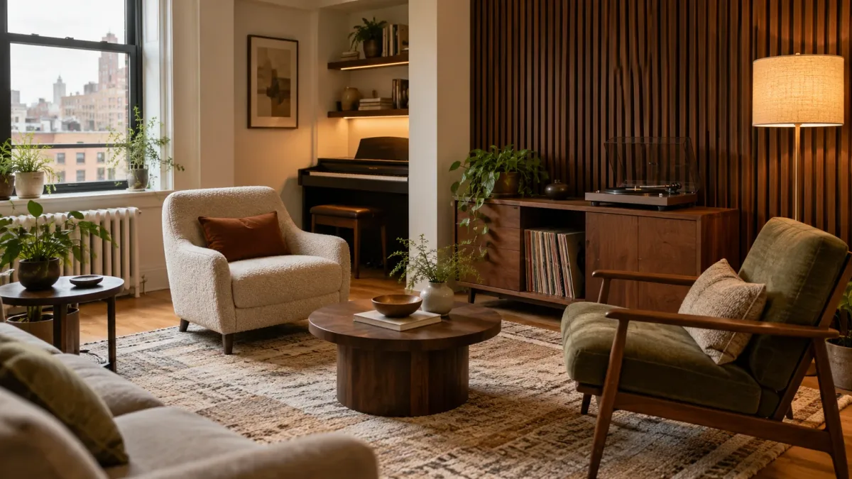
AI-generated home-styling concept; use the arrangement as inspiration, not as a photograph of a featured residence.
Build one comfortable conversation zone
Use painter’s tape to mark the approximate rug and furniture footprint before moving heavy pieces or buying a new rug. Arrange the main seats so people can make eye contact without craning their necks, and test the route from the doorway to the window, kitchen, or hall. A clear path matters more than a symmetrical arrangement. If one side of the room is narrow, a loveseat with two compact chairs may work better than a deep sectional that turns the seating area into a wall.
Choose a rug large enough that the seating feels connected. In many rooms, the front legs of the sofa and chairs can sit on the rug, which visually anchors the group; the exact size depends on door swings, room shape, and furniture proportions. Do not stack rugs unless the lower one is flat, secure, and not creating a curled or slippery edge. Layering can add color and texture, but a trip hazard is not a design detail worth keeping.
Display a small, edited collection of music objects
Choose three or five pieces with meaning rather than filling every shelf. A turntable, a row of records, a favorite instrument, a concert photograph, or framed sheet music can make the music theme feel personal without creating visual clutter. Repeat one material, such as walnut or brushed metal, so the display connects to the rest of the room. Group objects with some negative space around them; if every inch is occupied, nothing becomes a focal point.
Storage should match how the objects are used. Keep records upright and accessible, put cables and accessories in closed bins, and leave enough shelf or cabinet space for the collection to grow without spilling onto the floor. If you do not play an instrument, choose another authentic anchor—a stack of well-used cookbooks, a camera, or art from a place you love—rather than borrowing music symbols only because a celebrity set uses them. The best room feels like its occupant, not an imitation of a screen.
Layer textiles for comfort, not as soundproofing
Combine a few tactile surfaces: a low-pile rug for easy cleaning, a nubby throw or cushion, matte wood, and a curtain fabric that suits the amount of daylight you want. Contrast matters more than quantity. One crisp upholstery fabric beside a visibly textured rug and warm wood can feel richer than several similarly fuzzy fabrics competing at once.
If you are considering multiple rugs, make sure the floor and furniture can support the layers safely. Keep edges flat, use an appropriate rug pad, and avoid putting an unstable small rug where a chair moves or a door opens. Likewise, curtains should be hung for the window’s proportions and the room’s light-control needs, not copied from a studio backdrop. The textiles should improve daily comfort first; their visual warmth is a bonus.
Adapting the Look for a Small Apartment
Small rooms benefit even more from the set’s idea of connected zones, but every piece must earn its footprint. A keyboard that slides under a desk, a record cabinet that doubles as a sideboard, or a slim bench that can move to the wall will be more useful than a stage-like platform. Use a single rug to define the conversation area, then let a lamp or small shelf signal the music corner. Keep the center of the room open enough for walking and moving a chair.
Use vertical surfaces selectively. One slatted or wood-toned accent, a narrow record shelf, or a framed piece of music-related art can provide height without crowding the floor. If you are renting, freestanding shelving, a wood veneer cabinet, peel-and-stick paneling approved for your wall, or a large framed print gives you a reversible option. Before mounting a heavy shelf or instrument, locate studs and follow the hardware rating; decorative inspiration does not override safe installation.
The palette should respond to daylight and the size of the room. Dark wood can be an accent rather than a full wall, while cream or light gray seating helps preserve an open feeling. Reflective surfaces can brighten a dim corner, but too much glass, polished metal, and bare hard flooring may make the space feel cold. Balance them with upholstery, a curtain, or a throw—and check how the room looks at night, when most music listening and entertaining may happen.
Mistakes That Make a Music-Lounge Room Feel Themed
The first mistake is copying symbols instead of the underlying design. A neon sign, a row of empty frames, and a faux-brick wall do not create a musician’s lounge by themselves. The set feels convincing because the objects, material palette, lighting, activity zones, and audience relationship support one another. At home, choose one or two cues that connect to your actual habits, then let the rest of the room remain a comfortable living space.
The second is going dark everywhere. Dark walls, heavy curtains, dark floors, and low light can flatten a small room, especially when the only light comes from a television. Keep some surfaces pale, use adjustable lamps, and let one deeper material carry the mood. If you love a dark palette, test it on a smaller wall or cabinet first; changing a wall color is easier than discovering after a renovation that the room feels smaller at every hour.
The third is confusing visual texture with acoustic engineering. A rug is not a substitute for sound isolation, and a decorative slat wall is not automatically an acoustic panel. Do not glue random foam to a wall or block vents in the name of studio style. When recording quality or neighbor noise is the true issue, identify whether you need to treat reflections inside the room or reduce sound traveling through walls, doors, and floors; those are different problems with different solutions.
Finally, do not let a display interrupt the room’s actual use. Oversized instruments can block windows, unstable stands can tip, cords can cross a walkway, and a coffee table that is too large can make seating feel far apart. Measure first, keep daily paths clear, and make the important items easy to put away. A useful room can still be photogenic, but it should not require a reset every time someone wants to sit down or play a song.
Conclusion
The New York set works because it brings the show’s two identities—conversation and music—into one coherent space. Its walnut slats, brick, records, rugs, performance nook, and audience arrangement are not isolated decorations; they support a flexible studio built for interviews, songs, and a close relationship with the people in the room. The production details are specific to television, but the design principle is easy to use at home: decide how people will gather, make the activity visible, and use a few layered materials to give the space warmth and personality.
For a first step, rearrange the seating you already own so conversation feels easier, then add one music object that matters to you and one light source that improves the room at night. If those choices make the room more comfortable to use, build from there. The result can borrow the spirit of a musician’s lounge without turning your home into a stage set.