21 Colors That Go With Peach for Any Room
See which colors go with peach walls, furniture, and decor. Compare 21 pairings by mood, room, contrast, and undertone before choosing paint or accents.
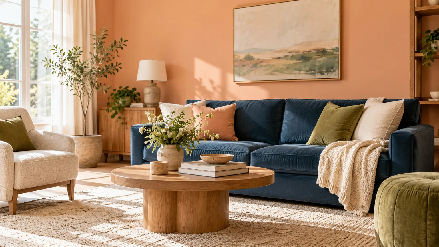
Peach is a warm color, but it is not one fixed shade: it can look creamy and pale, pinkish, or distinctly orange depending on the paint, fabric, and light around it. The easiest pairings either echo that warmth for a relaxed, blended room or introduce a cooler color to give peach more definition.
Below are 21 colors that work with peach, along with the effect each creates and the situations where it tends to work best. If you are choosing paint, start with the undertone and mood guidance first; if peach is coming from a sofa, rug, or tile you already own, use that item as the color sample to build around.
Quick answer: choose the pairing by the mood you want
For a quiet, easy-to-live-with palette, pair peach with warm white, cream, beige, taupe, or walnut brown. These colors share or soften peach’s warmth, so they are dependable around large surfaces such as walls, rugs, and upholstery. Sage, olive, and muted blue also feel calm, but their cooler notes give peach more separation.
For a brighter contrast, try powder blue, slate blue, teal, or navy. A dark blue can make peach look clearer and more intentional, while a pale blue creates a gentler contrast. If the room already has several strong colors, let peach or the accent color dominate and keep the remaining pieces quieter.
For a more tonal, lively room, look to blush, dusty rose, coral, terracotta, butter yellow, or mustard. These warm neighbors can make a room feel sunny and expressive, but several saturated colors together may compete. Choose one as the main partner, then vary texture and lightness rather than adding more bright hues.
Start with the peach undertone
Before choosing a second color, decide which peach you have. A pink-leaning peach usually looks soft beside rose, muted green, or blue-gray; a golden peach can handle cream, olive, and brown; and a vivid coral-peach often needs a quieter neutral or a deep blue to keep it from taking over. These are visual tendencies, not fixed formulas, because paint brands use different color recipes under the same broad name.
Look at the peach item beside your floor, trim, and the largest piece of furniture in the room. The best companion color usually relates to one of those existing surfaces, so a peach wall and honey-oak floor may call for a cooler blue accent, while a peach sofa on a gray rug may benefit from warm wood or cream.
Choose a soft blend or a clear contrast
The color wheel gives a useful starting point: adjacent hues tend to create a related, easy-flowing palette, while colors on opposing sides make a stronger contrast. Benjamin Moore’s color handbook describes these analogous and complementary relationships and shows why neither approach has to be all-or-nothing. Peach sits in a broad red-orange range, so blue and blue-green can contrast with it, while cream, coral, and warm brown sit closer in feeling.
Contrast is not just about choosing a different hue. A pale peach wall beside a deep navy cabinet has contrast in both hue and depth; peach beside pale blue has contrast in temperature, but little contrast in depth. A practical interior color-theory overview from MK Library also recommends using strong complementary colors in moderation, since too much contrast can feel jarring. Decide which kind you want, then test the actual materials together before repeating the combination across a whole room.
21 colors that go with peach
The pairings below are grouped by the way they behave, not by a strict color-wheel formula. Use the table as a shortlist, then read the notes for how to control scale, undertone, and saturation.
| Color | Effect beside peach | Good starting point |
|---|---|---|
| Warm white | Gentle contrast; keeps the room light | Trim, ceiling, bedding |
| Ivory | Soft, creamy transition | Upholstery, curtains |
| Cream | Warm, low-contrast pairing | Walls, rugs, cabinetry |
| Sand beige | Natural and grounded | Floors, woven textiles |
| Greige | Quiets a strong peach | Large furniture, adjacent rooms |
| Taupe | Adds depth without a hard edge | Rugs, trim, upholstery |
| Walnut or chocolate brown | Rich, earthy anchor | Furniture, frames, flooring |
| Blush pink | Romantic, close-toned blend | Bedding, cushions, art |
| Dusty rose | Muted, layered warmth | Upholstery, rugs, textiles |
| Coral | Brighter, more energetic warmth | Small accents, artwork |
| Terracotta | Earthy tonal contrast | Tile, ceramics, textiles |
| Butter yellow | Soft sunshine and lift | Small furniture, lampshades |
| Mustard yellow | Bold, vintage warmth | One focal accent |
| Sage green | Quiet cool balance | Curtains, cabinetry, bedding |
| Olive green | Earthy, slightly dramatic contrast | Upholstery, rugs |
| Forest green | Deep, formal contrast | Chairs, doors, built-ins |
| Mint green | Fresh, light contrast | Tile, linens, small accents |
| Powder blue | Airy cool contrast | Bedding, seating, artwork |
| Slate blue | Muted, tailored contrast | Rugs, curtains, upholstery |
| Teal | Saturated blue-green counterpoint | One focal piece |
| Navy | Strong, crisp anchor | Sofa, cabinetry, accents |
Warm neutrals: white, ivory, cream, beige, greige, and taupe
1. Warm white gives peach a clean edge without the starkness of a blue-white. Use it on trim, a ceiling, or linen curtains when you want the peach to stay prominent; if both wall and trim are very warm, check that they do not merge into one flat band under evening bulbs.
2. Ivory keeps the palette soft and slightly more layered than white. It works especially well in upholstery and bedding, where fabric texture can distinguish the colors even when their lightness is similar. Pair it with a natural wood or a small dark detail so the room still has definition.
3. Cream adds a yellow note that can make pale or rosy peach feel warmer. It is an easy choice for a rug, cabinet, or adjacent wall, but too much cream beside a golden peach can push the whole space toward yellow-orange. If that happens, bring in a cooler material such as a muted blue-gray or stone.
4. Sand beige grounds peach with a natural, low-key quality. It is most convincing when it appears in a material with visible texture, such as jute, linen, oak, or unglazed ceramic, rather than as several smooth beige surfaces at once. This pairing is a useful bridge between a peach wall and existing wood floors.
5. Greige can calm a vivid peach because its gray component reduces the overall warmth. Choose one with a subtle warm or neutral undertone for a smooth transition; a strongly blue-gray greige can make the peach appear more orange by comparison. Test it beside the peach rather than relying on its label.
6. Taupe supplies a deeper neutral without the visual weight of black. Use it on a rug, upholstered chair, or lower cabinetry, then repeat it in smaller touches to connect the room. Taupe also works when you want peach to read as a supporting color instead of the main event.
Warm neighbors: brown, pink, coral, terracotta, butter yellow, and mustard
7. Walnut or chocolate brown is an effective anchor for peach because dark wood grain adds both depth and material variation. A walnut table, picture frame, or bed frame can keep a peach room from feeling sugary, particularly when the surrounding walls and textiles stay light. Red-brown wood will feel warmer; cooler dark brown gives a more restrained contrast.
8. Blush pink creates a close, gentle blend with pinkish peach. Keep the colors from disappearing into each other by mixing textures—matte paint, velvet, cotton, or patterned fabric—or by choosing a blush that is clearly lighter or darker than the peach. This pairing is well suited to bedrooms and soft seating, but can feel overly sweet if every major surface is pastel.
9. Dusty rose has more muted depth than blush, so it can make a peach-and-pink palette feel collected rather than sugary. Try dusty-rose curtains or a rug with a paler peach wall, and let cream or brown wood break up the warm color field. If the peach is already dark or coral-like, use dusty rose sparingly.
10. Coral is a lively partner when you want a sunny, energetic room. Because coral and peach can be similar in hue and intensity, they need a clear difference in scale or value: for example, peach on the wall with a coral cushion, or a coral artwork against pale peach. Avoid using both at full strength on large adjacent surfaces unless you deliberately want a vivid look.
11. Terracotta makes peach feel more grounded and architectural. Bring it in through clay pots, tile, a patterned rug, or a rust-colored textile rather than matching the wall with another large painted plane. A pale peach with deep terracotta has more definition than two mid-tone oranges next to each other.
12. Butter yellow adds a soft, optimistic note without the sharpness of a saturated yellow. It works on a lampshade, throw, or small piece of furniture beside muted peach and cream. If your peach is golden, choose a paler yellow or place a neutral between them so the room does not become a continuous block of warm color.
13. Mustard yellow adds a stronger, more vintage-looking accent. It can make a pale peach wall feel more deliberate when used in one upholstery piece, art detail, or cushion, especially with dark wood or navy nearby. Keep mustard to a smaller role if the peach itself is bright, since both colors can draw the eye at once.
Greens: sage, olive, forest, and mint
14. Sage green is a restrained counterpoint to peach. Its muted, gray-green quality gives a room a fresher appearance without the sharpness of a saturated green; use it for a duvet, curtains, lower cabinets, or an upholstered chair. A warm sage tends to blend more easily, while a cooler one creates more separation.
15. Olive green feels earthier and more assertive than sage. Pair olive upholstery or curtains with peach walls, then add cream and wood to keep the contrast from becoming too heavy. Olive also works as the dominant color with peach reduced to a cushion or artwork, a useful route if you like peach but do not want peach-colored walls.
16. Forest green gives peach a deep, formal contrast. Try it on a chair, interior door, or built-in against a lighter peach, and use warm white or brass-colored hardware as a small bridge between them. This combination needs adequate light or a lighter floor and ceiling to prevent the darker surfaces from swallowing a small room.
17. Mint green produces a brighter, more playful contrast than sage. It suits tile, a painted side table, or small linens in a bathroom, nursery, or sunroom, especially with a softened peach rather than a strong orange-peach. Keep the surrounding neutrals simple so the palette reads as intentional instead of candy-like.
Blues: powder blue, slate blue, teal, and navy
18. Powder blue makes a pale peach feel airy and a saturated peach feel more distinct. It is easy to introduce through bedding, a lampshade, art, or a painted cabinet; repeating it in two places helps it connect to the peach instead of appearing as an unrelated accent. A softer blue is usually easier to live with than a high-chroma electric blue.
19. Slate blue is a more subdued choice for rooms where bright blue feels too strong. Its gray content can work well with muted peach, cream, and medium wood, creating a palette that feels balanced rather than nautical. Check both colors in the room, because a very cool slate may make warm peach seem brighter or more orange.
20. Teal brings more saturation and a green undertone, which gives peach a lively, polished contrast. Use teal on one focal item—a sofa, painted cabinet, or large artwork—then repeat it in a smaller detail. The pairing is strongest when one hue is clearly dominant and the other has room to breathe.
21. Navy is the deepest and most graphic blue option. It can sharpen a peach room through upholstery, a headboard, a door, or picture frames, while warm white and wood keep the contrast from feeling severe. In a small or dim room, use navy in limited areas rather than across several large surfaces.
Build a palette with peach as one part of the room
A successful room usually has a clear lead color, supporting colors, and a few accents, rather than 21 equally loud choices. Choose one peach surface or item as the starting point, select one main companion from the list, and then use neutrals and materials to connect the two. This is a practical way to keep a palette coherent without treating any percentage formula as a rule.
Texture can do some of the work that another color might otherwise do. Linen, velvet, woven wool, painted wood, glazed tile, and natural stone respond differently to light, so a room with a few repeated colors can still feel layered. If color begins to feel busy, remove one accent before adding another neutral; too many “almost matching” colors can make peach look accidental.
Apply the pairings room by room
In a living room, peach is easiest to adjust when it appears in cushions, an ottoman, or art, since those pieces can be moved or changed. If the walls are peach, use a sofa in cream, taupe, sage, or blue and introduce brown wood to connect the palette to the floor. A patterned rug can bring two or three of the colors together without requiring exact matches.
In a bedroom, peach can sit behind calmer colors that do not compete for attention. Try warm white or ivory bedding with sage, powder blue, or dusty rose in one layer; if the walls are already pale, darker navy or olive accents add the definition that bedding alone may not provide. Avoid buying a full bedding set and curtains in slightly different peach shades before seeing them together, because the mismatch can be more obvious across large surfaces.
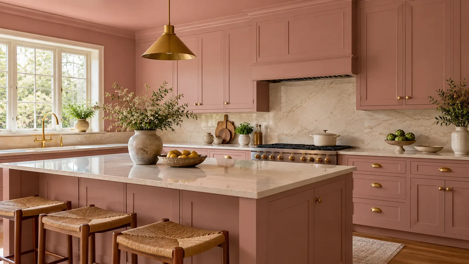
In a kitchen or dining area, peach can warm the room through painted cabinetry, a breakfast nook, tile, or a small appliance, while cream, walnut, sage, and navy offer practical partners. If peach is on cabinets, let the backsplash and counters act as quieter surfaces; if it is only on a wall, chairs or table linens are a low-commitment way to test coral, teal, or mustard.
In a bathroom or entry, repeat peach in a smaller surface such as a vanity, painted door, tile, or artwork. White and mint keep a small room bright, while terracotta, olive, and navy give an entry more weight. Consider the fixed finishes—floor tile, metal fixtures, and wood—as part of the palette before selecting paint, since replacing a wall color is much easier than replacing those materials.
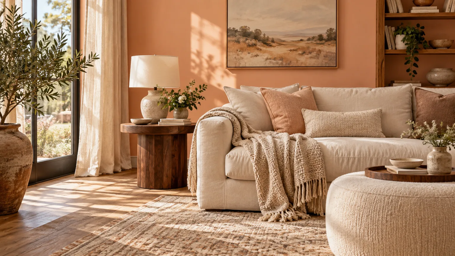
How light, finishes, and materials shift the palette
A paint color on a screen or small paper chip cannot show exactly how it will behave across a room. Natural light changes through the day, and artificial bulbs can make the same surface look warmer or cooler; the room’s floors, trim, and nearby fabrics also reflect color back into the space. Benjamin Moore’s color handbook recommends sampling at home and viewing the color at different times, while Jotun notes that its muted golden peach can shift with lighting, finish, and substrate on its Peachy color page.
Finish affects the way a painted surface reflects light, so compare colors in the sheen you plan to use. A flatter wall finish can look softer than a glossier trim or cabinet finish even when the paint color is identical. That difference can be useful for defining surfaces, but it can also make a peach wall appear more muted than a peach door painted in a higher sheen.
Materials count as colors too. A red-toned wood floor, golden oak, cool gray stone, brass, black metal, and white tile can each change whether peach looks pink, orange, or neutral by comparison. Before choosing a new paint color, place a sample next to a floor or tile sample and the largest fabric that will remain in the room.
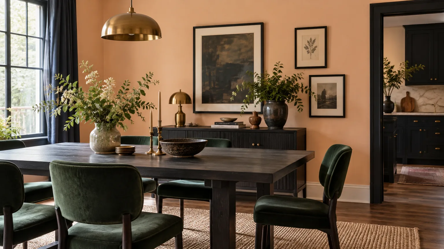
Common mistakes when decorating with peach
The first common mistake is choosing a companion color from its name alone. “Sage,” “white,” and “peach” can each describe many different color formulas, so compare the actual samples; two shades with similar names may have very different undertones. The Benjamin Moore color handbook also emphasizes that light changes a paint’s appearance, which is why a digital preview is best used for inspiration rather than final approval.
Another is assuming every peach needs the same kind of contrast. A muted peach beside stark white or a bright blue can look much more intense than expected, while a strong coral-peach with cream and terracotta can feel crowded because all three are warm and relatively vivid. Adjust the strength of the partner color before rejecting the entire pairing: choose a grayer, lighter, or darker version and see if the relationship improves.
Do not try to match every peach object exactly. If the wall, curtains, rug, and sofa all use slightly different peaches, the room can look inconsistent instead of layered. It is often better to repeat one peach tone and add a related but clearly distinct color, such as dusty rose, cream, or terracotta.
Finally, avoid introducing a new accent color just because it appears in a reference photo. A room image may include specific lighting, art, flooring, and materials that make the pairing work; your room will have its own fixed colors. Borrow the relationship—warm peach against cool blue, for example—not the exact shade or quantity shown in someone else’s space.
How to test a peach palette before committing
- Gather what is already fixed. Put together samples or clear photos of the floor, tile, countertops, trim, and large furniture that will stay. Choose a peach swatch that sits comfortably with those materials before adding companion colors.
- Select two possible partners, not six. Pick one soft option, such as cream or sage, and one higher-contrast option, such as navy or teal. This makes it easier to see which direction suits your light and furniture instead of comparing a pile of unrelated paint chips.
- Use large movable samples. Paint sample boards or use the manufacturer’s larger peel-and-stick samples, then move them to more than one wall. A small chip is easy to misread because the surrounding wall and adjacent colors affect how it appears.
- Check morning, afternoon, and evening. Look at the peach and its partner in daylight and with the room’s usual lamps on. If peach becomes too orange at night, try a more muted or pink-leaning sample, or shift the companion color toward gray or blue.
- Judge the whole combination at normal viewing distance. Place the sample beside a fabric or material from the room, then step back. If the peach dominates, reduce its area or choose a calmer partner; if the colors feel flat, add contrast through a darker accent or a more varied texture before repainting.
- Commit only after the pairing works in context. Once you have a favorite, review the actual product color and finish with the paint supplier, and test that finish on the intended surface. Manufacturers caution that digital displays vary and that lighting, substrate, and finish can alter the result, so the sample board is the final check—not the color name or a phone screen.
Conclusion
Peach works with warm neutrals when you want a gentle, cohesive room, with greens when you want an earthy counterpoint, and with blues when you want a cooler, clearer contrast. Coral, pink, yellow, and terracotta keep the palette warm and expressive, but they are easiest to manage when one color leads and the others stay quieter.
Start with the peach shade and materials you already have, choose one companion color that supports the mood you want, and test both in the room’s real light. That small check is more reliable than choosing from a color name or an online photo—and it lets peach fit the room you have, not just the room in the inspiration image.