20 Colors That Go With Lavender in Any Room
See 20 colors that go with lavender, including white, sage, navy, pink, and rust. Learn how undertones, lighting, and room use change the right pairing.
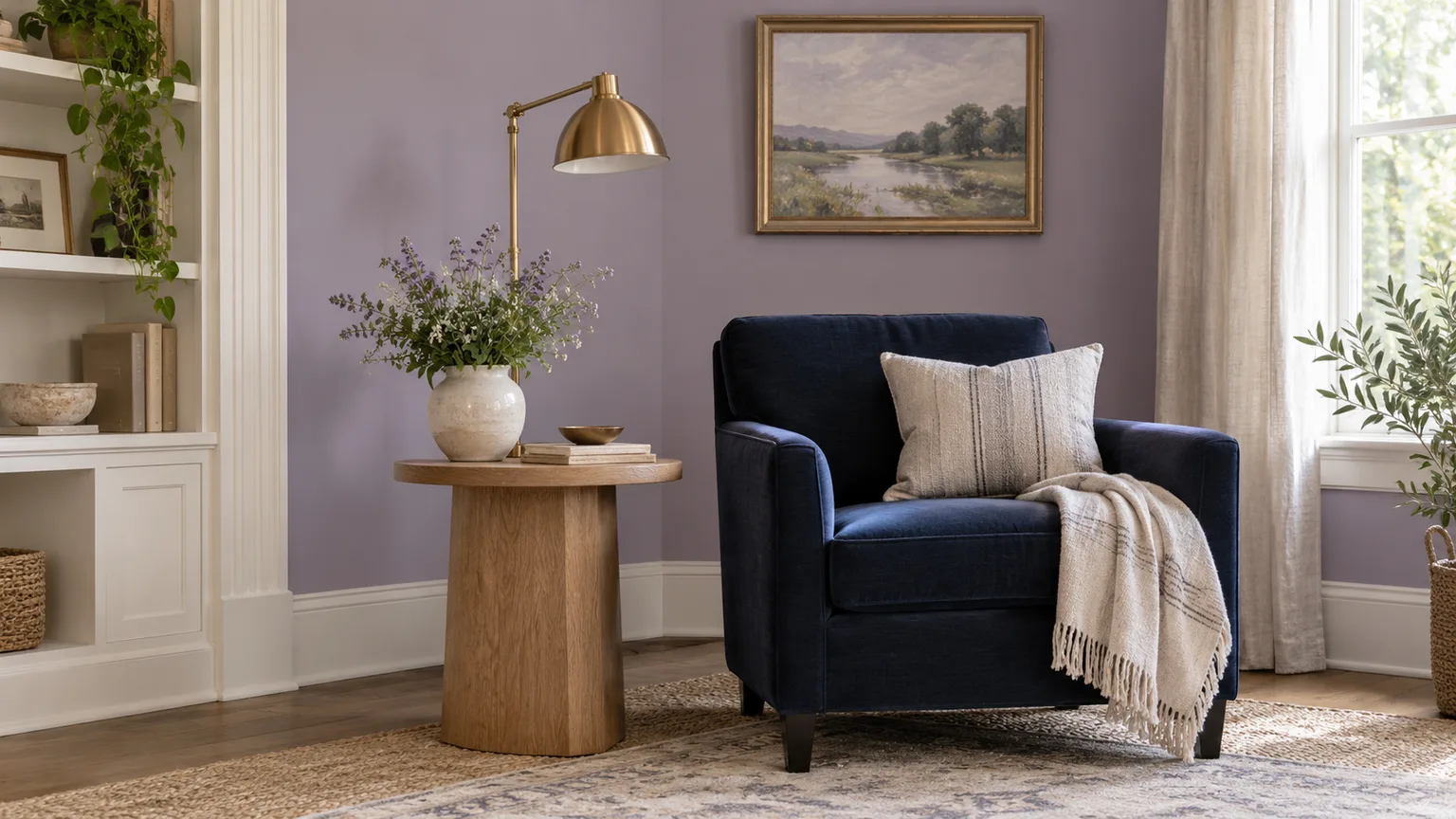
Lavender can read as airy, romantic, tailored, or dramatic depending on what sits beside it. Warm white and oak keep it gentle; charcoal and navy sharpen it; sage and olive make it feel grounded; a small hit of rust or marigold brings energy. The useful question is not whether a color “always” goes with lavender, but whether its undertone, depth, and amount suit the lavender and the room you have.
Start with the paint, fabric, or object you already own, then build around its actual cast. A pink-leaning lavender and a blue-gray lavender behave differently next to cream, green, or orange. The twenty pairings below include familiar combinations as well as the less obvious details—what material to use, where to put the color, and how much contrast to introduce.
Start with the lavender you have
Look at the lavender beside a plain white sheet and a neutral gray object in daylight. If it looks rosy, treat it as a warm pink-violet; if it leans periwinkle or blue, consider it cool; if it looks smoky, its grayness will soften saturated colors nearby. This comparison is more useful than choosing from a phone screen, where display brightness and color settings can shift the shade.
Next, notice its value (how light or dark it is) and chroma (how vivid or muted it appears). Pale, low-chroma lavender can sit beside other soft colors without much competition. A saturated violet-lavender needs either a clear neutral buffer or a deliberate high-contrast partner; putting several equally vivid colors together can make the room feel unsettled.
Color-wheel relationships offer a starting point, not a decorating law. Sherwin-Williams describes analogous colors as neighbors on the wheel, complementary colors as opposites, and monochromatic palettes as variations within one family; these approaches create different levels of contrast. Lavender’s opposite sits around yellow, but in a room a softened ochre may be easier to live with than a bright primary yellow, and a grayed green can make a calmer bridge. See the paint-maker’s color-theory overview and color-harmony guide for the underlying relationships.
20 colors that make lavender easier to use
Treat the numbered combinations as palette starting points. Repeat colors in more than one place—such as a pillow and a small framed print—so the room feels connected, but let one hue lead instead of giving every accent equal visual weight.
Whites and earthy neutrals
1. Warm white. A creamy white softens a cool lavender wall and prevents the room from looking icy, especially when the lavender has a blue or gray cast. Use it on trim, bedding, a rug, or a lampshade; if your lavender is already pink and warm, choose a less yellow white so the two do not turn peachy together.
2. Ivory or cream. Ivory brings more visible warmth than white and suits dusty, mauve-leaning lavender particularly well. A cream headboard or linen curtain can make a bedroom feel layered rather than pastel-on-pastel, but check the fabric beside the lavender in both daylight and the room’s evening lighting because yellow cream can look dingy beside a crisp blue-violet.
3. Beige. Sand, oatmeal, and putty beige give lavender a quiet, natural partner that works well when you want color without a strong contrast. Keep the beige’s undertone in view: pink-beige echoes a rosy lavender, while a stone or green-beige can cool it; mixing an orange-beige with blue-violet may create a muddy-looking divide unless a warm wood tone connects them.
4. Taupe or greige. These mixed gray-brown neutrals give lavender a more grown-up, architectural setting than a flat white wall. A pale greige sofa with lavender cushions is a low-commitment way to try the pairing; on walls, use enough value contrast between the two so the lavender does not disappear into a nearly identical gray-beige.
Gray and deep contrast
5. Light gray, including blue-gray. A light gray with a blue or violet undertone can make lavender feel crisp and contemporary, while a warmer gray helps a pink lavender feel less sugary. Blue-gray also works as a connecting color between lavender and navy; compare chips together, because a cool gray that seems neutral alone can look noticeably blue once it touches a warmer lavender.
6. Charcoal or dark gray. Charcoal adds definition and gives a pale lavender something substantial to sit against. Try it in a rug, curtain rod, picture frame, or one upholstered chair before painting a whole wall; dark surfaces absorb more light visually, so a small room may benefit from charcoal accents rather than a large dark field.
7. Black. Black turns lavender from soft and traditional toward graphic, contemporary, or a little theatrical. A slim black bed frame, table legs, or framed art can outline a room without dominating it; use a warm white or natural texture nearby to keep the contrast from feeling stark, especially when the lavender paint is very pale.
Wood and brown
8. Natural wood. Oak, ash, and pale maple bring a tactile counterpoint to lavender’s smooth painted surface. The grain makes a pastel palette feel less precious, and it is easy to repeat through a floor, side table, or picture frame; cooler pale woods usually suit blue-lavenders, while honeyed woods naturally warm muted or pink-lavenders.
9. Brown. Cognac, walnut, and chocolate brown each give lavender a different degree of weight. Cognac leather adds a warm, casual note, walnut feels classic, and deep brown can make a lavender sofa or wall feel more playful than formal; add a soft white or cream nearby to separate the darkest brown from the purple rather than letting both merge into a heavy block. Nature-inspired room palettes often use wood, warm white, and layered browns to create depth instead of relying on one flat neutral, as shown in these earth-toned room examples.
Silver and gold
10. Silver. Brushed silver, pewter, or chrome reinforces the cooler side of lavender and looks clean beside blue-violet paint, glass, and cool gray. Use it in a lamp, mirror edge, or cabinet pull rather than scattering shiny pieces everywhere; multiple reflective surfaces can make a restrained palette feel busy, and polished chrome reads sharper than soft brushed nickel.
11. Gold or brass. Warm brass adds a useful counter-temperature to cool lavender and makes the pairing feel more tailored. A brass light fixture, frame, or small tray can stand out without turning the room into a metallic theme; pair antique or satin finishes with dusty lavender, while a highly polished gold has more visual force and is better used sparingly.
Greens
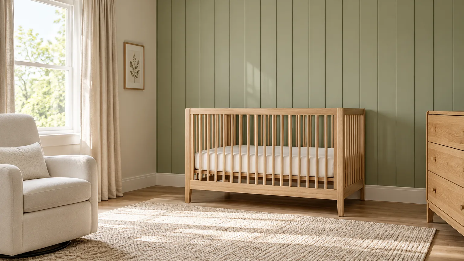
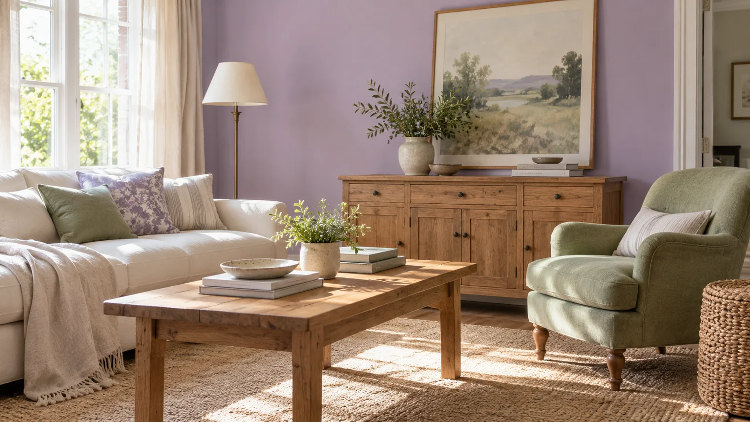
12. Sage green. Sage and lavender create a botanical, quiet palette because both can be softened with gray. Try sage in bedding, an upholstered chair, or cabinetry and use warm white or oak between larger areas; if both colors are pale and low-contrast, add a darker wood, muted brass, or deeper green so the room retains definition. Green-gray paint and wood are often used together to keep nature-based palettes balanced rather than overly sweet.
13. Olive green. Olive makes lavender earthier and more unexpected than sage. A single olive chair, cushion, or painted cabinet can anchor a lilac wall, especially when the olive has a brown or gray base; avoid pairing two highly saturated versions at equal strength unless you want a bold maximalist result. A woven rug or warm wood is an effective visual bridge.
Blues
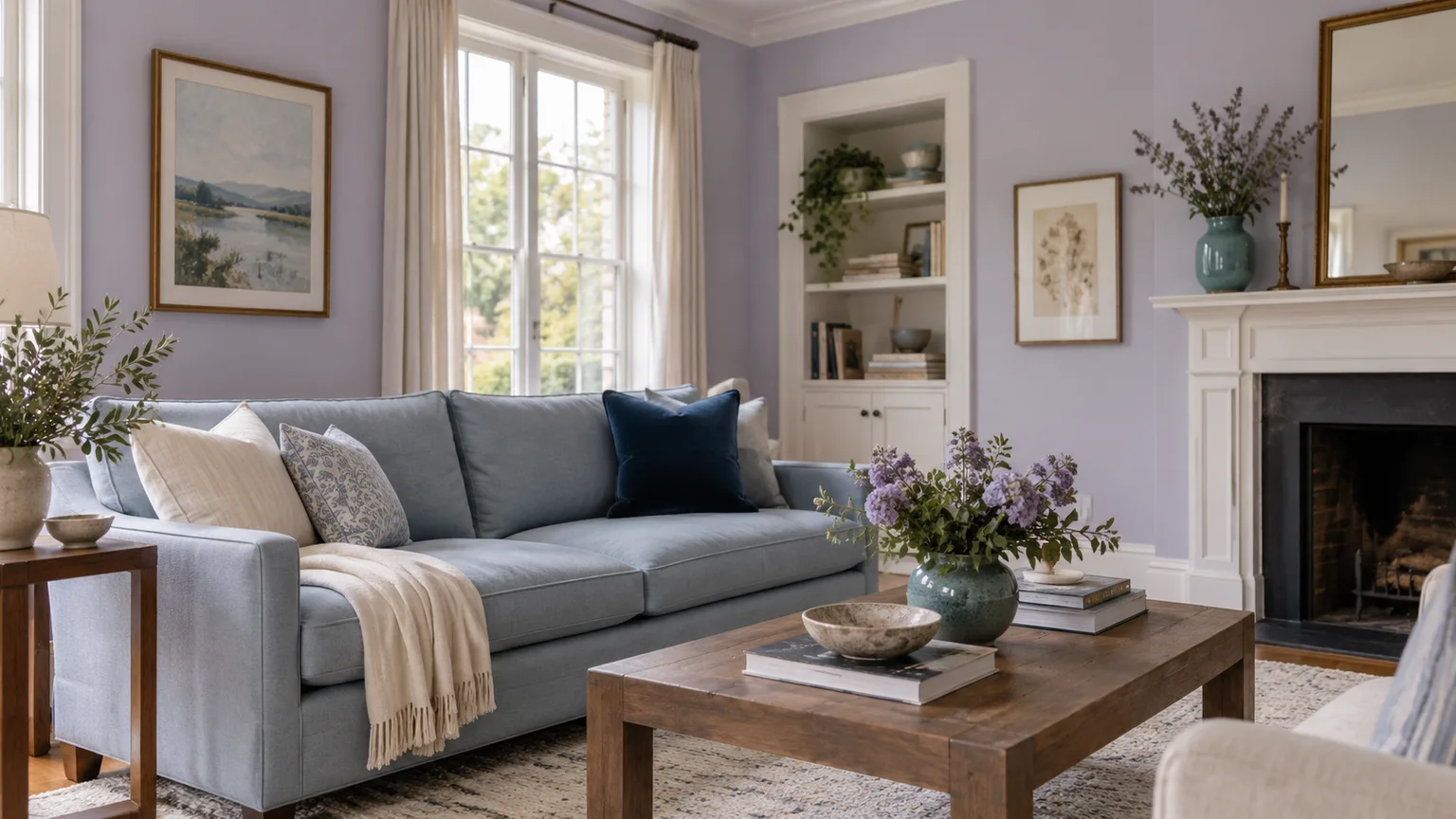
14. Powder blue. Pale blue beside lavender creates a soft, airy scheme suited to bedrooms, nurseries, and sunlit sitting rooms. Keep one shade slightly grayer or deeper than the other so they do not blur together; if the whole room becomes pastel, introduce a warm material—oak, cane, linen, or a small brass accent—to keep the palette from feeling cold.
15. Blue-gray. Blue-gray is a practical middle ground between lavender and stronger blue. Use it on a rug, upholstered piece, or adjoining room and let the lavender provide the clearer color note; this is particularly helpful in open-plan homes where you want a gentle transition rather than a hard boundary between spaces.
16. Navy. Navy gives lavender contrast without the severity of black and can make a pale wall look more deliberate. A navy throw, headboard, or lower cabinet provides enough depth for a bedroom or reading corner; if the lavender is dark or saturated, break up the block with white, linen, or warm wood. The combination of lavender, white, and a small navy accent is easier to balance than equal areas of all three.
17. Teal. Teal adds liveliness because it is more saturated and greener than powder blue. Use it as a controlled accent—a lamp base, one cushion, a painted stool, or a repeat in artwork—then allow lavender and a neutral to occupy the larger areas. Dusty lavender and muted teal tend to blend more easily than electric teal with a bright violet.
Pink and purple
18. Blush or dusty rose. A muted pink can make lavender feel soft and cohesive rather than like two unrelated colors. Choose dusty rose, mauve-pink, or plaster pink when the lavender leans red; a clear bubblegum pink is a much stronger statement and can make a bedroom feel deliberately playful. A warm-white gap in curtains, bedding, or trim helps separate the colors when their values are close.
19. Deep purple. Plum, aubergine, or eggplant adds shadow to a pale lavender and builds a monochromatic palette with more range than using one shade repeatedly. Keep the dark purple to a headboard, rug, art, or one chair unless the room has generous light; multiple deep violet surfaces can make an already dim room feel smaller. Repeat a lighter lavender elsewhere to keep the dark accent connected.
Yellow and orange
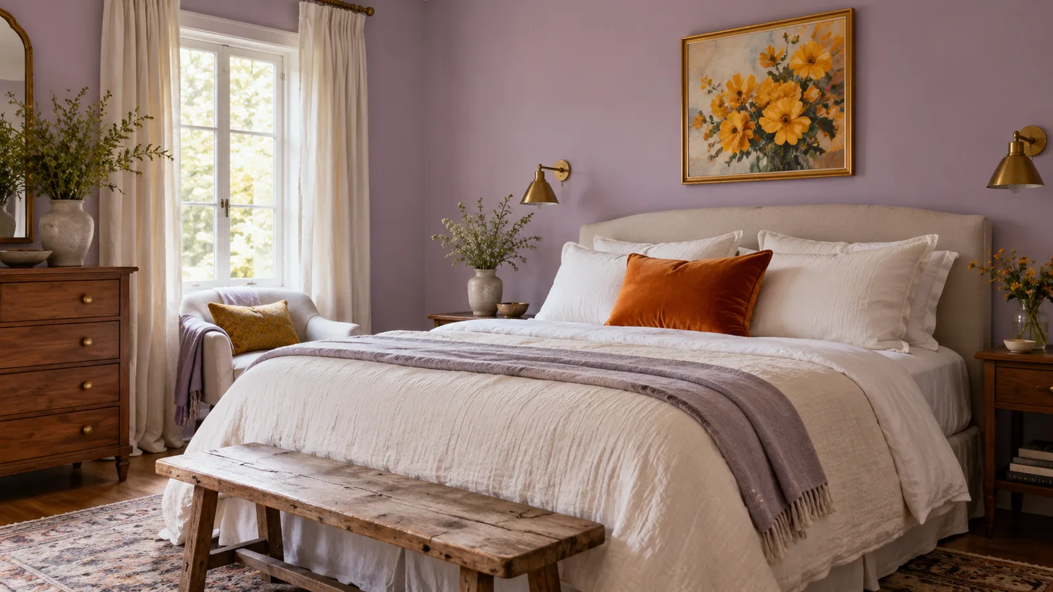
20. Marigold or rust-orange. Yellow sits opposite violet on the color wheel, so it can create strong complementary contrast; paint guidance on using complementary colors also explains that their balance and amount shape how forceful a room feels. Choose butter, straw, ochre, or marigold for a warm lift, or rust and terracotta for an earthier result. Put the vivid shade in a cushion, lampshade, artwork, or small upholstered piece first; it is easier to judge one accent than a wall-to-wall complementary scheme.
Build a three-color palette, not a pile
A reliable starting formula is lavender + a connective neutral + one accent. The neutral might be warm white, gray, beige, wood, or even a textured natural fiber; it gives the eye a rest between lavender and a high-contrast color. Then repeat your accent in two small locations so it looks intentional rather than accidental.
Here are three complete combinations you can adapt: (1) gray lavender, warm white, and natural oak for an easy bedroom; (2) rosy lavender, sage, and antique brass for a softer living room; and (3) cool lavender, navy, and rust for a richer study or dining area. For more color, use lavender, muted teal, and dusty pink, but let one be dominant and keep the other two in smaller textile or artwork doses.
The exact proportion is not a rule, but a useful way to start is to make one color the field, one the support, and one the punctuation. Sherwin-Williams’ guidance on complementary paint also recommends varying the amount of each hue and using neutrals or analogous shades to prevent a high-contrast scheme from becoming overwhelming. A designer-led room-palette roundup likewise emphasizes choosing a foundation color and keeping a concise thread of colors through smaller spaces.
Choose a pairing for the room
Bedrooms
Lavender is easy to use in a bedroom because its softness can be balanced with crisp or tactile materials. For a restful direction, try lavender walls with white bedding, oak bedside tables, and a small navy detail; for a warmer, more enveloping scheme, use dusty lavender, ivory, and walnut. If you share the room, test pinker and bluer versions before committing—what feels calming to one person may look too sweet or too cool to another.
For a child’s room, lavender does not have to be paired only with white. Sage, muted teal, or a touch of marigold can grow with the room as furnishings change, while removable bedding and art are easier to replace than painted walls. Keep the largest surfaces soft and let brighter color appear in items that can be moved or swapped.
Living and dining rooms
A living room has more opportunities to bring in material contrast: lavender upholstery against brown leather, a lavender wall behind a wood console, or lavender curtains beside charcoal metalwork. If the room already contains a strong rug or artwork, pull one neutral and one accent from it instead of introducing a third competing palette. In a dining space, deep purple, navy, or brown can provide visual weight, while brass or warm wood keeps a cool lavender from feeling detached.
In open-plan rooms, repeat one of the same neutrals or accents across zones. A lavender reading chair can relate to a dining area through a shared wood tone, a blue-gray rug, or brass lighting; the two spaces need not use identical paint colors. This continuity is more comfortable than giving every functional zone an unrelated set of high-contrast colors.
Kitchens, baths, and work spaces
Lavender can work in kitchens when it appears in a painted island, backsplash, small appliance, or textiles rather than requiring every fixed surface to match. White, pale gray, walnut, and brushed brass are useful partners, but compare lavender to the actual countertop and cabinet finish; undertones that look subtle on a phone may be conspicuous beside stone or tile.
In bathrooms, lavender and white can feel fresh, while lavender with charcoal or navy looks more graphic. Check the bulbs and mirror lighting before choosing a wall color, since evening light may shift a cool lavender toward gray or make a warm one look pinker. In a home office, use navy, charcoal, or a wood desk to give lavender a more defined backdrop, then keep vivid orange and yellow accents limited if visual calm matters during work.
Balance color with proportion and material
Color is only one part of a pairing. Velvet, matte paint, polished metal, raw linen, and varnished wood make the same color relationships feel different because their surfaces reflect or absorb light differently. A lavender wall with brushed brass feels quieter than that same paint with mirrored gold; a lavender sofa on a patterned rug can appear less prominent than the wall version of the color.
Before adding more paint, look at the room’s fixed materials: floor, stone, tile, upholstery, and cabinetry. Those surfaces are already part of the palette, even if their colors seem neutral. If they are warm—honey oak, cream stone, or rust-toned brick—test lavender beside a related warm white or brown; if they are cool—gray tile, black metal, or blue-white marble—try a cooler lavender and a soft gray bridge.
Use strong colors at different visual weights. Lavender walls with tiny orange accessories may look balanced; lavender walls with an orange sofa and a saturated yellow rug may feel like a three-way contest. Repeating a smaller accent in a second spot is usually enough to connect it, while repeating every color equally can make a room look overly coordinated.
Test paint and fabrics in the actual room
Paint chips are useful for narrowing choices, but they are too small to show how a color will behave across a room. Order a sample or make a large sample board, apply two coats if the paint instructions call for it, and place it vertically near the trim and the furniture that will stay. Move it to more than one wall: light from a window, reflected greenery, a neighboring painted wall, and artificial bulbs all influence what you see.
Sherwin-Williams’ guidance on paint undertones and lighting recommends comparing similar chips side by side to reveal undertones, then evaluating colors in the actual lighting; it notes that northern light can emphasize blue while artificial bulb temperature also affects appearance. That direction note applies to rooms in the Northern Hemisphere; window exposure, trees, shade, and local conditions still matter more than a simple rule. Look at the sample in morning, afternoon, and evening, with your normal lights on, before choosing the companion white or accent.
Test the pair rather than approving each color separately. Put the fabric, wood sample, or metal finish beside the lavender board; a companion neutral that looks agreeable alone may make the wall paint seem unexpectedly pink, gray, or dull. If you have a busy pattern, test a sample of that pattern at the scale it will be used, because a tiny swatch hides how much of the room the pattern will occupy.
Avoid common lavender-palette mistakes
A common mismatch is pairing a yellowed white with a strong blue-lavender and assuming they are neutral enough to reconcile. If the white turns creamier beside the paint, choose a cleaner white or bring in a warmer bridge such as oak, beige, or brass. Conversely, an icy gray can make pink-violet paint appear more peachy; change one variable at a time so you can identify the source of the clash.
Another trap is selecting from color-wheel opposites and using both at full saturation across large surfaces. A bright violet wall and intense yellow cabinets can vibrate visually, even though purple and yellow are a textbook complementary pairing. Lower the chroma of one color, reduce it to an accent, or add a quiet neutral between the two.
Finally, do not assume a screen preview is a faithful paint sample or that the names “lavender,” “lilac,” “mauve,” and “periwinkle” mean the same thing across brands. Different paint lines can vary in formulation and sheen, and adjacent fixed finishes can shift how a sample reads. Choose by the sample in the room, not by a color name or an online image alone.
Conclusion
Lavender has more range than a pastel bedroom palette: it can feel grounded with wood and olive, tailored with navy and brass, airy with white and powder blue, or lively with marigold and rust. The best partner depends on the lavender’s undertone, the room’s fixed finishes and light, and how much contrast you want to see every day.
Start with one pairing that suits the mood, add a neutral to connect the colors, and repeat one accent in a couple of small places. Test the actual paint and materials together before committing; that small step is what turns a pleasing palette on paper into a room that feels right in your light.