6 Things That Make Your Coffee Table Look Cluttered, Organizers Say
Learn what makes a coffee table look cluttered and how to fix it with smarter storage, fewer objects, better scale, and room to use the surface.

A coffee table looks cluttered when too many objects are competing for attention, but the problem is not simply “having stuff.” A remote you use every night, a book you are actively reading, or a small bowl that catches keys can be perfectly reasonable; the visual mess starts when useful items have no home and decorative items fill every remaining gap.
The fix is a better system, not a personality transplant. Clear the surface, decide what the table needs to support, then keep only the objects that earn their space through use, beauty, or meaning.
Why coffee table clutter happens so quickly
Coffee tables sit at the intersection of several routines. They hold drinks, snacks, glasses, game pieces, mail, remotes, reading material, children’s activities, and whatever someone was carrying when they sat down. That makes the surface a landing pad before it becomes a design feature.
There is also a visual reason the table can feel messy faster than a shelf. Items are usually viewed from several sides, close to eye level, and against a large uninterrupted plane. A few unrelated small objects create more visual noise than the same objects grouped on a bookcase, where shelves and vertical spacing provide structure.
Research on home environments can add context without turning a coffee table into a medical problem. In a home-tour study, researchers found associations between how participants described their homes and patterns of mood and cortisol across the day; that does not prove that a messy tabletop causes illness, but it supports treating the home as part of how people experience daily routines. The National Association of Productivity & Organizing Professionals similarly describes organizing as support for decision-making around objects and spaces, and notes that disorganization can contribute to stress and frustration (NAPO’s professional-organizer guidance; the home-environment study).
The five-minute coffee table reset
Before buying a tray or rearranging the decor, start with a completely empty tabletop. This is faster than trying to edit a crowded arrangement in place because you can see the table’s usable area, inspect sticky rings or dust, and make decisions without keeping objects simply because they are already positioned attractively.
Sort every item into four decisions
Make four temporary groups: use here, store nearby, move elsewhere, and remove or recycle. “Use here” is for the few things that belong to the living-room routine; “store nearby” is for essentials that need quick access but do not need to be visible; “move elsewhere” is for objects that have migrated from another room; and “remove” covers trash, dead batteries, dried flowers, expired catalogs, and things nobody wants.
Do not create a fifth pile called “decide later” unless you give it a deadline. A small undecided pile is often how a cleared table becomes a crowded table again. Put sentimental pieces or uncertain purchases in a labeled box for one week, then judge whether anyone looks for them before returning them to the room.
Leave a landing zone for real life
The table is not successful if it looks beautiful for five minutes but has nowhere to put a mug. Reserve one clearly usable area—more on a small table, less on a large one—before adding decorative objects. If your household eats in the living room, plays cards, folds laundry, or works from the sofa, leave enough open surface for those activities instead of treating function as an afterthought.
1. Visible remote controls and everyday tech
Remote controls are a classic example of a necessary object that creates instant disorder when every device has its own wand. Add charging cables, headphones, game controllers, reading glasses, and a phone, and the center of the room starts to resemble a work station rather than a place to relax.
The answer is not to hide everything in a distant cabinet. If people have to stand up and search, they will put the items back on the tabletop. Instead, choose the closest container that keeps the surface visually quiet: a lidded box, a shallow catch-all, a drawer in the sofa’s end table, or a small basket on a lower shelf.
Give the essentials a return-home station
Assign one home for all remotes, not one home per person. A box with enough width for the largest remote is better than a narrow decorative container that forces the controls to sit beside it. If a remote is used constantly, an open tray may be more realistic than a lid; the goal is a repeatable return, not a perfect photograph.
Keep charging cables from becoming a second clutter category by choosing one charging location and using a short cable or cable sleeve where possible. Do not leave a charging hub on the tabletop unless the table genuinely functions as a workstation; otherwise place it in a side table, console, or nearby shelf where it remains reachable but does not divide the visual field.
2. Too many books in too many stacks
Books add height, color, texture, and a glimpse of your interests. They become clutter when every book is being asked to act as decor, when stacks multiply without a purpose, or when the table is so full that nobody can comfortably open one.
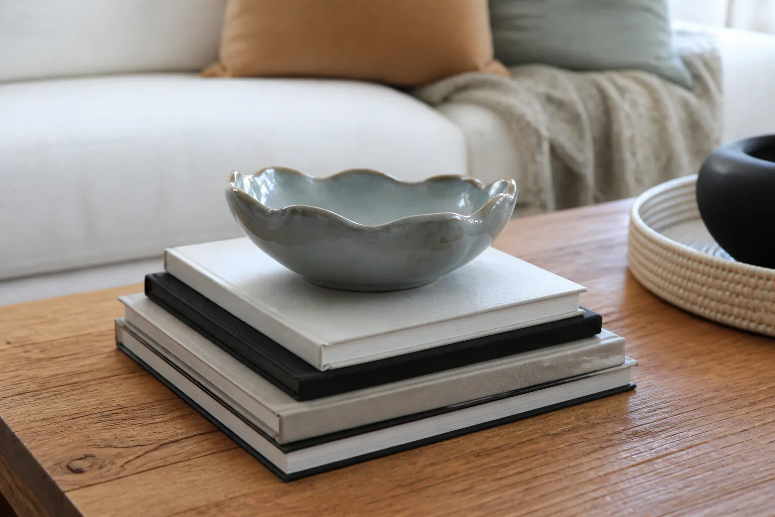
A useful starting point is one stack of one to three books on a small table, or two low groupings on a larger rectangular table. That is a flexible editing rule, not a law: a family room may need a current puzzle book and a board-game box, while a formal room may need only one large book and a bowl.
Choose books for use, not just color
Keep the books that people actually open, browse, or enjoy discussing. If a cover matches the room but the book has been untouched for years, move it to a shelf and bring it back when the subject becomes relevant. Rotating a small selection gives the tabletop interest without requiring a permanent tower.
Stack books with the largest and most stable volume at the bottom, then stop before the pile becomes precarious. The top book should be easy to lift without disturbing a vase or knocking into another object. A stack also needs a visual reason to exist: it can raise a bowl, create a low platform for a small object, or give a reading habit a convenient place to land.
This is where a design rule needs a reality check. A book that is too precious to touch is decoration; a book that invites someone to pick it up is part of the room’s function. Both are valid, but mixing many untouchable stacks with loose daily reading creates the worst of both systems.
3. Collections without a boundary
Collections are meaningful, but a coffee table rarely has enough area to display every small piece individually. Miniature figures, travel souvenirs, shells, paperweights, and ceramics start to look accidental when they are spread across the whole surface with no shared base, repeated color, or visible grouping.
The first question is whether the collection belongs on the coffee table at all. Put fragile or high-value pieces somewhere less exposed if children, pets, or frequent entertaining make the surface a risky location. For the pieces that can stay, reduce the number until the group reads as one idea from across the room.
Group collections inside a container
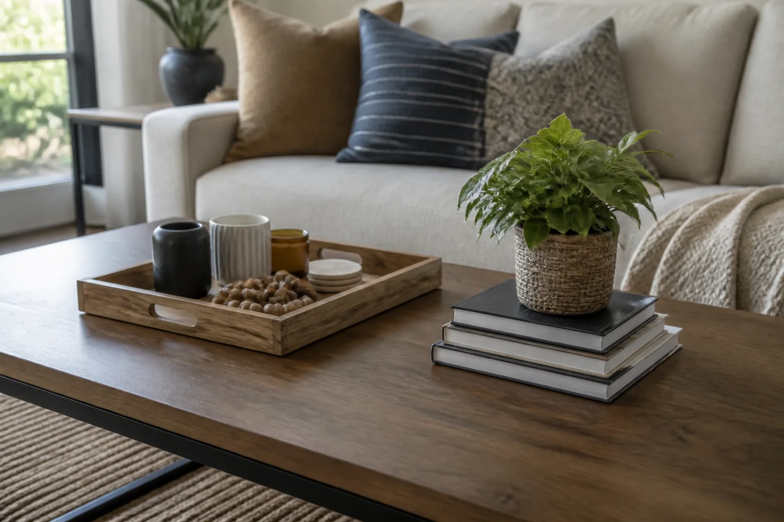
A tray gives a collection an edge, which makes the grouping legible and easy to lift when the table needs to work. A shallow bowl, lidded box, or glass cloche can do the same job for smaller pieces, while a short stack of books can provide height without scattering objects around the entire table.
Use one organizing principle at a time. Group by material, story, or color; do not try to coordinate every attribute. Three similar objects with breathing room often look more intentional than nine unrelated objects packed shoulder to shoulder, even when the larger collection is more valuable or sentimental.
Leave an empty margin around the container. If the tray touches the table’s edges or is surrounded by a second ring of tiny objects, it stops acting as a boundary and becomes another layer of accumulation.
4. A permanent magazine pile
Magazines and catalogs are useful when they are current, but a leaning pile is usually a delayed decision. The oldest issue may still be attractive, yet if nobody has opened it in months, it is taking up prime space without serving the room.
Use a limit and a migration plan
Choose a maximum number of active issues—one to three is enough for many homes—and give the rest a destination. Recycle them, move them to a magazine file, tear out a page you genuinely want to keep, or set a calendar reminder to revisit a subscription before the next issue arrives.
The migration rule matters more than the number. If magazines keep returning to the tabletop, place the file or basket closer to the seating area, not in a room that nobody visits. A low basket beside the sofa can hold active reading while the coffee table stays reserved for one current issue or an open book.
Avoid replacing a magazine pile with a permanent pile of decorative books unless those books are better used. The visual upgrade is not the point; the point is to keep the table from becoming a paper-storage system.
5. Decor overload and tiny objects
Decor overload happens when every object is individually appealing but the group has no hierarchy. Candles, bowls, figurines, beads, vases, coasters, and small plants can all be good choices, yet too many similar-sized items force the eye to scan instead of rest.

Edit each object by its visual job
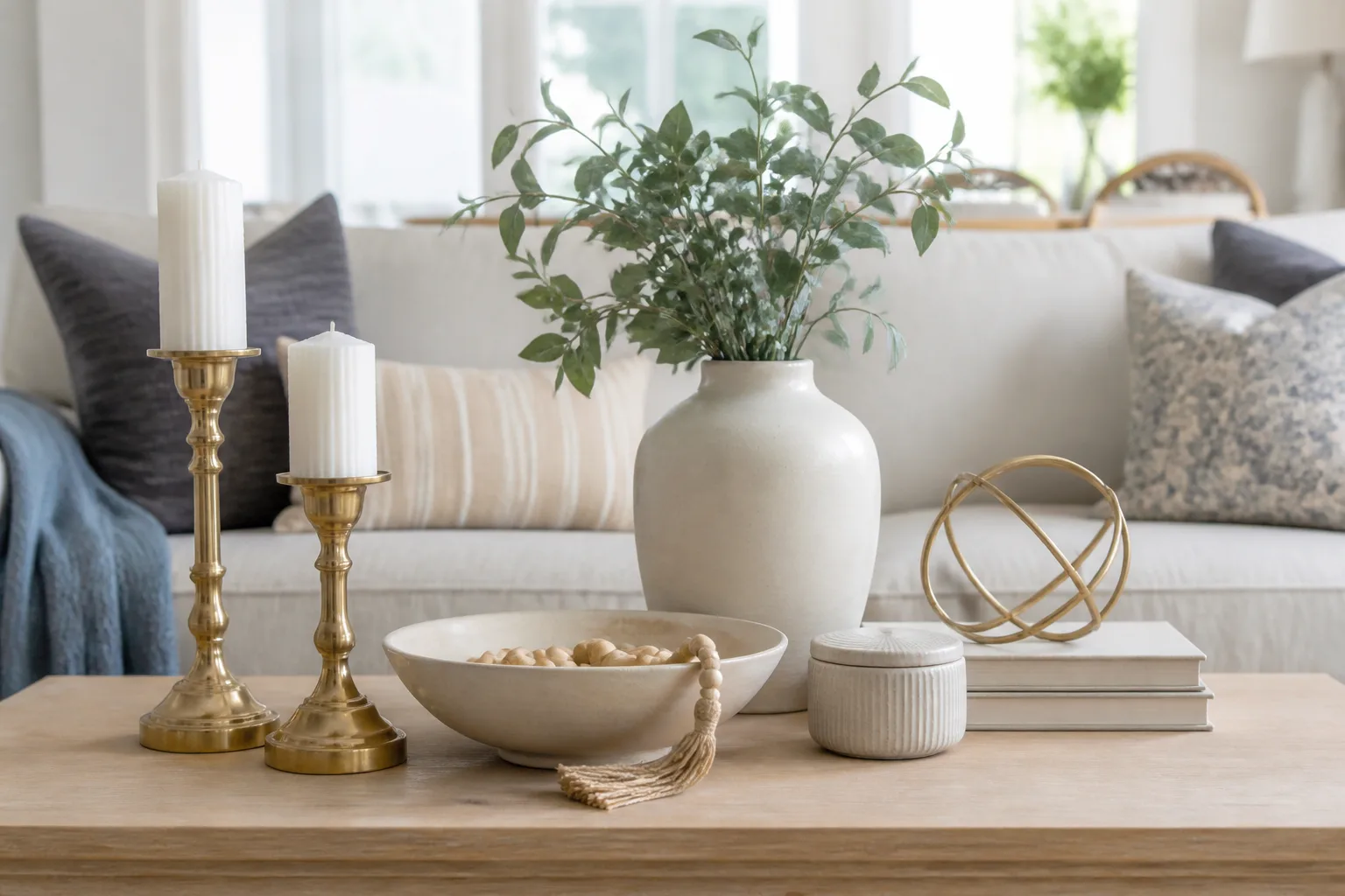
Ask what each piece contributes. A tall vase provides height, a tray creates a boundary, a bowl holds something, a book stack adds a low layer, a plant adds movement and color, and a sculptural object supplies a focal point. If three objects perform the same job at the same height, keep the one with the strongest meaning or the clearest relationship to the room.
The best edit is often to remove one layer, not to rearrange all of them. Take away the beads, the extra candle, or the small accent that sits beside a larger centerpiece, then look again from the sofa and from the main entry point. If the arrangement suddenly reads more clearly, leave it alone rather than filling the gap.
Use color and material to connect objects without making them identical. A wood tray, ceramic bowl, and linen-covered book may feel cohesive through texture and warm neutrals; adding several unrelated finishes can make a small surface feel busier than it is.
6. Decor at the wrong scale or in the wrong place
Scale problems run in two directions. A tall vase, oversized bowl, and large sculpture can overwhelm a small table and block conversation, while a field of tiny objects can look scattered on a large table because none of them creates a visual anchor.
Build a height rhythm without blocking the room
Start with one dominant piece, then add one low layer and one small supporting accent. Vary height modestly rather than creating a mountain: a low stack of books, a medium bowl, and a taller but narrow vase can create rhythm while preserving the view across the room.
Check the arrangement from every seat, not only from above. John Lewis & Partners recommends considering floor clearance, table shape, object height, and the ability to see past accessories; HGTV’s styling guidance similarly emphasizes varied scale, groupings, trays, and leaving usable space for cups and personal items (John Lewis coffee-table guidance; HGTV’s designer tips).
Place tall or fragile pieces toward the least-traveled side of the table, and keep the most frequently reached-for items near the seating position that uses them. If a centerpiece has to be moved every time someone watches television or serves snacks, it is in the wrong place or doing too much.
Make the table work for the way you live
The right coffee table arrangement is a compromise between visual calm and everyday access. A room used for entertaining may benefit from a removable tray, a stack of conversation-starting books, and a bowl that can be cleared in one lift. A family room may need open space for a game, a box for controllers, and a surface that can be wiped quickly.
Match the essentials to the room’s actual habits
Make the easiest action the tidy action. If remotes are used from the sofa, the container belongs within arm’s reach; if people read in the evening, a small current stack can stay; if drinks are always set down on one corner, do not fill that corner with ceramics just because it photographs well.
Design editors and organizers often return to the same principle: contain small groups, vary scale, and keep the surface usable. Better Magazine’s coffee-table method begins with something low and flat, adds one sculptural element, then introduces a living element; HGTV also recommends a tray because it can anchor smaller pieces and be moved when the surface is needed (Better Magazine’s three-step styling method).
For a small table, choose one visual anchor and one functional container, then stop. For a large table, divide the surface into two or three loose zones rather than filling the perimeter; the zones should support different jobs, such as reading, display, and drinks, while keeping a clear route for hands.
Conclusion
The six biggest coffee-table clutter traps are visible remotes, excessive book stacks, uncontained collections, permanent magazine piles, decor overload, and objects that are the wrong size or placed where they interfere with the room. None requires a total redesign.
Empty the table, sort what you find, give daily essentials a nearby home, and rebuild with one anchor, one low layer, and enough open space to use the surface. When in doubt, remove one object and wait a day; if the room functions better and your eye feels calmer, the empty space was doing useful work.