38 Best Sage Green Paint Colors for a Soothing Space
Compare 38 sage green paint colors by depth, undertone, room, and coordinating trim so you can sample the right shade before you paint.
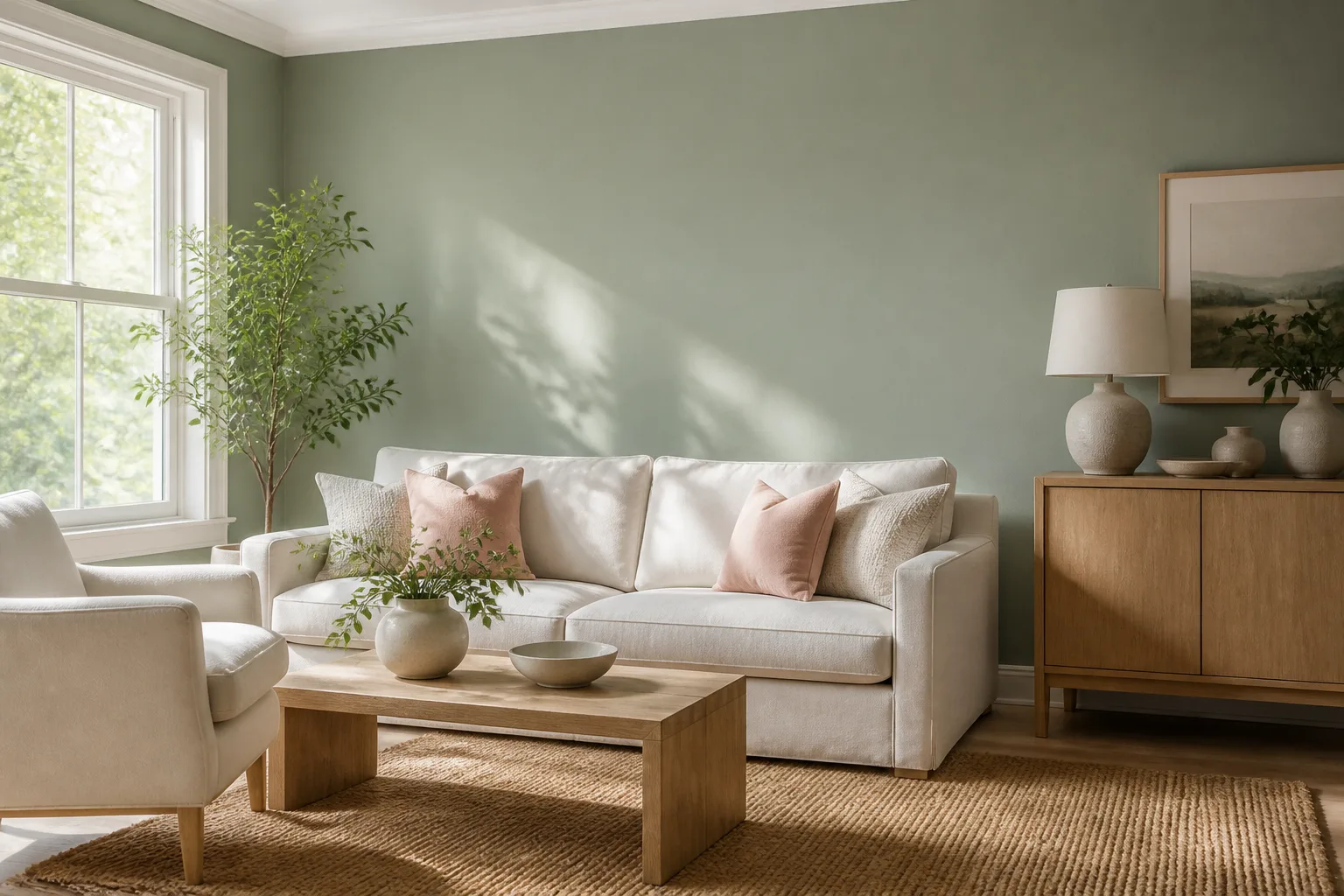
Sage green is not one paint color. It is a family of softened greens that can look silvery, yellowed, blue-gray, olive, or almost neutral depending on the mix and the light around it. That range is exactly what makes sage useful—and exactly why a color that looks perfect online can turn minty on a sunny wall or muddy in a dim hallway.
The list below treats “best” as best for a particular room, light pattern, and set of fixed finishes. Use the descriptions to narrow the field, then test a real sample beside your floor, countertop, upholstery, trim, and hardware. Manufacturer swatches and names can change, and a screen cannot reproduce the way paint shifts from morning daylight to warm evening lamps.
How to choose a sage green that will look right in your room
Before comparing paint names, identify the conditions that will judge the color every day. A pale gray sage can feel airy in a bright south-facing room but disappear beside cool white trim; a deeper olive sage can make a library feel enveloping but look heavy in a small north-facing bathroom.
Start with undertone, not the color name
The name “sage” tells you the general family, not the exact direction of the color. Look at the sample and ask whether the green leans yellow and herbal, blue and silvery, gray and quiet, or olive and earthy. The answer matters more than whether the label says sage, moss, fern, lichen, or eucalyptus.
Undertone is easiest to see by comparing two samples side by side, never by looking at one chip in isolation. Put a cool gray sage next to a warm cream, then next to a blue-white; its personality will change in each comparison because color is relational. Color Matters’ overview of color context makes the same broader point: surrounding hues, value, and saturation alter how a color is perceived, so a “neutral” green is never visually alone. (Color Matters)
If your room has honey oak, red-toned brick, beige stone, or warm brass, a sage with a little yellow or olive usually feels integrated. If it has blue-gray tile, crisp white marble, or chrome, a more muted or blue-gray sage may sit comfortably—but it can look cold if the room receives little natural light.
Use light reflectance value as a brightness clue
Light Reflectance Value, usually abbreviated LRV, describes how much visible light a color reflects on a scale from very dark to very light. It is helpful for comparing a pale sage with a mid-tone sage from the same family, but it is not a promise that the paint will make your room bright. Gloss, wall texture, surrounding colors, window size, and bulb temperature all change the result.
Use LRV as a sorting tool. Higher-value sages are the safer starting point for a small room or a space with limited daylight; medium values give cabinetry and built-ins more presence; lower values are strongest when you want a cocooning effect and have enough contrast in the trim, ceiling, or furnishings. Do not choose a paint solely because its LRV looks high on a chart—sample it where it will live.
Test on more than one wall
Paint a large sample board, ideally at least 18 by 24 inches, or use two coats on a removable primed board. Move it around the room during the day. Check the wall beside the window, the darkest corner, and the wall facing the main light source; then view it with the lamps you actually use after sunset.
Keep the board vertical. A color on a flat card held under a store’s bright lighting will not show the same shadow, texture, or reflected color as a vertical wall. Leave the sample in place for at least a full day, and compare it against the flooring and trim rather than against the white of the sample board.
The most useful test is not “Do I love this chip?” It is “Does this color still look intentional at 8 a.m., 2 p.m., and 8 p.m., beside the things I cannot easily replace?” If the answer changes dramatically, choose a more forgiving shade or adjust the neighboring finishes.
38 sage green paint colors, organized by mood and depth
These 38 colors are a practical starting palette, not a universal ranking. Names and formulas belong to their respective manufacturers, while the room suggestions are editorial guidance based on depth, undertone, and the amount of visual weight each shade can carry.
Pale and silvery sage paints
Pale sages are the easiest way to bring green into a room without making the walls the loudest element. They work especially well where you want daylight, light upholstery, or natural wood to remain prominent. Their risk is appearing nearly gray or slightly blue, so test them next to the floor and the white you plan to use on trim.
1. Benjamin Moore Silver Sage. A silvery, restrained choice for a bedroom, dressing room, or soft home office. It is a good candidate when you want sage to behave almost like a neutral, but it needs warm textiles if the room already has cool light. (Benjamin Moore Silver Sage)
2. Farrow & Ball Lichen. A natural, softened green that suits older homes, limewashed textures, and rooms with warm wood. It has enough color to avoid looking like plain gray while remaining calm on broad walls. (Farrow & Ball Lichen)
3. Benjamin Moore Misted Green. A light, hazy green that makes sense on vertical paneling, a bathroom wall, or a ceiling detail. Its gentle quality is useful in a room with several architectural lines because it adds color without hard contrast. (Benjamin Moore Misted Green)
4. Farrow & Ball Mizzle. A softly weathered option for a laundry room, hall, or small sitting room. It can read more gray in shadow, so pair it with creamy white rather than a blue-white if you want the room to feel warm. (Farrow & Ball Mizzle)
5. Sherwin-Williams Softened Green. A light choice for a half wall, wainscoting, or a room that needs a quiet color boundary. Use it when you want the lower portion of the wall to feel grounded without creating a strong two-tone effect. (Sherwin-Williams Softened Green)
6. Benjamin Moore Sage Tint. A pale sage that works on beams, trim, or a full wall when you want a delicate green veil. On a low-light wall it may lose its green, so test it against the ceiling and any nearby gray upholstery. (Benjamin Moore Sage Tint)
7. Clare Money Moves. A fresh, approachable sage for a dining room, mudroom, or small accent area. It is particularly useful when you want the green to connect white cabinetry with natural wood, though the exact balance should be checked against your countertop. (Clare Money Moves)
8. Valspar Green Trellis. A light green suited to a child’s room, playroom, or casual bedroom where the furnishings supply most of the color. It can tolerate cheerful accents, but keep large patterns nearby from pushing it toward a more saturated look. (Valspar Green Trellis)
9. Farrow & Ball French Gray. Despite its name, this is a green-influenced gray that can fill the role of a quiet sage in a bathroom or sitting room. Choose it when you want the green note to be subtle and the stone, tile, or artwork to lead. (Farrow & Ball French Gray)
10. Sherwin-Williams Nurture Green. A livelier pale-to-light sage for bedroom walls, a garden-facing room, or a space with vintage furniture. It has more visible personality than the silvery options, so it is a better fit when you want the walls to read clearly as green. (Sherwin-Williams Nurture Green)
11. HGTV Home by Sherwin-Williams Meadow Sage. A soft, usable shade for a fireplace surround or a small living-room feature where you want a tonal effect. Test the sheen and surface carefully if you are painting masonry, because texture can make the color look deeper. (Meadow Sage)
12. Benjamin Moore Saybrook Sage. A versatile light-to-mid sage that can bridge traditional furniture and contemporary upholstery. It is a strong sample for wainscoting, a guest room, or cabinetry when you want the green to feel established rather than pastel. (Benjamin Moore Saybrook Sage)
13. Benjamin Moore Spring Break. A lighter, garden-like green that can bring freshness to a kitchen ceiling, enclosed porch, or sunny breakfast area. Balance it with grounded materials—wood, stone, woven texture—so the room does not feel overly sweet. (Benjamin Moore Spring Break)
Mid-tone sage paints
Mid-tone sages are the most adaptable group for cabinetry, libraries, living rooms, and dining rooms. They have enough value contrast to define a wall or built-in, but they are usually easier to live with than a very dark green. The key question is whether you want the green to recede into the background or act as a deliberate architectural color.
14. Sherwin-Williams Clary Sage. A warm, earthy green that looks natural with wood floors, woven textures, and aged metal. It is a useful whole-room candidate when you want a traditional feel without the heaviness of forest green. (Sherwin-Williams Clary Sage)
15. Sherwin-Williams Evergreen Fog. A gray-green with enough depth for kitchen cabinets, a library, or a built-in. It can look sophisticated with warm white and brass, but samples are essential because the gray component may become prominent in low light. (Sherwin-Williams Evergreen Fog)
16. Sherwin-Williams Mountain Road. A grounded, neutral-leaning green for a basement, family room, mudroom, or accent wall. Its depth helps it hold its own beside dark upholstery, but a small room may need a lighter ceiling and strong lamp light. (Sherwin-Williams Mountain Road)
17. Behr Sage Garden. A brighter mid-tone choice for a contemporary living room, creative workspace, or cabinet run. It has more energy than a gray sage, so use it when you want the paint to contribute visible color rather than disappear behind the decor. (Behr Sage Garden)
18. Behr Bitter Sage. A warm, vintage-friendly green that sits comfortably beside rosy stone, walnut, aged brass, or cream. It is a natural choice for a kitchen or dining area, but compare it to the room’s wood stain before committing. (Behr Bitter Sage)
19. Behr Sage Green ICC-77. A straightforward mid-tone green for base cabinets, a powder room, or a small built-in. Use it as a controlled accent when a full wall of color would compete with patterned tile or a busy backsplash. (Behr Sage Green)
20. Farrow & Ball Pigeon. A complex blue-gray green that brings a collected, slightly historic mood to mudrooms, cabinetry, and bedrooms. It can be beautiful with warm metals and pale wood, but its blue side becomes clearer next to bright white. (Farrow & Ball Pigeon)
21. Farrow & Ball Verre de Terre. A softened earth green that suits laundry cabinetry, a garden room, or a paneled hallway. It is a useful middle ground when olive feels too yellow and gray sage feels too cool. (Farrow & Ball Vert de Terre)
22. Clare All the Sage. A friendly, easy-to-read sage for a farmhouse kitchen, casual bedroom, or family room. Pair it with warm white, oak, and matte black for a relaxed palette; use a larger sample if the room has strong green landscaping outside. (Clare All the Sage)
23. Benjamin Moore Herb Bouquet. A leafy, more assertive green that works on an accent wall, a pair of built-ins, or a tonal bedroom. It is a good choice when pale sage feels washed out but you do not want the drama of a deep green. (Benjamin Moore Herb Bouquet)
24. Benjamin Moore Winchester Sage. A medium sage with enough body for a library, office, or dining room. It can support antiques and darker wood while still feeling fresher than a brown neutral, especially when the ceiling remains light. (Benjamin Moore Winchester Sage)
25. Benjamin Moore Texas Sage. A warm, natural-leaning green that can make a bedroom feel settled without becoming too dark. It is especially appealing with linen, cane, warm white, and medium wood, but test it if the room gets weak northern light. (Benjamin Moore Texas Sage)
26. Benjamin Moore Dry Sage. A muted, substantial green suited to an office, bedroom wall, or lower cabinetry. Its softness lets it pair with gold-toned metal and warm neutrals, while the medium depth gives it enough presence to define millwork. (Benjamin Moore Dry Sage)
Deep, smoky, and olive-leaning sage paints
Deep sages create the strongest mood and can make a room feel intentionally wrapped rather than merely tinted. They are best when the room has good layered lighting, a ceiling that does not feel oppressive, or enough contrast from trim and furnishings. On a large wall, a deep green can look more neutral than expected; on a small sample, it may look much darker than the finished room.
27. Farrow & Ball Green Smoke. A smoky, blue-leaning green for an entry, study, dining room, or dramatic cabinet color. It is a strong option when you want an aged, atmospheric look, but it should be tested beside both daylight and warm bulbs. (Farrow & Ball Green Smoke)
28. Sherwin-Williams Green Onyx. A deep, mineral green that works for a tonal bedroom, built-in, or statement wall. Use it where you can repeat the depth in upholstery or art; otherwise the wall may feel visually disconnected from the room. (Sherwin-Williams Green Onyx)
29. Benjamin Moore Sage Wisdom. A deeper, enveloping sage for a bunk room, den, or ceiling-and-wall treatment. It is most convincing when the room embraces the color with warm metal, wood, or cream instead of trying to make it behave like a pale neutral. (Benjamin Moore Sage Wisdom)
30. Benjamin Moore Cedar Mountains. A rich, earthy green that creates a backdrop for antiques, red accents, and warm wood. Consider it for a living room or dining room with enough daylight and a clear plan for the ceiling and trim. (Benjamin Moore Cedar Mountains)
31. Benjamin Moore Sage 2143-10. A very deep sage that reads almost like a green-black in shadow. It can be handsome on a fireplace wall, a small powder room, or furniture, but it is not the first sample to choose for a dim room you hope will feel airy. (Benjamin Moore Sage)
32. Benjamin Moore Sioux Falls. A grounded, darker green for a playroom accent, library, or cozy media space. It provides a stable backdrop for brighter colors, though a room with little daylight will need light upholstery and layered fixtures to keep the palette from closing in. (Benjamin Moore Sioux Falls)
33. Sherwin-Williams Meadow Sage. A mid-to-deep green that can anchor a fireplace, cabinet, or focal wall. Use it when you want a clear color statement but still want a softer edge than navy or charcoal. (Meadow Sage)
34. Benjamin Moore Clary Sage. A darker, warmer interpretation of the herb-inspired family for a traditional living room, built-in, or accent wall. It is a good reminder to compare the exact formula and finish, because color names can overlap across brands. (Benjamin Moore Clary Sage)
35. Sherwin-Williams Cucuzza Verde. A brighter, more characterful green that suits vintage furniture, a bedroom ceiling, or a color-drenched nook. It is less gray than many “quiet” sages, so choose it when the room can carry visible green. (Sherwin-Williams Cucuzza Verde)
36. Benjamin Moore Green Smoke. A deep, softened green for a study, dining room, or dramatic cabinetry. It is a useful alternative to a blue-green when you want the room to feel earthy and shaded rather than crisp. (Benjamin Moore Green Smoke)
37. Farrow & Ball Cooking Apple Green. A cheerful, yellow-influenced green that can bring life to a nursery, kitchen detail, or painted shelving. It is not a sleepy gray sage, so pair it with calm materials and use a sample to check how much yellow your room can support. (Farrow & Ball Cooking Apple Green)
38. Farrow & Ball Calke Green. A strong, historic-feeling green that looks particularly at home on cabinetry, paneling, or a room with antique furnishings. It has enough depth to create a cocoon, so keep the ceiling and the light plan in view before using it wall to wall. (Farrow & Ball Calke Green)
Best sage green paint colors for each room
The best shade depends on what the room needs the paint to do. A bedroom may reward a low-contrast, quiet sage; a kitchen often needs a color strong enough to sit beside counters and appliances; a bathroom may need a lighter value to survive a small window and glossy tile.
Bedrooms and nurseries
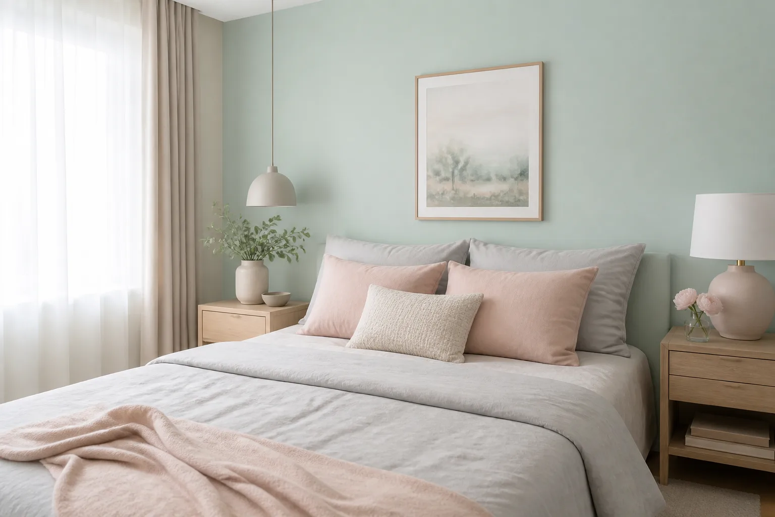
Start with pale or mid-tone sages such as Silver Sage, Lichen, Saybrook Sage, Texas Sage, or Dry Sage when the goal is restfulness without a blank white room. These shades give bedding, wood, and artwork room to work, and they are easier to soften with cream, linen, and blush than a saturated green.
For a more enveloping bedroom, sample Sage Wisdom, Green Smoke, or Green Onyx on one wall and consider carrying the same color onto the ceiling. The ceiling treatment can look intentional when the room has adequate lamps and a light bedspread; it can feel heavy when a low ceiling, dark floor, and dark furniture all compete for visual weight.
In a nursery, avoid choosing only from a digital palette. Check the color next to the flooring, crib finish, curtains, and night-light. A gentle sage can still look blue or gray beside cool white furniture, while a yellowed sage may exaggerate warm pine or beige carpet.
Kitchens and dining rooms
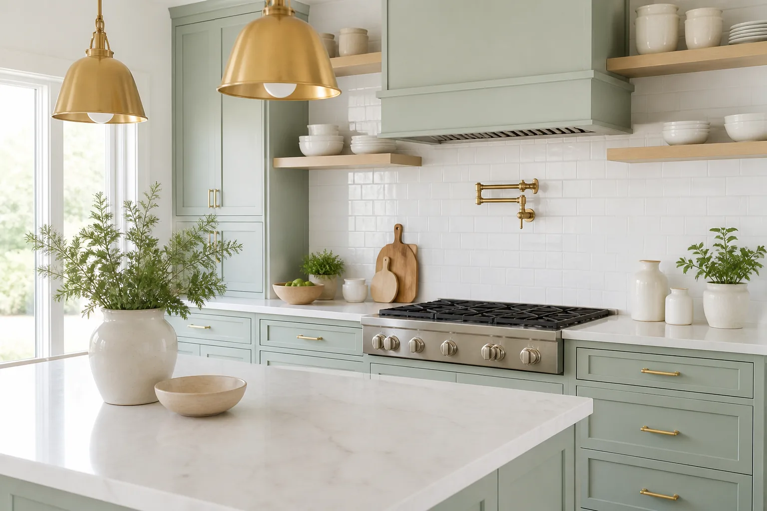
Cabinet paint needs more body than a wall color often does. Mid-tone choices such as Evergreen Fog, Pigeon, Bitter Sage, All the Sage, or Herb Bouquet can hold their shape around hardware, counter edges, and changing daylight. Pale colors can work too, but they may look chalky or disappear into a white backsplash unless the room has strong contrast.
For a farmhouse or vintage kitchen, warm sages look natural with oak, walnut, terracotta, unlacquered brass, and creamy walls. For a cleaner modern kitchen, try a muted gray sage with white tile, pale quartz, black pulls, or a dark island—but sample the green beside the actual counter, because reflected stone color can push it in an unexpected direction.
Dining rooms can carry deeper color because the lighting is often intentionally layered. Green Smoke, Cedar Mountains, or a deep sage on the lower walls can create a strong backdrop for wood and metal, while a lighter ceiling keeps the room from feeling sealed.
Living rooms, offices, and libraries
A living room usually benefits from a sage that can connect several materials rather than compete with one hero object. Mountain Road, Clary Sage, Winchester Sage, and Saybrook Sage are useful middle-ground samples for rooms with wood, woven texture, leather, cream upholstery, or black accents.
Offices and libraries can handle more depth because the desired mood is often focused and intimate. Try Herb Bouquet, Green Onyx, Sage Wisdom, or Sioux Falls when shelves and books need a clear background. Keep one light element—ceiling, rug, upholstery, or large artwork—strong enough to create relief.
If the living room opens into the kitchen, compare the sage to both rooms before painting. A color that looks softly gray beside a living-room sofa may look distinctly green beside bright white cabinets. The shared sightline is part of the sample, not a detail to solve later.
Bathrooms, mudrooms, and small spaces
Small rooms are not automatically limited to pale paint. They can support deeper sage when the color is deliberate and the trim, mirror, lighting, and floor create contrast. For an airy bathroom, start with Misted Green, Mizzle, French Gray, or Softened Green; for a moodier powder room, Green Smoke or a deep sage can be more memorable than a safe pale shade.
Mudrooms and laundry rooms are good places for practical mid-tone colors because cabinetry and lower walls see more activity. Pigeon, Verre de Terre, Bitter Sage, or Meadow Sage can hide everyday visual noise better than a very pale green, while brass, black, or warm wood hardware gives the room a finished edge.
Do not assume a darker paint will disguise poor preparation. In a high-use space, clean the surface, repair dents, use the correct primer, and choose a washable finish appropriate to the product. Dark color makes patchiness and uneven sheen more noticeable, not less.
Colors that go with sage green
Sage is easiest to coordinate when you decide whether you want quiet continuity or intentional contrast. Quiet continuity uses cream, tan, pale wood, and neighboring greens. Contrast introduces a dark value, a warm opposite, or a clear accent so the room does not become a low-contrast wash of gray-green.
Trim, ceilings, and wood tones
Warm white trim is usually the most forgiving partner for a warm or olive sage. It keeps the room from looking stark and helps yellow-leaning greens feel deliberate. A cool white can be beautiful with a blue-gray sage, but beside a warm sage it may make the walls look yellower than they did on the sample.
Painting trim the same sage as the walls can make paneling, doors, and built-ins feel architectural rather than outlined. Use a different sheen or a slightly lighter/darker companion if you want the detail to remain visible. Full color drenching works best when the walls, trim, and ceiling share a clear relationship; random near-matches can look accidental.
Natural wood is one of sage’s most reliable partners, but “wood” is not one color. Honey oak, red-toned walnut, pale ash, and painted wood each pull the green differently. Bring a flooring or cabinet sample to the paint store, and do not judge the wall color against a generic white board if the wood is staying.
Accent colors that sharpen or soften sage
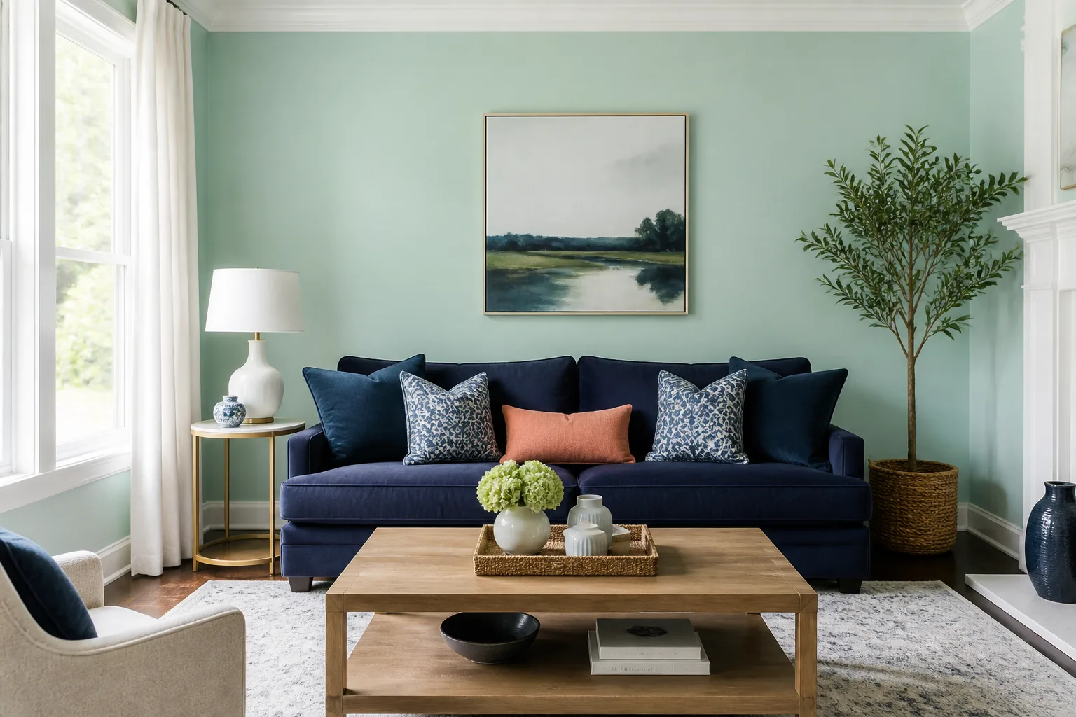
Use blush, dusty rose, or muted coral to warm a pale sage without making the room loud. This pairing is strongest when the pink is softened and repeated in only a few textiles or art details. Bright bubblegum pink can make a gray sage look colder by comparison.
Use navy, charcoal, or soft black when sage needs structure. Dark accents increase value contrast, which is why they can make a pale green feel more modern. The trade-off is visual weight: repeat the dark color in small doses so one navy sofa does not make the rest of the room feel washed out.
Use terracotta, rust, cinnamon, or ochre with warm and olive-leaning sages. These colors echo the earthy side of the palette and work well with wood, leather, and woven materials. If the sage already looks yellow in your room, too much ochre can push it toward khaki; add cream or a cooler textile to restore balance.
Use lavender, dusty blue, or muted denim with blue-gray sage when you want a cooler, quieter scheme. Keep the saturation levels related. A very bright blue beside a dusty sage can make the wall look dull, while a softened blue creates a more cohesive transition.
Use neighboring greens for a tonal room. A pale sage wall with a deeper olive cabinet or forest-green accent can look layered, especially when the whites and woods remain warm. The palette needs value contrast; three nearly identical greens can flatten the room instead of making it feel sophisticated.
How to paint with sage without making a room feel gray
Gray is not a failure in a sage paint—it is often part of the reason the color feels quiet. The problem comes when the room needs warmth or contrast and the chosen sage has too little chroma to stand up to cool light, gray flooring, and blue-white trim.
Start by placing the sample beside the fixed elements, then check the darkest wall. If it looks gray everywhere, choose a slightly warmer or greener companion. If it looks too minty in daylight, compare a grayer or more olive option rather than trying to correct the wall with bright white trim.
Sheen also changes perception. Matte and low-sheen surfaces scatter light softly and tend to make a color feel quieter; higher sheen catches highlights and can make edges look more pronounced. Walls, trim, cabinetry, and bathroom surfaces may need different finishes, so compare a sample in the finish you will actually use.
Do not use one small test patch as proof. A tiny square is dominated by the existing wall around it, while a large board shows the color’s value and undertone more honestly. Look at it under the room’s real bulbs, beside the final hardware, and at the time of day when you use the room most.
The last check is contrast. Fine Gardening’s account of a garden designed around value and texture rather than precise color offers a useful adjacent lesson: a composition can remain legible when light/dark relationships and surface differences are doing real work. Apply that idea indoors. If the sage wall, sofa, rug, and curtains are all the same value, add texture or a darker/lighter element before assuming the paint is wrong. (Fine Gardening)
Conclusion
The right sage green paint is the one that behaves well in your specific room, not the one with the most appealing name or the prettiest online swatch. Narrow the choices by undertone and depth, compare them to the finishes that will stay, and test a large sample through daylight and lamplight before buying the full quantity.
For a safe first round, sample one pale sage, one adaptable mid-tone, and one deeper or warmer option. That three-sample comparison will reveal whether your room wants a silvery green, an herbal neutral, or a moodier olive direction—and it will give you better information than scrolling through dozens of isolated color chips.