4 Design Ideas From Walton Goggins’ Hudson Valley Home
See how Walton Goggins’ Hudson Valley home makes vintage furniture, mixed styles, oversized art, and contrasting materials feel warm—and how to adapt each idea.
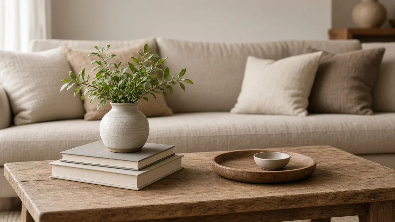
The most useful thing to take from Walton Goggins and Nadia Conners’ Hudson Valley home is not a shopping list. It is the way distinct pieces seem to belong together: vintage furniture beside modern seating, large artwork alongside smaller personal pieces, and polished finishes warmed by rougher materials.
The supplied coverage connects those choices to the couple’s move from Los Angeles to the Hudson Valley and to objects Goggins had kept for years. The Architectural Digest home tour is the source linked for that house description. Think of the four ideas below as design decisions you can adapt—not evidence that a single “celebrity look” or a particular purchase is necessary.
What the Home Actually Shows—and What to Borrow
The four visible ideas are vintage pieces, a mix of design styles, artwork large enough to establish a room’s mood, and material contrast. The home-tour coverage describes a Togo chair and sofa near a vintage desk, contemporary art with smaller pieces collected around the house, and combinations such as dark cabinetry, brass, marble, brick, and wood. Those details make the rooms feel layered rather than ordered around one matching set.
There is a useful limit to what a home tour can tell you. It shows a finished interior, but it does not establish what each piece cost, how it was sourced, how the rooms function day to day, or whether the same choices will suit another home. Borrow the underlying relationships—old beside new, large beside small, smooth beside tactile—and test them against your own room, budget, routines, and architecture.
Make Vintage Furniture Feel Collected, Not Crowded
Vintage furniture brings age, variation, and a sense of continuity that a room full of new coordinated pieces can lack. The payoff comes from choosing something with a reason to be there, not from filling every corner with objects that look old.
Start With One Piece That Earns Its Place
Begin with a piece you would still want if no one called it a trend: a desk with a useful work surface, a dining table that fits the household, a side chair with a shape you love, or a cabinet that solves a storage problem. A meaningful piece can move between homes because it is functional and personal; a decorative purchase made only to complete a theme usually has a shorter life.
Before you buy, measure the piece and the route it has to travel. Check that it can pass through doors and stairs, that drawers open, that legs and joints feel stable, and that any repair is within your skill and budget. For upholstered furniture, look closely at seams, cushions, the underside, and the frame; a low purchase price can disappear quickly if cleaning, reupholstery, or structural work is needed.
Also distinguish desirable wear from damage. A softened finish or small mark may add character, but a strong musty odor, active pests, loose joints, water-swollen veneer, or a repair that affects stability deserves a pass or a professional estimate before you commit. Ask whether the piece is solid wood, veneer, or a combination; each can be attractive, but they respond differently to sanding and refinishing. A good secondhand decision includes transport and repair costs, not just the tag price.
Pair Patina With a Quieter Backdrop
An aged finish is most legible when it has room around it. Put a carved wood table against a simpler sofa, let a distinctive chair stand apart from a plain wall, or place a vintage desk beside clean-lined lighting. If every object has a strong silhouette, ornate carving, or a distressed finish, the room can feel like a shop display instead of a home.
Use color as a bridge. A warm wood tone can repeat in a frame or lamp base; a dark metal detail can connect a chair to a light fixture; a muted upholstery color can calm a more decorative table. You do not need exact matches. Repeat one quality—tone, shape, or finish—so the objects feel related while retaining their differences.
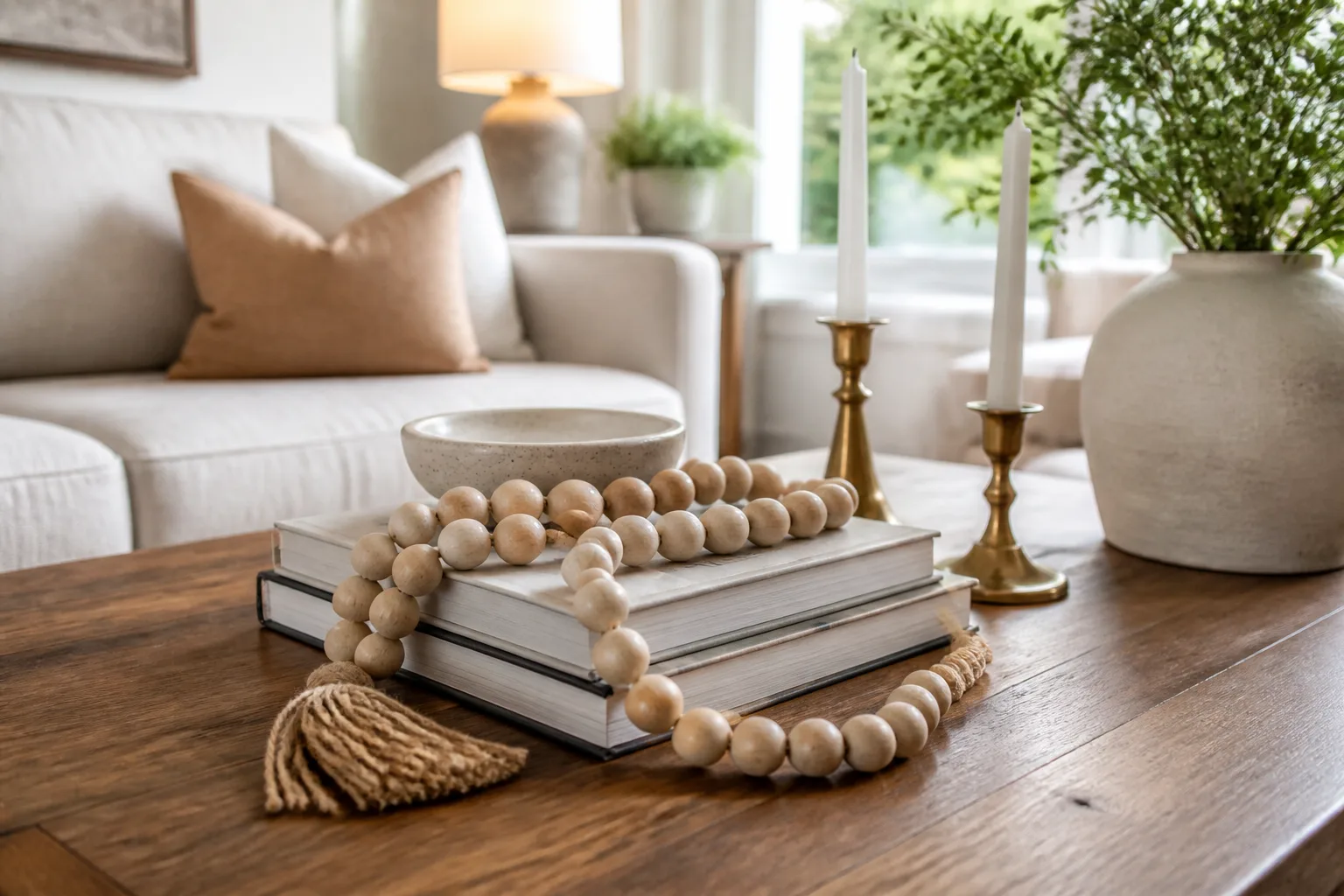
The same restraint applies to small objects. House Beautiful’s designer advice on coffee-table styling favors tactile, personal pieces while leaving room for everyday use. A collected arrangement should still let you set down a cup, open a book, or clear the surface without moving a dozen fragile objects.
Mix Design Styles Without Losing a Point of View
Mixing styles makes a room feel individual, but variety alone does not create cohesion. The room needs a clear lead: perhaps the architecture, a large sofa, a desk, or a strong color palette. Other styles can then act as accents instead of competing for equal attention.
Choose a Lead Style, Then Add Contrast
Look at the room before buying anything. If its strongest feature is an old fireplace, let that establish a traditional note and bring in cleaner upholstery or lighting. If the architecture is spare and modern, a vintage desk or a patterned rug can add history without requiring every object to come from another period.
A practical editing test is to name the room’s dominant quality in a few words—quiet and modern, warm and rustic, or formal with playful accents. Then ask whether each proposed item supports that description, deliberately contrasts with it, or simply adds more noise. Keep the first two kinds and reconsider the third.
Limit the number of competing statements. If the sofa has a dramatic profile, choose a calmer rug; if the rug carries a strong pattern, let nearby upholstery be quieter. You can repeat an architectural curve in a lamp or chair, or pick up one color from a painting in a cushion. These small echoes make unlike pieces feel as though they were chosen in conversation, without making the room look like a catalog set.
Make Old and New Feel Related
Contrast works best when there is a small point of connection. A contemporary chair and an antique desk may differ in period and shape, but they can share a dark finish, similar visual weight, or a nearby color in the rug. A modern lamp can sit on an old side table if the scale feels balanced and the lamp’s material picks up another finish in the room.
Avoid buying a whole room as a “style mix” package. Instead, build it in layers: keep the pieces that already work, add one contrasting object, live with the arrangement, and only then decide whether the room needs another. This pause matters because a photograph compresses a space into one image; your actual room has walkways, doors, everyday clutter, and changing light.
Go Big With Art, Then Let It Breathe
Large artwork can set a room’s tone faster than a collection of small accessories. It gives the eye a clear place to land and can tie together colors that appear elsewhere in the furniture or textiles. In the home-tour coverage, large contemporary works sit alongside smaller pieces that add personal detail rather than trying to compete with the main statement.
Size Art for the Wall and Furniture Below
Choose the wall first, then assess what sits beneath it. A large canvas above a substantial sofa or console can feel anchored; the same piece on a narrow strip of wall between a door and window may crowd the architecture. Conversely, a small print above a long sofa can look stranded even if the artwork itself is beautiful.
Before ordering, tape the proposed outside dimensions on the wall with painter’s tape or cut a paper template. View it from the doorway and from the seats where you spend time. Check the edges against nearby trim, windows, and shelves; leave enough breathing room that the artwork reads as a focal point rather than another object squeezed into a gap.
Remember to judge the frame and mat as part of the artwork’s total visual size. A wide, dark frame can make a modest print feel heavier; a generous pale mat can give a small image more presence while keeping it distinct from a bold wall color. If you are choosing between two sizes, compare the full framed outlines in the room rather than judging the image on a phone screen or in a shop.
Make One Focal Point Do the Work
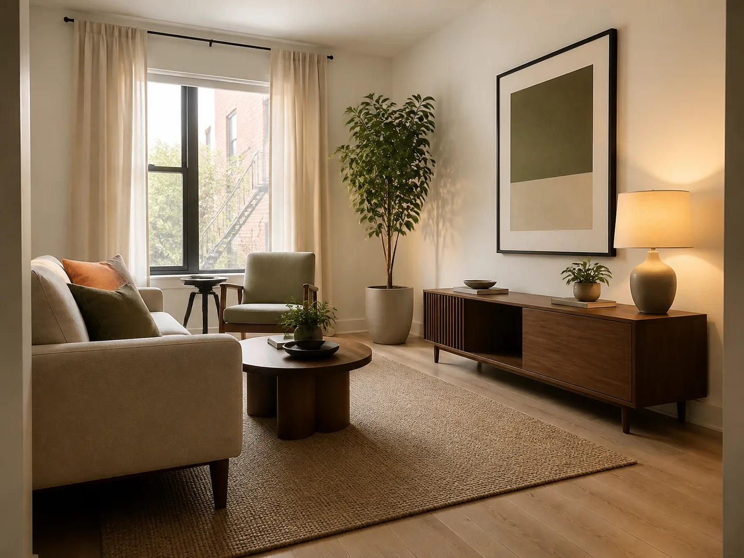
“Go big” does not mean every wall needs a large canvas. Pick the wall that benefits from a visual anchor, then let other walls stay quieter or carry smaller pieces. If you already own several prints, a grouped arrangement can provide comparable presence when the overall composition is planned as one unit, with consistent spacing and a shared color or frame detail.
The image matters, but so do glare, lighting, and how you live in the room. A glossy frame opposite a sunny window may reflect light at the wrong time of day; delicate work near a busy walkway may need a more protective frame. If you rent or want to avoid unnecessary holes, test the paper outline first and check the hanging method against the art’s weight and the wall material.
Mix Materials for Warmth and Depth
Material contrast gives a room dimension even when its palette stays restrained. The home described in the tour brings together dark cabinetry, brass fittings, Carrara marble, rustic wood, brick, and metal. Each surface has a different temperature and texture, so the combination feels richer than a room where every finish is equally smooth or equally new.
Repeat a Finish to Connect Unlike Surfaces
Start with what cannot easily change: flooring, cabinetry, counters, brick, or a large upholstered piece. Then choose one or two movable finishes that echo something already present. Brass hardware can repeat in a lamp or frame; warm wood can recur in a table and picture frame; black can appear in a cabinet, chair leg, or small accessory.
Repetition makes contrast feel intentional. It does not require a room to have only three materials or every metal to match. Instead, make one finish the connector and let the others provide variation. Houzz’s living-room design guide describes how contrasting neutrals and textures such as wood, stone, leather, and metal can create depth; the useful principle is to give each material a partner elsewhere in the room.
An easy way to plan this is to make a quick inventory of what is already fixed, then what can move. If the kitchen already has dark cabinets and pale stone, a wood stool or dining table may be enough warmth; you may not need another metal finish. If a living room has timber floors and a wood table, introduce contrast through upholstery, a ceramic lamp, or a metal frame instead of buying another wood object in a slightly different stain.
Balance Hard, Soft, Matte, and Reflective Textures
If a kitchen has hard stone and metal surfaces, bring in wood, woven texture, or a softer color nearby. In a living room with a large upholstered sofa, a stone or wood table can add definition. A shiny finish catches light, while a matte or weathered surface absorbs it; using both can keep a room from looking flat or overly polished.
Think about upkeep before committing. Marble can stain or etch, brass changes with use depending on its finish, and textured upholstery may need more frequent cleaning than a smooth weave. A material is not a good choice just because it looks beautiful in a photograph. It should fit the people, pets, cooking, sunlight, and maintenance habits of the home.
Translate the Look Room by Room
You do not need to redesign an entire house to use these ideas. Choose one room and one move. The home’s mix of old and new, personal art, and contrasting materials can be translated into a small update that respects the architecture and leaves useful space intact.
In a living room, the simplest starting point is often the seating area: keep the sofa that works, then decide whether it needs one stronger companion—a distinctive side chair, a more substantial table, or a piece of art that anchors the wall. Do not change all three at once. The room should still support conversation, walking, and setting down a drink; visual interest is not useful if the arrangement makes ordinary movement awkward.
Home Office: Soften Modern Seating
A desk often has a strong rectangular shape and a practical role, so it can ground a room’s design. Pair a newer chair with a vintage desk, or use a contemporary desk with a framed keepsake, older lamp, or inherited storage box. Keep the work surface clear enough to function; the personal layer can live on a shelf or wall rather than competing with the task.
If you are adding a large chair or sofa, tape its footprint on the floor and check the route from the doorway to the desk. A striking silhouette is only successful if drawers open, the chair can move, and the room still supports the work you do there.
Kitchen and Dining: Let Patina Bridge Classic and Contemporary
The dining room and kitchen offer natural opportunities to mix sturdy wood with metal, stone, and painted cabinetry. A worn table can soften crisp cabinets; a simple pendant can keep an ornate table from feeling too formal. If a full renovation is out of reach, try a smaller bridge: change a light fixture, add a wood cutting board that is actually used, or bring in a secondhand dining chair with a different shape.
Treat black cabinetry, brass, and marble as a palette to interpret, not a required recipe. In a smaller or darker kitchen, use a lighter wall or wood surface to offset deep cabinets. In a busy household, select finishes for cleaning and wear first. The goal is a balance of surfaces with different character, not a photorealistic copy of someone else’s kitchen.
Mistakes That Make the Look Feel Forced
The first mistake is shopping before editing. If you add a vintage piece, oversized art, new lighting, and contrasting hardware all at once, you will not know which change improved the room. Start with one move and take a photo from the doorway before and after; the camera often makes imbalance easier to notice than standing close to the furniture.
The second is confusing “collected” with “crowded.” Meaningful objects still need negative space, and furniture needs clear paths around it. If a room feels unsettled, remove one small item before buying another. If styles feel disconnected, repeat a color or finish instead of adding more décor.
The third is copying a finish without considering context. A dining table that looks beautiful in a spacious house may overwhelm a small apartment; delicate marble may not suit a heavily used family kitchen; large art can dominate a room with low ceilings or little wall space. Borrow the design logic, then scale it to your rooms, budget, and habits.
If you are unsure where to start, take one photo of the room in daylight and one at night, then list what you want to keep, what feels out of scale, and what the room is missing. Make a single change that addresses the clearest issue. Live with it for a few days, including the room’s busiest time, before adding another layer. That pause helps distinguish a real improvement from the excitement of bringing home something new.
Conclusion
The four ideas in Walton Goggins’ Hudson Valley home work because they create relationships: a vintage piece has a modern counterpoint, a large artwork has quieter neighbors, and hard finishes are softened by wood and texture. You can use the same logic without reproducing the house or buying a matched set of new things.
Start with what you own, choose one change that has a clear job, and check it at the scale of the whole room. When a piece is useful, personal, and connected to its surroundings, it can stay interesting long after a particular trend has passed.