22 Black Christmas Tree Ideas for a Chic, Moody Look
See how to decorate a black Christmas tree with colors and finishes that stand out. Get palette ideas, styling steps, room-fit tips, and light safety advice.
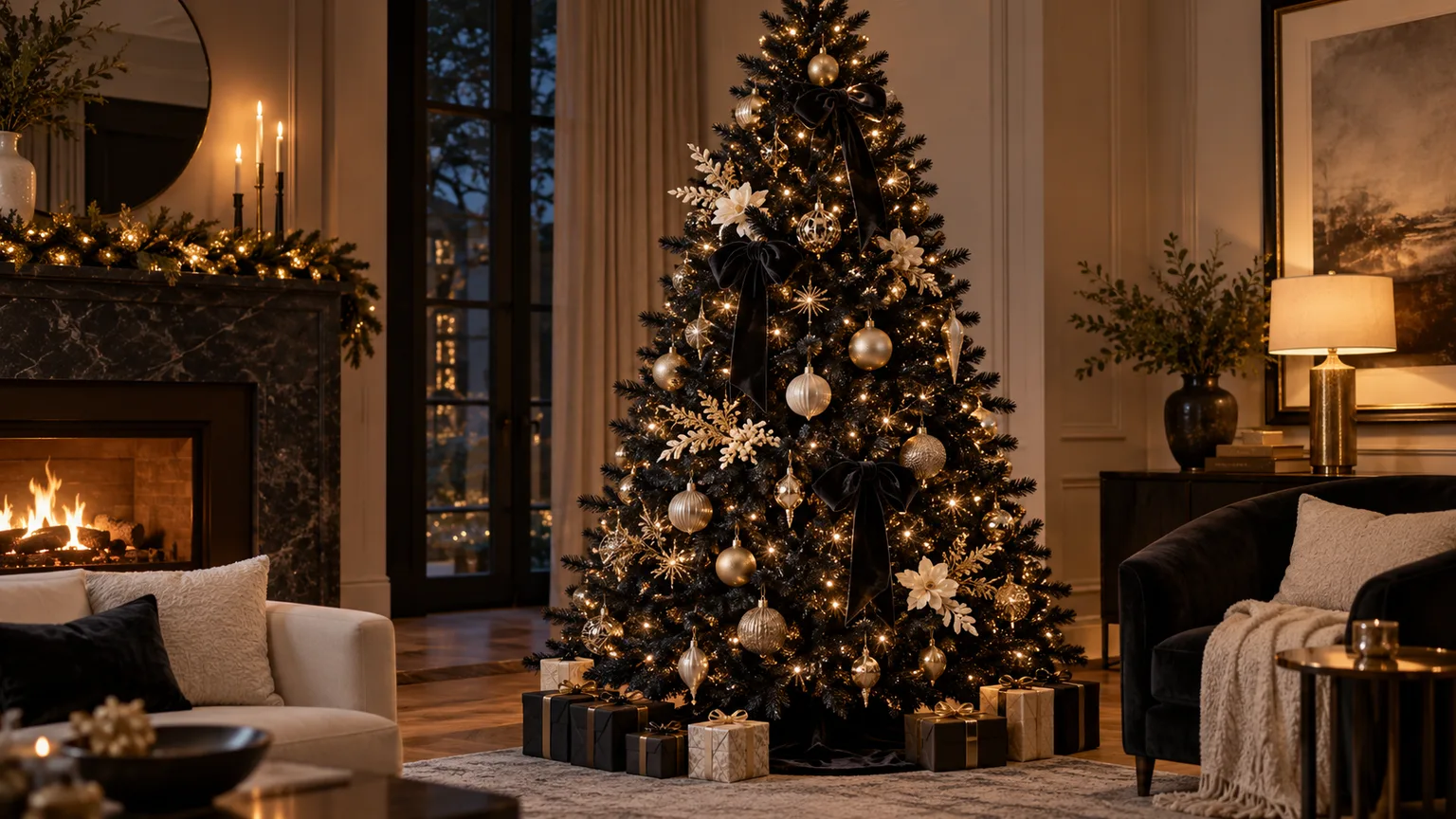
A black Christmas tree can read as graphic and modern, richly vintage, or quietly dramatic. The difference is less about buying a particular ornament set and more about contrast: against dark branches, a matte black bauble nearly disappears, while a clear glass globe, pale ribbon, or metallic finish catches the eye from across the room.
Begin with one question: should the tree feel bright and crisp, warm and glamorous, or saturated and playful? Choose a small palette that answers it, then repeat one or two of its colors in the room. This gives you 22 directions to try without turning the tree into a collection of unrelated decorations.
Choose the palette around your room, not the trend
Look at the room in daylight and after dark before choosing lights or ornaments. A black tree is a strong silhouette, so it can anchor a pale room; in a room with dark walls or furniture, it may blend in unless you add lights, reflective ornaments, or a lighter backdrop. A quick phone photo from the sofa helps reveal where branches merge into the wall and which side needs more brightness.
Limit the main palette to two colors plus a neutral or metallic. For example, black, ivory, and brushed silver feel cooler; black, cream, and antique gold feel warmer; black, teal, and plum look more theatrical. You can still hang sentimental ornaments outside that scheme. Give them a repeated color—perhaps a ribbon loop or a few matching glass balls—so collected pieces feel included instead of random.
Before buying a whole set, make a small sample with one ornament in each finish you are considering. Hold or hang them at three heights—near the top, at eye level, and low on the tree—because a dark ornament can disappear on one branch while a glossy version catches the light on another. Look at the sample from the doorway and the sofa, first in daylight and then with the room lamps on. This quick test reveals whether you need more contrast, a warmer strand of lights, or simply fewer colors.
Think of the tree as a shape with a foreground and background. The branches are the dark backdrop; the ornaments and lights are the foreground. Larger accents establish the pattern, medium pieces carry it around the tree, and a few smaller objects fill gaps. If everything is the same size, the eye has no clear place to land. If every ornament is bright, the black branches stop acting as a frame and the tree can look crowded rather than dramatic.
The room gives you useful boundaries. In a pale, minimalist space, a black tree can provide the strongest contrast on its own, so restrained ornaments may be enough. In a colorful or patterned room, repeat one existing color on the tree and keep the other ornaments quieter. In a dark room, move the tree toward a lighter wall or create a little reflected light with glass and metal instead of using more decorations as a substitute for illumination.
Ideas 1–6: Black, white, and silver
These looks depend on a visible difference in value or shine. Use them when you want the tree to feel clean-lined, architectural, or wintery rather than heavily colorful.
1. Black branches with ivory ornaments. Matte ivory balls, paper stars, or ceramic shapes create the clearest contrast without the sharper feel of pure white. Mix two or three sizes and leave some branches visible between them; the open gaps make each pale ornament read as an intentional focal point.
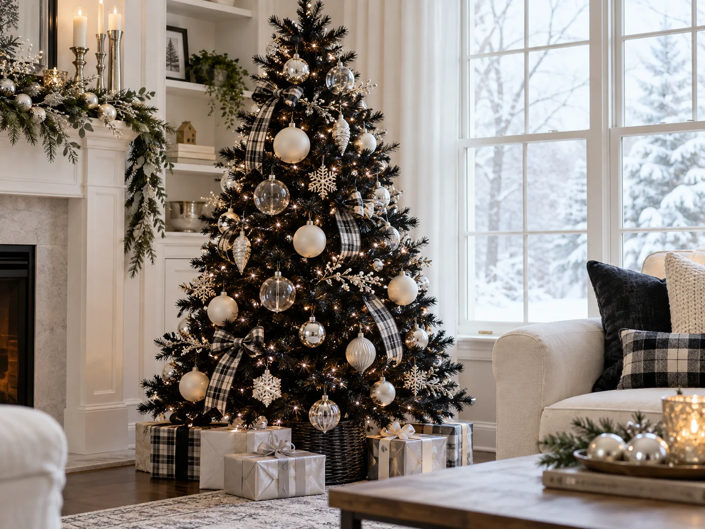
2. Black and silver with warm lights. Mercury-glass finishes, brushed silver, and a few mirrored ornaments give the tree sparkle, while warm-white lights soften the cool metal. Put the most reflective pieces at eye level and near the outer tips, where they catch room light instead of disappearing in the interior.
3. Icy blue and clear glass. Pale blue, transparent glass, and silver make a black tree feel frosted without adding flocking. Choose translucent ornaments and snowflake shapes, then keep the lights neutral or cool; a second warm color can make the icy palette feel muddy.
4. Black-and-white plaid ribbon. Tuck a wide checked ribbon in loose vertical cascades rather than wrapping a tight spiral around the tree. The pattern supplies movement and a farmhouse or tailored note, but it needs breathing room: pair it with simple white balls instead of adding several competing prints.
5. Tone-on-tone black with texture. If you like a nearly monochrome look, combine matte, satin, ribbed, and glossy black ornaments with a few small warm lights. Texture becomes the contrast. This works best on a tree with dense branches and a well-lit room; in a dark corner, add a visible accent such as a brass topper or pale tree skirt.
6. A black-and-white graphic tree. Alternate solid black ornaments with white geometric shapes, stripes, or checks. Use a repeated rhythm—white every few branches, then a black accent—rather than placing all the pale pieces in one cluster. The idea also works on a white tree if you want the palette but not a black silhouette.
Use warm or cool light to control the mood
Warm-white lights pull out bronze, cream, blush, and wood. Cool-white lights make silver, icy blue, and crisp black-and-white ornaments feel sharper. Neither is automatically more sophisticated; the room’s existing bulbs and finishes matter. If the tree sits beside a lamp, test a short string before decorating the whole tree so the light temperatures do not fight.
On black branches, lights can look sparse even when the strand is bright because dark needles absorb some of the visual contrast. Weave a strand slightly inward as well as around the tips, then step back. The lights should reveal depth, not form one bright outline around the outside. Use only strands rated for the tree and location, check cords for damage, follow the manufacturer’s connection limits, and switch lights off before leaving or going to bed. The U.S. Fire Administration’s holiday guidance recommends inspecting seasonal light strands and keeping trees away from heat sources.
Make graphic patterns and finishes readable
Patterns are most effective when they are large enough to register from the room’s normal viewing distance. One oversized plaid bow can do more than a dozen tiny printed ornaments. Repeat its colors in two or three places, then let plain glass or metal fill the spaces around it.
Reflective finishes are useful on a black tree, but a full coating of mirror-bright baubles can feel busy. Mix glossy pieces with satin or matte ones, and vary the shape more than the color. Southern Living’s Christmas tree ideas show how ribbon, ornaments, and different light sizes can contribute separate layers; on a black tree, leave more dark branch visible so those layers stay distinct.
Ideas 7–12: Metallics, vintage color, and ribbon
Metallics make a black tree glow, but each metal changes the temperature of the display. Gold looks cozy, silver reads cool, and bronze or copper gives the arrangement a softer, older finish.
Build depth with gold, bronze, and mixed metals
Use the metal finish as a repeating accent instead of scattering every color evenly. A few matching baubles near the top, middle, and base establish a pattern; then smaller supporting ornaments can fill the gaps. This also makes an older collection easier to use: group similar finishes in loose clusters so each one reads clearly, rather than placing every style in a strict alternating sequence.
7. Antique gold and cream. Pair old-gold ornaments with a few cream or champagne pieces rather than bright yellow-gold everywhere. Use a simple star or bow topper, and echo the gold in a lamp base, frame, or gift ribbon so the tree feels connected to its setting.
8. Amber and bronze. Amber glass, bronze balls, and warm fairy lights give black branches a candlelit effect. Add only a small amount of clear glass so the warm pieces do not flatten into one dark mass. A woven basket or natural-fiber skirt reinforces the relaxed, collected look.
9. Mixed metals with a rule. Silver, gold, and copper can coexist if one finish leads and the others appear as accents. A practical ratio is about two-thirds dominant metal, with the rest split between supporting finishes; treat it as a visual starting point, not a strict formula. Carry the leading metal onto gifts or nearby decor to tie the mix together.
10. Vintage blush and gold. Dusty pink, pale rose, and gold create a nostalgic palette that reads softer against black than hot pink. Add glass baubles, feathered picks, or fabric flowers sparingly, and keep the topper simple. If the tree already has lots of texture, choose one blush finish rather than adding glitter to every ornament.
11. Velvet ribbon as the main decoration. Wide velvet in black, ivory, or deep burgundy brings depth without adding many small objects. Let several short tails drape between branch tiers or attach generous bows at uneven intervals. Country Living’s tree-trimming examples include vintage and reused ribbons; that approach is especially useful when you want personality without buying a complete matching set.
12. A dramatic black-and-white ribbon tree. Use a monochrome ribbon with one oversized bow at the top and a handful of smaller bows lower down. The repeated motif gives a skinny tree vertical movement and a full tree a tailored finish. Keep ornaments quieter—clear glass, white matte balls, or a few black shapes—so the ribbon remains the feature.
Use pink and ribbon as deliberate accents
Pink is most convincing when its role is clear: blush ornaments can soften the tree, while a single hot-pink topper acts as a focal point. Ribbon can carry either approach through the branches. Choose wired ribbon if you want sculpted loops to hold their shape, or soft velvet if you prefer short, draped tails. Keep the rest of the ornaments simpler than the ribbon; when bows, garlands, glitter, and large flowers all compete, the dark tree becomes a crowded display rather than a clean backdrop.
Ideas 13–17: Jewel tones and familiar Christmas color
Black is a strong backdrop for saturated colors, but the eye needs a clear order. Select one leading jewel tone, one supporting color, and a small metallic accent; then repeat the lead color enough times for the arrangement to look deliberate.
Pair black with peacock blue, emerald, or plum
These deep colors need either shine or a neighboring lighter accent to stay visible. Glass, satin, or a narrow metallic edge catches light; matte velvet can disappear if the room is dim. If you already own dark jewel ornaments, arrange a few at the branch tips and mix in clear or warm-metal pieces rather than replacing the set.
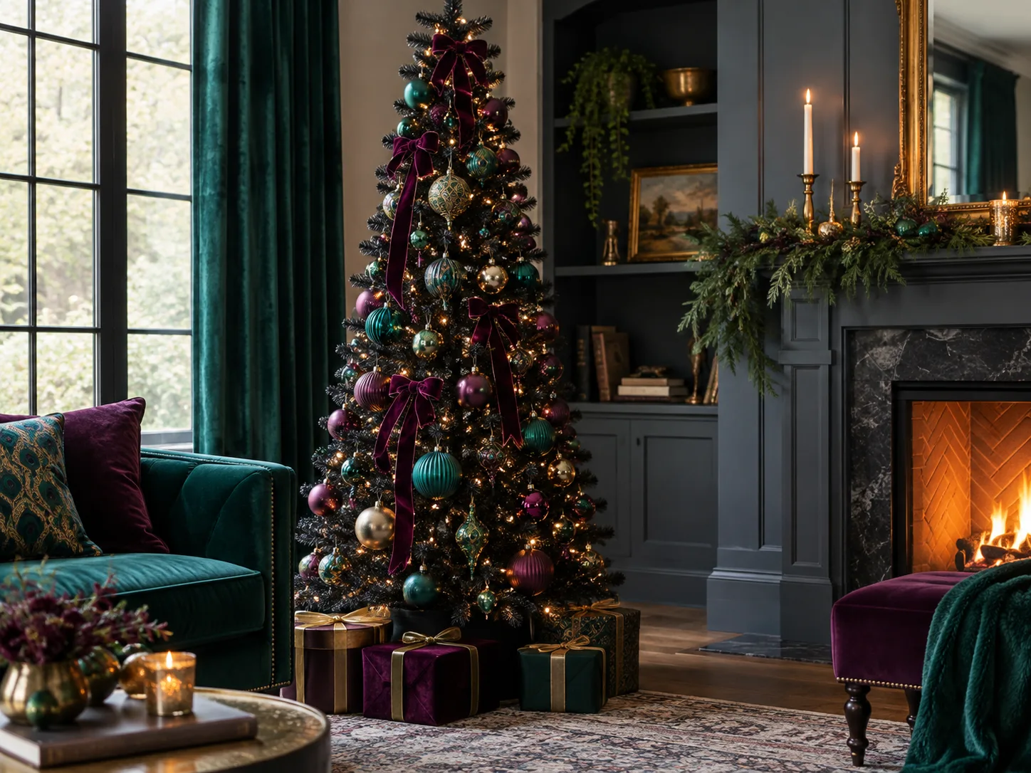
13. Peacock blue, emerald, and plum. A peacock palette combines deep blue, green, and purple for a layered, jewel-box effect. Use one color in larger balls and the others in smaller ornaments or ribbon. Against the black branches, glass and satin finishes help those dark hues remain visible.
14. Emerald and brass. Green ornaments can disappear against some black trees, so choose glossy emerald, chartreuse, or translucent green rather than flat forest-green alone. Brass or warm gold provides the contrast. This palette is a good bridge between a traditional evergreen feeling and a more modern tree color.
15. Plum and violet. Purple ornaments, from lavender to aubergine, make a moody bedroom or media room tree feel intentional. Keep the range within one color family and add either silver for a cooler look or gold for a warmer one. A few clear ornaments break up the darkest shades.
16. Red and green, with black as the frame. Classic red and green need not be abandoned. Bright red glass, berry picks, or tartan ribbon stand out against black; deeper green can sit closer to the branches. Let the red appear in several places around the tree, then repeat it in gift wrap so it reads as a palette instead of a single bold patch.
17. Fuchsia and white for a fashion-inspired accent. Hot pink, crisp white, and black create an energetic, graphic combination. Use fuchsia in a topper, ribbon, or a few larger baubles and keep the rest simple. The high contrast is playful, but too many saturated ornaments can compete with one another; edit back before adding more.
Keep red, green, and fuchsia from competing
Red can be the lead with green as a familiar supporting color, or fuchsia can be the only bright accent. Avoid asking several saturated colors to be equally prominent. Lay the ornaments out before hanging them and remove one color if the palette feels scattered; the black branches already supply a strong visual note, so a limited color story often looks fuller than a larger assortment.
Ideas 18–20: Natural forms and layered texture
Black can make handmade materials look more polished by giving their irregular shapes a clear outline. It also makes pale natural materials stand out, so use them where you want a softer, less formal tree.
18. Dried botanicals and seed heads. Dried palm spears, strawflowers, or seed pods add an asymmetrical, bohemian note. Secure them well and place larger pieces in a few deliberate sweeps, not in every gap. Dry plant material is combustible, so keep it away from hot lights and candles; battery-operated candles are a safer choice near any tree decorations.
19. Wood, paper, and woven accents. Wood beads, folded paper stars, and small woven ornaments warm up a black tree without relying on shine. Repeat one natural material in the tree skirt or gifts, then use a few glass or metallic pieces to keep the display from feeling flat. This look suits Scandinavian, rustic-modern, and neutral rooms.
20. Black ornaments with a natural garland. A dried-flower or foliage garland can soften a dark tree, especially when draped asymmetrically. Use a lightweight garland and anchor it at several branch points so it does not sag into one heavy diagonal. Keep the ornaments mostly black, wood, or warm metal to avoid introducing too many colors.
Balance handmade and reflective ornaments
A mix of materials looks collected when the scale changes as well as the finish. Put the largest visual shapes—bows, stars, or statement ornaments—on the outside of the branches. Use smaller beads and simple balls inside to fill gaps without crowding the visible outline. If your natural ornaments are pale, they already supply contrast; they do not need glitter added on top.
Ideas 21–22: Slim, tabletop, and alternative silhouettes
The tree’s shape changes how a palette reads. A narrow silhouette has less branch area for ornaments, so a few oversized accents look better than many tiny ones; a tabletop tree benefits from details visible at close range.
21. A skinny black tree for a tight corner. A pencil tree fits beside a window, sofa, or console where a full-width tree would obstruct movement. Emphasize the vertical line with a long ribbon, slim topper, and repeated ornament shape. Measure the floor footprint and the height to the ceiling before buying; leave room for the stand and topper, not just the listed tree height.
22. A mini forest or flat-panel tree. Several tabletop black trees can create a layered console display, while a wall-mounted branch arrangement or painted plywood silhouette takes almost no floor space. Use fewer ornaments at a smaller scale and keep the display stable, especially on shelves where a bump can send pieces down. A flat panel is an alternative shape, not a substitute for a fully decorated tree, so choose it when saving space matters most.
Fit the tree to the room and viewing distance
Before you buy, measure the ceiling height, width available at the base, doorway or stair turn, and distance from the tree to the main seat. A tall, narrow tree often looks more balanced in a small room than a short, dense one, but sparse branches need more deliberate ornament placement. If the black silhouette merges with a dark wall, move it toward a lighter background or add a pale tree collar, skirt, or nearby lamp rather than trying to cover every branch with ornaments.
Finish with a safe, balanced decorating sequence
Work from the largest choices to the smallest. Fluff the branches, test the lights, add ribbon or garland, place large ornaments at uneven intervals, fill with smaller pieces, then finish with the topper and base. Step back after each layer; the aim is a readable silhouette with a few open spaces, not maximum ornament count.
Do not try to fill the tree from front to back in one pass. First place a few of the largest ornaments where their color will show from the main viewing angle. Turn the tree or walk around it if the display will be seen from several sides, and put less-important pieces deeper inside to create depth. Finish with the smallest ornaments only where a gap needs a little weight. This keeps the outer contour visible and makes later edits easy: remove one cluster without having to rebuild the entire tree.
For a real tree, safety has to shape the display as much as color does. The U.S. Fire Administration advises keeping a tree at least three feet from fireplaces, radiators, space heaters, candles, and heat vents; it also recommends checking seasonal light strands and turning tree lights off before leaving home or going to bed (light safety tips). Avoid putting dried botanical picks near hot bulbs, and do not hide damaged cords under a tree skirt.
Check the whole room before adding one more accent
Look at the tree from the doorway and from the place where you will usually sit. If the dark outline is strong but its decorations disappear, add light or a reflective finish before adding more ornaments. If the tree feels busy, remove one pattern or one color; a black tree already supplies a major graphic element, so restraint can be the detail that makes the room feel finished.
Conclusion
The best black Christmas tree is the one whose palette works with your room and whose ornaments remain visible at the distance you actually view it. Choose warm gold and cream for a softer glow, silver and ivory for crisp contrast, or a controlled jewel palette for a richer statement. Then build the display in layers, let some black branches show, and use the tree’s scale to guide how much decoration it can carry.