25 Colors That Go With Mint Green in Any Room
Discover 25 colors that go with mint green, plus color-theory rules, room-by-room pairing advice, and undertone tests so your palette feels fresh, not dated.
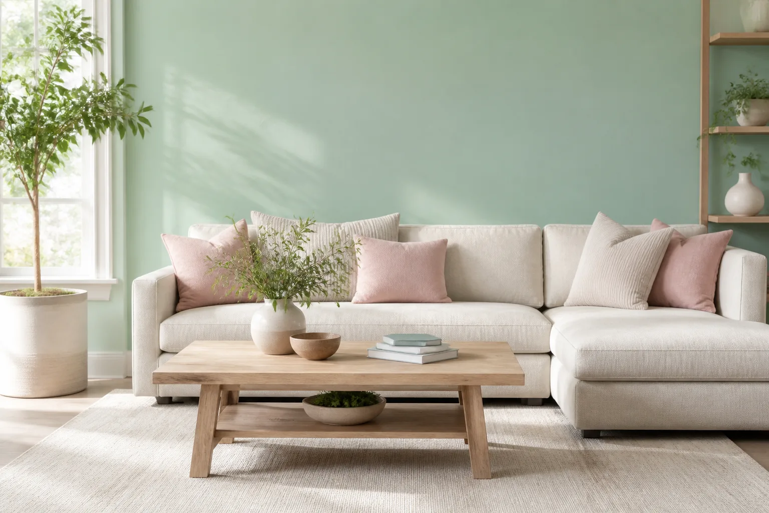
Mint green sits in that awkward middle ground between neutral enough to live with daily and bold enough to define a room. Get the pairing right and the space feels airy, optimistic, and quietly sophisticated. Get it wrong and mint reads like a dated bathroom tile or a candy-colored kids room you did not intend. The difference is almost never the mint itself — it is the accent color, the proportion, and whether you matched undertones before you bought the paint.
This guide covers 25 colors that go with mint green, organized by how they work on walls, furniture, and hardware — not as a random mood-board dump. You will also get the undertone test, the proportion rule designers use, and room-specific shortcuts so you can stop second-guessing swatches.
What Makes Mint Green Tricky (and Worth the Effort)
Mint green is a light, cool-toned green with more white in the mix than Kelly green or emerald. That lightness is its superpower: it bounces light, makes small rooms feel larger, and carries a retro charm rooted in Art Deco pastels and 1950s kitchen trends without locking you into one era. Benjamin Moore’s Helen Shaw notes that pastels like mint add warmth and color without the visual weight of a saturated statement shade (Livingetc).
The trap is assuming every mint swatch behaves the same. Two paints both labeled “mint green” can lean blue (icy, spa-like) or lean yellow (sage-adjacent, warmer). Pair a blue-mint wall with a yellow-beige sofa and the room goes muddy. Pair the same wall with cool gray or sky blue and it suddenly looks intentional.
Cool blue-mint versus warm yellow-mint undertones
Hold your mint swatch next to a pure white card and a medium gray card. If the mint looks crisp and slightly icy beside white, it likely has blue undertones — pair it with cool grays, navy, sky blue, and silver metals. If it looks slightly creamy or olive beside white, it carries yellow or green-yellow undertones — lean toward warm wood, tan, mustard, and cream rather than icy blue accents.
Paint a large test patch on the actual wall and view it at morning, afternoon, and under your evening bulbs. Mint shifts more than charcoal or white because its lightness amplifies ambient light color. A mint that looked perfect at the store can turn gray-green under warm LED bulbs — and that is not a pairing problem, it is a lighting problem you fix before choosing accents.
Three Color-Theory Rules That Fix Most Pairing Mistakes
Color theory is not decoration trivia — it is a shortcut for predicting whether two hues will fight or harmonize. Color Matters explains that color harmony creates visual order: extreme sameness bores the eye, extreme contrast overwhelms it, and balanced pairings land in the middle where rooms feel settled.
Analogous greens, complementary reds, and neutral anchors
Analogous pairings use hues beside mint on the color wheel — sage green, forest green, and yellow-green. They feel coordinated because they share DNA. Use analogous schemes when you want a green-forward room that feels layered rather than flat. Vary value (light mint walls, dark forest green sofa) so the palette does not turn monotonous.
Complementary pairings sit opposite mint on the wheel — red-purple, raspberry, and coral-red territory. Complementary combinations create maximum contrast and energy (Color Matters). They work when you want mint as a calm base and one bold accent — a red chair, a coral throw, a raspberry lamp shade — not when you paint half the room red.
Neutral anchors — white, cream, gray, beige, black, and wood — do not compete with mint’s hue. They let mint be the color story while providing the visual rest your eye needs. Most successful mint rooms use neutrals as the majority surface area and mint as the accent or one wall plane.
How Much Mint Green Should a Room Actually Use?
Designers often follow the 60-30-10 rule: roughly 60% dominant color (usually a neutral), 30% secondary color, and 10% accent. For mint, that typically means white or cream walls (60%), gray or wood furniture (30%), and mint on a single wall, cabinetry, or a statement sofa (10%). Flip it — mint on all four walls with no neutral break — and the room can feel like a mint box even if every individual pairing is technically correct.
Mint also works as a repeat accent across three small touches: mint throw pillows, a mint vase, and mint lamp shades in a mostly neutral room. The color reads as a deliberate theme rather than a single random object. If you are starting from mint tile or mint cabinetry you cannot change, treat that fixed element as your 10% and build the 60% neutral layer around it with paint, rugs, and large furniture.
Greens That Layer Beautifully With Mint
Green-on-green is the easiest mint pairing because it avoids undertone clashes — as long as you vary depth and temperature.
Forest green, sage, and monochromatic mint schemes
Forest green adds earthy depth beside mint’s lightness. Picture mint kitchen cabinets with a forest green banquette or mint walls with a deep green velvet sofa. The contrast is value-based (light vs dark) rather than hue-based, so the room feels coordinated without looking matchy. Forest green works especially well when you want mint to feel grown-up rather than playful.
Sage green warms the palette slightly. Sage carries more gray and yellow than mint, which makes it an excellent bridge between cool mint walls and warm wood floors. A sage throw on a mint accent wall, or sage upholstery against mint cabinetry, grounds the space without killing the freshness. Interior studio 2LG Studio pairs mint with pale white-washed oak because both read as cool tones (Livingetc).
Monochromatic mint uses multiple mint values — pale mint walls, slightly deeper mint tiles, and a mint-green accessory in a third shade. The key is contrast in lightness: if every mint surface is the same value, the room loses dimension. Add texture (matte paint vs glossy tile vs woven fabric) so the monochromatic scheme has depth even when the hue stays constant.
Neutrals That Keep Mint Fresh Instead of Dated
Neutrals are not boring when mint is involved — they are the frame that makes mint look current.
White, cream, beige, gray, and black foundations
White and mint is the cleanest pairing in the book. White amplifies mint’s brightness and works in kitchens, bathrooms, and any room where you want a hygienic, fresh feeling (House Beautiful). Use true white (Benjamin Moore Ultra White CC-10 or Behr Ultra Pure White) when your mint is blue-leaning; use warm white when your mint skews yellow.
Cream softens mint where pure white would feel stark. Cream walls with mint cabinetry or a mint sofa create a subdued, neutral-forward room where mint whispers rather than shouts. Rejo Design Studio balances mint velvet seating against rough white walls and wood tables — the harmony comes from material texture, not just hue (Livingetc).
Beige and mint build spa-like calm. Beige, cream, and white together with mint accents produce the soothing palette people want in bedrooms and primary bathrooms. Keep beige light (oatmeal, sand) rather than deep camel so mint stays the coolest note in the room.
Gray lets mint pop without high drama. Light gray with a soft green undertone (Benjamin Moore Distant Gray OC-68) echoes mint on the walls and makes mint accents feel integrated rather than pasted on. The New Design Project used gray daybeds and gray walls with green undertones to frame mint artwork — gray becomes the bridge color (Livingetc).
Black with mint channels retro modernism: think mint subway tile with black grout, mint walls with black window frames, or a mint sofa against a black accent wall. The high contrast is graphic and intentional. Keep black to trim, frames, and one furniture piece — black flooring plus mint walls plus black furniture can feel heavy unless the room has abundant natural light.
Warm Metals and Wood Tones That Balance Cool Mint
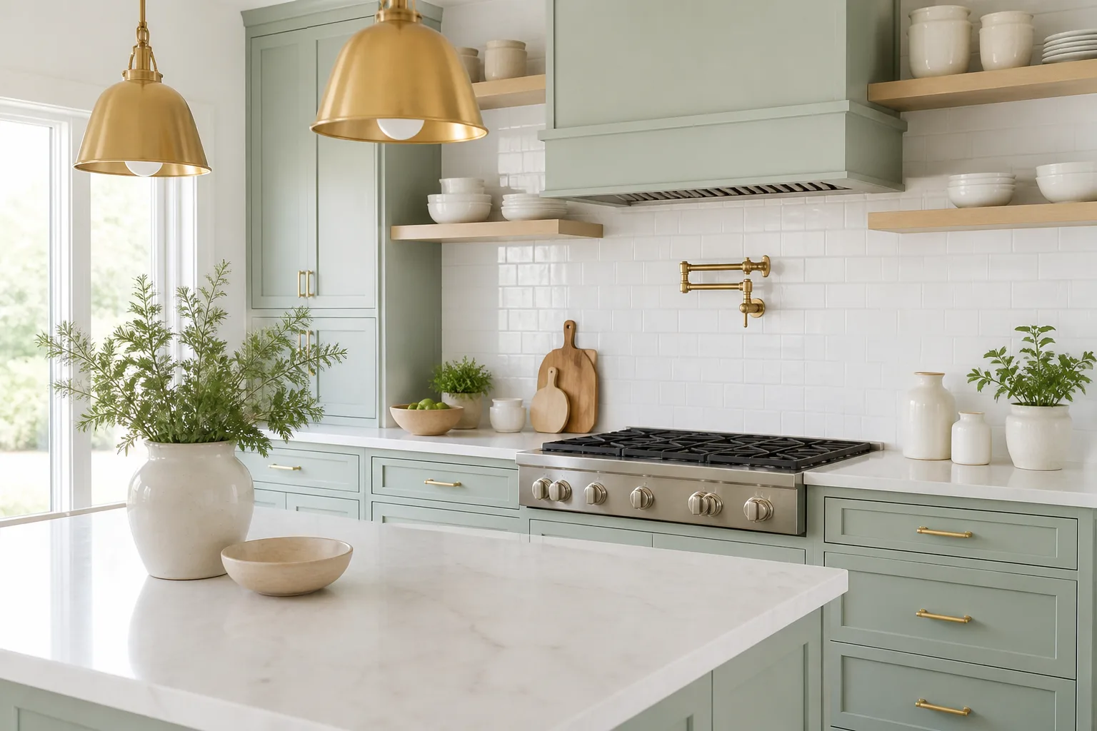
Mint’s default temperature is cool. Warm metals and wood prevent the room from feeling clinical.
Gold, copper, teak, blonde wood, tan, and natural wood
Gold hardware and fixtures elevate mint toward timeless elegance. Brushed gold faucets on mint cabinetry, gold pendant lights over a mint island, or gold legs on a mint accent chair add warmth without introducing a competing color. Gold works because it is a material finish, not a wall color — you get warmth in small, precise doses.
Copper and its orange-toned warmth pop against blue-leaning mint in a bolder, more contemporary way than gold. Copper pendant lights, copper cabinet pulls, or a copper planter beside mint walls create a sophisticated contrast that reads artisanal rather than rustic. Pair copper with mint in kitchens and dining spaces where metal finishes are expected.
Teak and blonde wood bring natural warmth that cool mint needs. Teak’s medium-brown tone with orange undertones works on floors, dining tables, and shelving. Blonde wood (white oak, ash, maple) keeps the room light and Scandinavian-calm — House of Chais-style kitchens combine mint cabinetry with blonde wood and white for an earthy boho feel. Natural wood tones broadly — including rattan baskets and untreated oak — connect mint to the outdoors and work in farmhouse, coastal, and Japandi rooms.
Tan and subdued browns match mint’s muted pastel energy. Tan upholstery, tan leather stools, or tan linen curtains beside mint walls create an earthy laundry-room or mudroom palette that feels grounded. Avoid pairing mint with dark chocolate brown on large surfaces — the brown can swallow mint’s lightness unless you keep the brown on floors or one furniture piece.
Blush, Mauve, and Pink Finishes With Mint
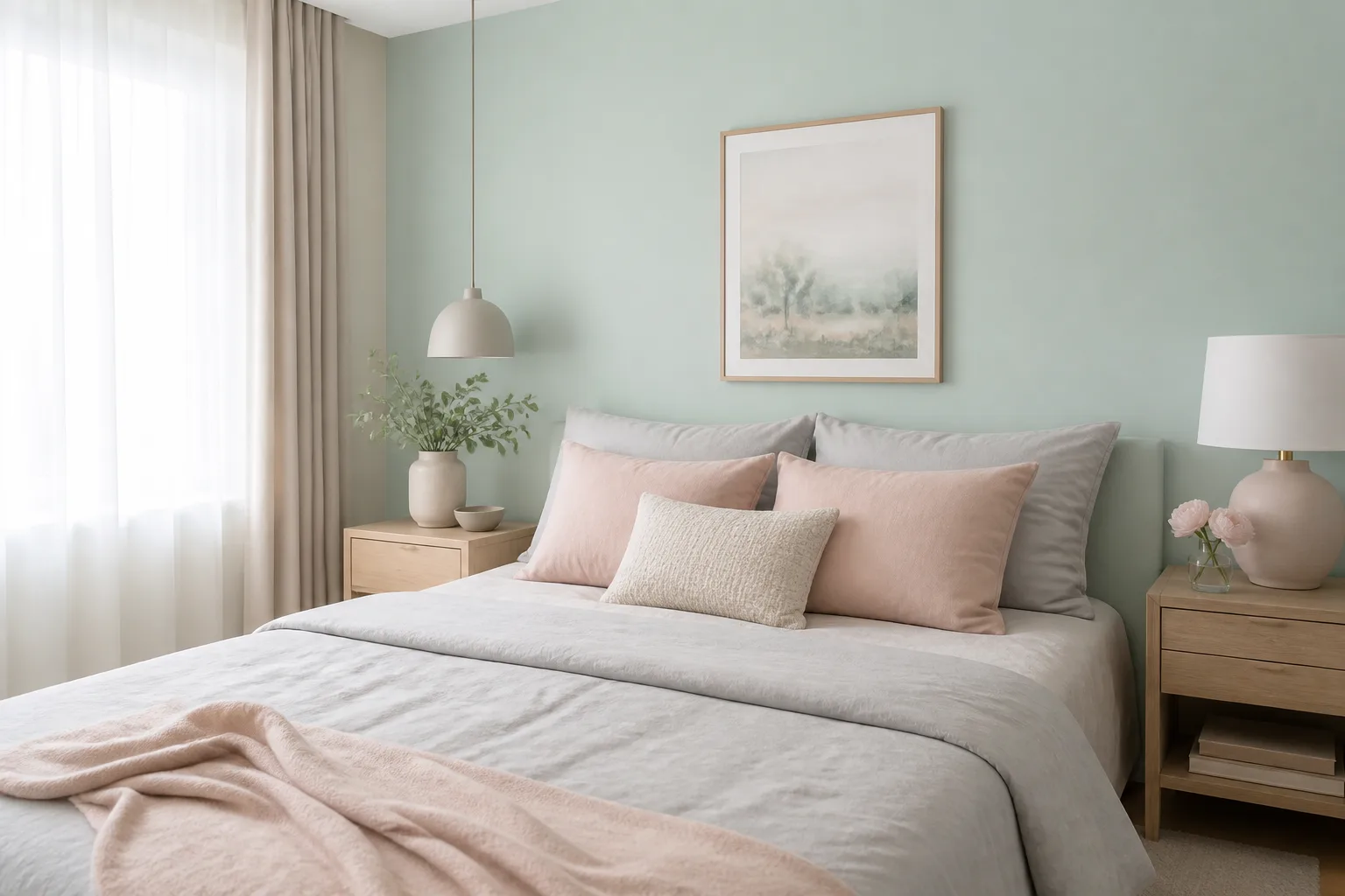
Pink and green is a classic garden pairing — rose stems, peony leaves — and it works indoors when you control saturation.
Blush, mauve, fuchsia, coral, rose gold, and peach
Blush pink beside mint feels playful and current without screaming nursery. Use blush on upholstery, bedding, or artwork against mint walls. The contrast is soft because both colors are light-value pastels. Blush works in bedrooms, powder rooms, and living rooms where you want color without intensity.
Mauve offers a more subdued pink-green contrast — nearly neutral mauve pillows on a mint sofa, or mauve curtains against mint walls. Mauve reads sophisticated and slightly vintage, which pairs naturally with mint’s retro associations.
Fuchsia and mint is high-energy: both are saturated pastels with strong personalities. Restrict fuchsia to one accent — a chair, a lamp, a single art piece — and keep everything else neutral. In a mostly white room with mint walls, fuchsia delivers drama without chaos.
Coral bridges pink and orange, making it one of the most versatile warm accents for mint. Coral and mint are both subdued yet energizing (Roomdsign). Coral throw pillows, coral ceramics, or coral artwork on mint walls feel bold but balanced because neither color shouts.
Rose gold finishes — lamp bases, mirror frames, hardware — add pink warmth through metal rather than upholstery. Rose gold beside mint cabinetry or a mint coffee table ties the pink-green story together in a single metallic note.
Peach and mint are both cheerful pastels on opposite sides of the color wheel, so they complement each other when peach stays in accent role. Peach throw pillows, peach artwork, or a peach upholstered chair against mint walls add gentle warmth. Both colors are light — if you use peach on large surfaces alongside mint walls, add white or cream breaks so the room does not turn saccharine.
Yellow Pairings From Soft Pastel to Mustard
Green and yellow are analogous on the color wheel, which makes yellow one of the safest bold pairings for mint.
Pastel yellow with mint creates a bright, cheerful room — ideal for kitchens, breakfast nooks, and kids spaces. Pastel yellow walls with mint cabinetry, or mint walls with pale yellow curtains, feel sunny without the intensity of primary yellow. Keep both colors in similar lightness so neither overpowers.
Mustard yellow is the eclectic option. Mustard’s depth and brown undertones ground mint’s coolness. Use mustard on one accent chair, a mustard rug, or mustard ceramics in a mint-forward room. This pairing works in mid-century modern, bohemian, and eclectic interiors where you want contrast with personality. Avoid mustard walls plus mint walls in equal proportion — pick one as dominant and the other as accent.
Red and Navy for High-Impact Contrast
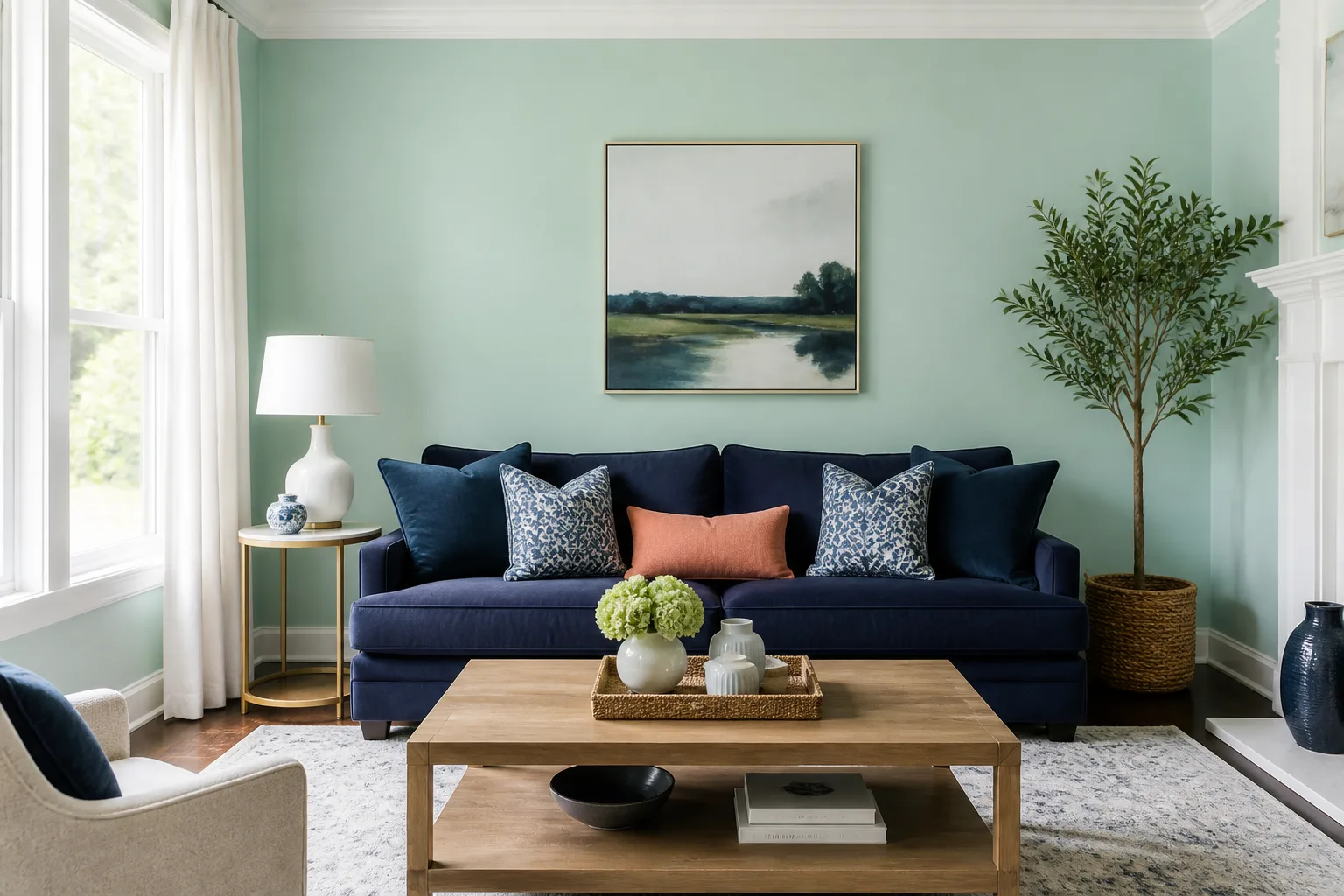
These are the pairings that surprise people — and the ones that fail most often when proportion is ignored.
Red is mint’s complementary color on the color wheel. Raspberry red and red-purple sit opposite yellow-green, creating maximum contrast (Color Matters). The pairing does not have to look like Christmas: keep red on a single accent chair, a vase, or dining chair upholstery against mint and pale blue walls. Owl Design layers soft mint walls with red velvet accents and red ceramics — the mint and pale blue backdrop keeps red from dominating (Livingetc).
Navy blue grounds mint through shared cool undertones while contrasting in value. Navy sofa, navy bar stools, or navy cabinetry against mint walls feels classic and collected. DeVOL kitchens pair mint walls with navy elements — the mint backdrop makes decorative details and artwork stand out while navy provides visual weight (Livingetc). Navy works in living rooms, bedrooms, and kitchens where you want mint to feel refined rather than playful.
Cool Blues and Purple Accents
Blue and green are natural partners — both read cool, both connect to sky and water.
Sky blue, navy, and purple
Sky blue and mint produce a soft, playful palette perfect for kids rooms, playrooms, powder rooms, and coastal spaces. Both are light-value pastels with cool undertones, so they feel harmonious rather than contrasting. Add white trim to keep the combination crisp.
Purple with mint is bolder than blue but shares the cool-family relationship. Deep purple — on a ceiling, a headboard, or lamp shades — against mint walls creates drama. YesColours pairs lavender and mint in bedroom schemes, echoing the natural lavender plant where green stems meet purple flowers (Livingetc). Use purple in one plane (ceiling, one wall, or furniture) rather than distributing both mint and purple equally across every surface.
Room-by-Room Pairing Cheat Sheet
Kitchen: Mint cabinetry or backsplash pairs with white walls, blonde wood floors, gold or brass hardware, and navy or forest green accents. Keep countertops neutral (white quartz, light gray stone). Mint and copper hardware is a strong contemporary choice.
Bedroom: Mint walls or headboard upholstery with gray bedding, blush pillows, and blonde wood nightstands. For a calmer room, use mint only on the wall behind the bed and keep other walls cream or light gray.
Bathroom: Mint tile with white fixtures, chrome or brushed nickel hardware, and black metal accents for graphic contrast. Sky blue accessories add playfulness in kids bathrooms.
Living room: Mint sofa or accent wall with neutral gray furniture, natural wood coffee table, and one bold accent (coral pillows, navy rug, or red chair). Follow 60-30-10 so mint does not dominate seating sightlines.
Kids room / playroom: Mint walls with pastel yellow, sky blue, and white — analogous pastels that feel energetic without chaos. Add one wood element to warm the palette.
Powder room: Mint walls with gold fixtures, blush art, and white wainscoting. Small rooms tolerate more mint because the color area is limited.
Laundry / mudroom: Mint cabinetry with tan baskets, natural wood shelving, and white walls — earthy, functional, not fussy.
If you are pairing mint with houseplants, mint walls complement real green foliage beautifully — the wall color and leaf tones are analogous, so plants look intentional rather than random. For plant-forward rooms, see our guides on living room plants and bedroom plants for species that match your light conditions.
Conclusion
The 25 colors that go with mint green — from forest green and sage through gold, copper, tan, white, black, gray, beige, cream, teak, blonde wood, mustard, pastel yellow, blush, mauve, fuchsia, red, coral, natural wood, sky blue, navy, purple, rose gold, and peach — all work when you match undertones, control proportion, and assign each color a role. Test your mint swatch against white and gray before buying accents. Use neutrals for 60% of the room, a secondary color for 30%, and mint or your boldest accent for the remaining 10%.
Mint is not a color you slap on and hope for the best. It is a cool, light, optimistic hue with decades of design history behind it. Pair it with intention — cool mint with cool blues and grays, warm accents through wood and metal, energy through coral or red in measured doses — and it feels fresh in 2026, not frozen in 1956. Grab sample pots, paint a poster-size patch, live with it for two days, then build your palette from what you actually see on your walls, not from what looked perfect on a phone screen.