Colors That Go With Olive Green: 13 Combinations
Discover 13 colors that go with olive green, plus undertone tests, the 60-30-10 rule, and room shortcuts so your palette feels earthy, not muddy.
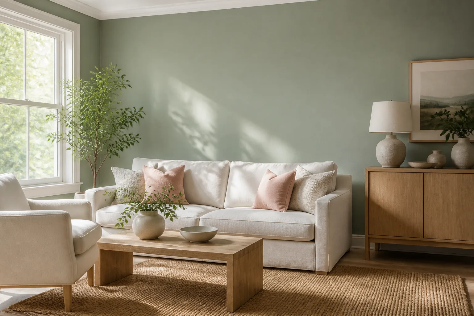
Olive green sits in a sweet spot between neutral and statement — muted enough to cover walls, sofas, or kitchen cabinets without screaming “trend color,” yet distinctive enough that the wrong accent turns the room khaki, cave-like, or accidentally military. The fix is rarely swapping olive for another green. It is matching undertones, controlling how much olive you use, and choosing accent colors that share olive’s warmth or balance it with calm neutrals.
This guide covers 13 colors that go with olive green — white, cream, black, brown, gold, mustard yellow, orange, rust, red, dusty pink, other greens, beige, and gray — with practical rules for each pairing, not just a mood-board caption. You will also get undertone tests, the proportion framework designers use, room shortcuts, paint swatches worth sampling, and a plant-room bridge if you style olive around real foliage. For a lighter, cooler green palette, compare our colors that go with sage green guide; for mint’s pastel energy, see colors that go with mint green.
What Makes Olive Green Different From Other Greens
Olive green is a muted, yellow-brown green — closer to dried leaves and clay soil than to emerald lawns or mint ice cream. Where sage reads gray and spa-calm, and mint reads light and retro-sweet, olive reads earthy, grounded, and slightly vintage without locking you into one decade. It works as a wall color, upholstery tone, cabinet finish, and even exterior trim because its low chroma behaves almost like a warm neutral.
That earthiness is also the risk. Olive absorbs light differently than white or gray, so it can make north-facing rooms feel dim if you pair it with too many dark accents. It can look sophisticated with brass and cream or dated with orange-brown carpet from the 1970s — same green, different neighbors. Two paints both labeled “olive” can lean golden khaki or gray-green drab, and those undertones dictate every pairing below.
Warm yellow-brown versus cool gray undertones
Hold your olive swatch beside a pure white card and a medium gray card. If olive looks golden or tan beside white, it carries warm yellow-brown undertones — pair it with cream, mustard, rust, terracotta, warm wood, and brass. If olive looks subdued and slightly silvery beside white, it leans cool gray-green — pair it with soft white, cool gray, black metal, and dusty pink rather than bright orange.
Paint a large test patch on the actual wall and view it at morning, afternoon, and under your evening LEDs before buying accent furniture. Olive shifts more under bulb temperature than charcoal does because its muted warmth amplifies ambient color. If you already own an olive sofa you cannot replace, treat that piece as your undertone anchor and build every other color around it.
Three Color-Theory Rules for Olive Green Pairings
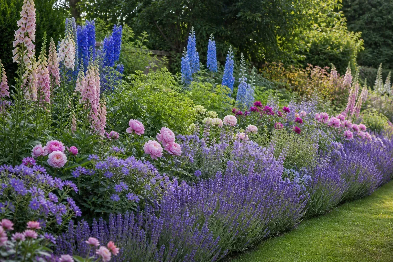
Color theory is a shortcut for predicting harmony before you commit to a sofa or a gallon of paint. Color Matters explains that color harmony creates visual order: extreme sameness bores the eye, extreme contrast overwhelms it, and balanced pairings land where rooms feel settled rather than chaotic.
Analogous greens, complementary warmth, and neutral anchors
Analogous pairings use hues beside olive on the color wheel — moss, forest green, sage, and khaki. They feel coordinated because they share DNA. Layer light olive walls with medium moss upholstery and dark forest green pillows, varying value so the room does not turn monotonous. Analogous schemes suit plant-heavy rooms and spaces where you want green to remain the story.
Complementary pairings sit opposite green on the wheel — red and red-purple territory. Rust, burgundy, dusty pink, and burnt orange create energy against olive’s calm base. They work when olive covers large surfaces and one warm accent — a rust chair, burgundy curtains, coral artwork — carries the contrast. They fail when you paint equal wall area in red and olive, which reads seasonal fast.
Neutral anchors — white, cream, beige, gray, black, and wood — do not compete with olive’s hue. They let olive be the color story while giving your eye rest. Most successful olive rooms use neutrals on roughly 60% of surfaces, olive as the secondary color, and one bold accent in the remaining 10%. The RHS notes that colour in gardens works through contrast and repetition — opposite colors create punch, adjacent colors feel harmonious, and the same logic applies when you repeat olive in paint and echo it in pottery or foliage indoors.
How Much Olive Green Should a Room Actually Use?
Designers often follow the 60-30-10 rule: roughly 60% dominant color (usually a neutral), 30% secondary color, and 10% accent. For olive, that typically means cream or beige walls (60%), wood or gray furniture (30%), and olive on cabinetry, one accent wall, or a statement sofa (10%). Flip it — olive on all four walls with no neutral break — and even correct pairings can feel like a green box, especially in rooms with limited natural light.
House Beautiful’s paint experts note that deeper olive can work in small rooms when you wrap the same tone across walls, ceiling, and trim for a cocoon effect — but that approach needs intentional warm accents (wood, brass, cream textiles) so the space reads cozy rather than closed in (House Beautiful). Olive also works as a repeat accent across three small touches — olive pillows, an olive ceramic vase, and olive lamp shades in a mostly neutral room — so the color reads as a deliberate theme rather than a single random object.
Olive Green + White and Cream — Bright Foundations
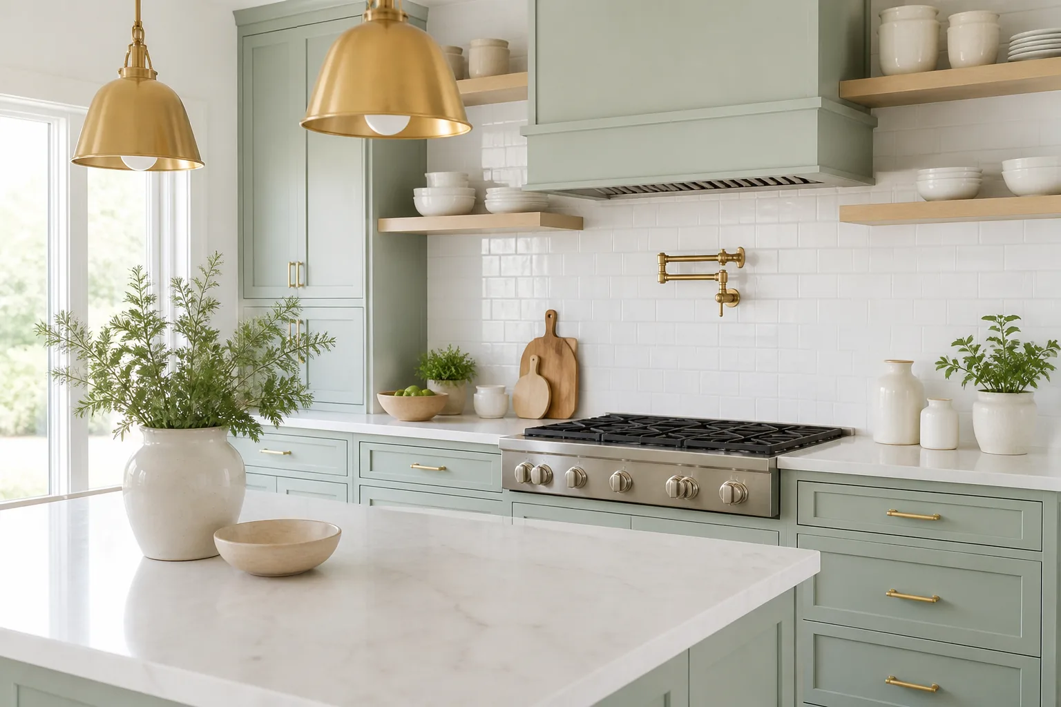
White and cream are the safest partners for olive green because they brighten muted green without introducing a competing hue. Warm cream trim beside yellow-olive walls feels cottage-calm; soft white beside gray-olive feels crisp and contemporary. The mistake is grabbing bright cool white because it is “safe” — on warm olive walls, icy white trim can make the green look dingy and the room feel unintentionally cold.
Use white on ceilings, trim, and large furniture when olive covers walls or cabinets. Use cream when you want warmth without pattern: cream bedding against olive walls, cream roman shades in an olive kitchen, cream bath mats on olive floor tile. If white feels too stark, off-white with a hint of yellow (not pink) usually bridges warm olive better than gray-off-white. For gray-leaning olive, a soft white with the slightest warm cast often works better than pure bright white.
Olive Green + Black and Charcoal — Modern Contrast
Black and charcoal add graphic edge to olive green without introducing a new hue battle. Black faucet hardware on olive tile, black picture frames on olive walls, or black metal lighting against olive cabinetry sharpen the palette for contemporary bathrooms, kitchens, and entryways. Charcoal sits softer than pure black and pairs well with olive in industrial or modern farmhouse rooms.
Black works best as hardware, frames, and thin metal lines rather than large black wall planes next to olive — too much dark green plus black can feel cave-like unless the room has abundant natural light. Balance with cream textiles or warm wood so the contrast reads intentional. Gray-olive walls with charcoal upholstery and brass accents deliver a tailored living-room look that ages well.
Olive Green + Brown, Wood, and Beige — Earthy Calm
Brown, tan, and wood tones are olive green’s natural family — think forest floor, bark, and dry grass. Dark brown leather against olive walls, walnut open shelves beside olive cabinets, or tan linen curtains on olive upholstery mimic outdoor palettes and keep rooms restful. This is the pairing to choose when you want grounded rather than bright.
Beige and camel work when olive is the wall color and you need upholstery that disappears gently. Avoid pairing yellow-beige carpet with gray-olive walls; the undertone clash turns muddy the same way cool gray on warm olive does. Mid-century and Scandinavian rooms lean on light oak + olive + white; cabin and traditional styles lean on dark walnut + deep olive + cream. Woven baskets, jute rugs, and linen reinforce the organic story without a fourth paint color.
Olive Green + Gold and Brass — Warm Sophistication
Gold and brass elevate olive green from casual to polished. Olive kitchen cabinets with brass pulls, olive walls with gold-framed mirrors, or an olive sofa with brass floor lamps add warmth and reflect light — critical in rooms where olive might otherwise feel flat. Elle Decor’s archives repeatedly pair muted greens with brass and gold accents in both traditional libraries and contemporary lofts because the metal temperature echoes olive’s yellow undertones.
Keep gold in hardware, lighting, and small decor unless you deliberately want a glam room. Brushed brass suits warm olive; antiqued gold works with deeper, gray-olive tones. Mixing brass with cream and wood prevents the combo from feeling flashy. Chrome and silver can work with gray-olive but often fight warm yellow-olive unless you introduce cool gray elsewhere to bridge the gap.
Olive Green + Mustard Yellow and Ochre
Mustard, ochre, and golden yellow share olive’s warm undertones, which makes them one of the easiest bold pairings. Yellow and olive sit near each other on the wheel, so the combination feels energetic without the full contrast of red. Mustard throw pillows on an olive sofa, ochre ceramics on olive open shelving, or a golden-yellow accent chair against olive walls read mid-century modern or Mediterranean depending on wood and metal choices.
Choose muted mustard over neon yellow — highlighter yellow clashes with olive’s muted character and reads harsh under most indoor lighting. Keep yellow in the accent zone (10%) when olive covers walls. Yellow-olive pairings suit sunrooms, kitchens, and home offices where you want optimism without pastel sweetness.
Olive Green + Orange and Rust — Shared Warmth
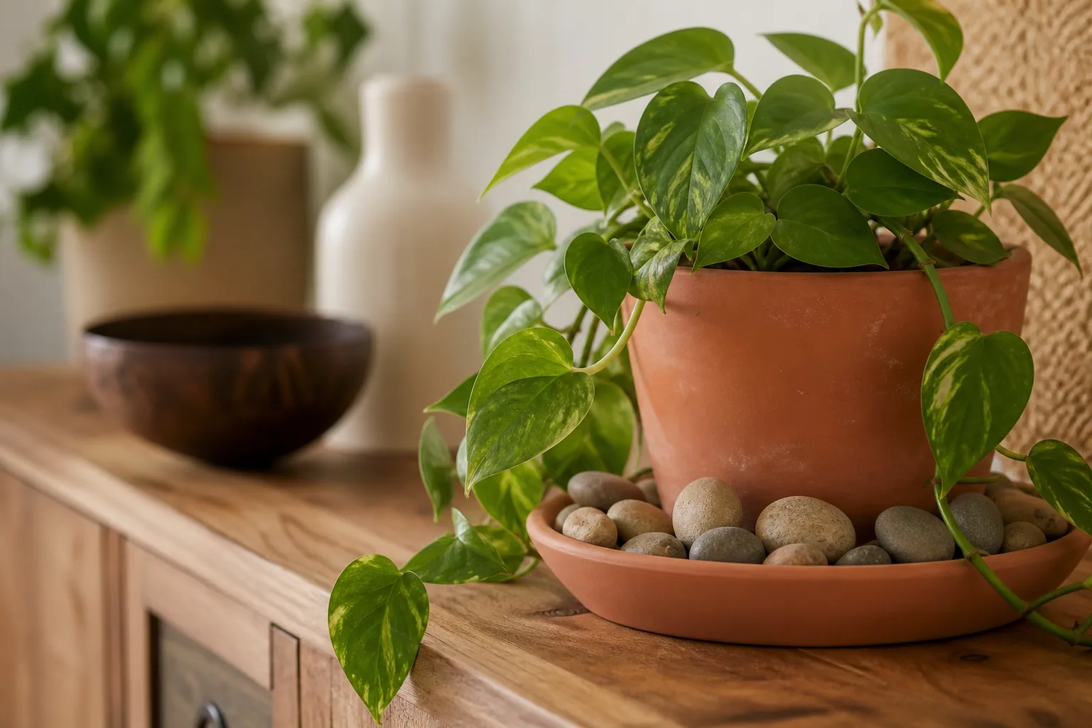
Orange and rust are among the most flattering complements for warm olive because they share yellow-red undertones. Rust curtains against olive walls, terracotta planters on olive built-ins, or a burnt-orange rug beneath an olive sectional deliver warmth that keeps cool-leaning olive from feeling sterile. House Beautiful designers note that greens with stronger yellow bases warm compact rooms — olive plus rust follows that same logic indoors (House Beautiful).
Use orange as accent, not co-dominant wall color. One terracotta sofa, rust ceramic vases, or coral-patterned artwork against olive walls delivers energy without turning tropical unless that is your goal. Bright orange works in small doses; rust and terracotta are safer on larger upholstery. Pair with cream or beige neutrals so orange does not compete with olive for dominance.
Olive Green + Red and Burgundy — Bold Complements
Green and red are complementary opposites, which is why olive plus red can look eclectic and sophisticated or accidentally holiday-themed depending on proportion. A burgundy velvet bench against olive wallpaper reads dining-room elegant; equal-area cherry red and olive walls read December. Deep wine red, oxblood, and brick terracotta work better than cherry red with muted olive.
Keep red on one furniture piece, dining chairs, or artwork when olive covers walls. Add wood tones or brass to further distance the palette from seasonal decor. If red feels too bold, borrow red’s warmth through rust instead — same energy, less contrast risk. Gray-olive handles burgundy more quietly than golden olive, which pairs better with brick and terracotta reds.
Olive Green + Dusty Pink and Rose
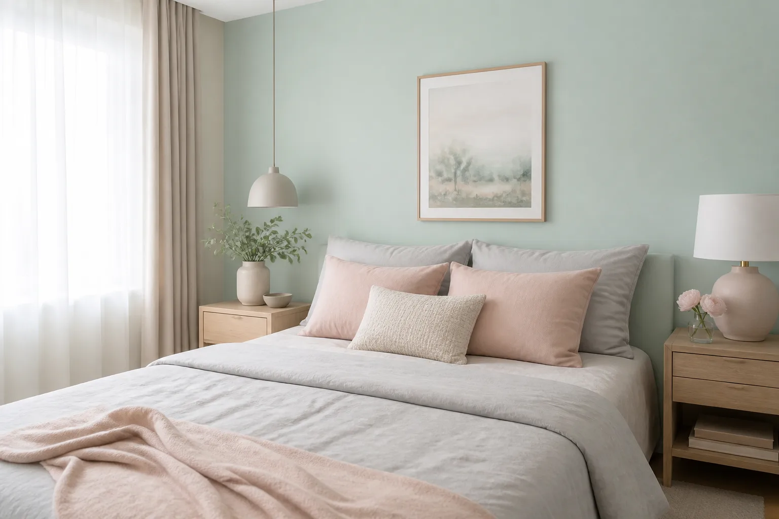
Dusty pink, blush, and mauve add soft contrast to olive’s earthiness without the sweetness of hot pink. This pairing reads calm in bedrooms — olive walls with blush bedding — and unexpected in living rooms when pink stays on textiles rather than walls. Dusty rose curtains against olive upholstery feel grown-up; bubblegum pink pillows against gray-olive can feel disjointed unless you add cream bridging neutrals.
Keep pink in the 10% accent zone unless you want a deliberately romantic room. Pair blush with cream or white so pink and olive do not compete. Mauve and dusty rose work especially well with gray-leaning olive; warmer rose tones suit yellow-olive and terracotta accents in the same space.
Olive Green + Gray and Other Greens
Gray and olive green both carry muted chroma, which makes them natural partners when values contrast. Light gray upholstery softens olive walls for a minimalist bedroom. Medium gray tile grounds olive cabinetry in a bathroom. Charcoal gray adds weight with brass hardware on olive kitchen cabinets. Match gray temperature to olive undertone: cool gray with gray-olive, warm greige with yellow-olive.
Other greens create monochromatic depth when you vary lightness. Olive walls with moss velvet, forest green pillows, and sage ceramics feel layered and botanical. Avoid putting five similar mid-tone greens on equal-size surfaces — the room turns flat. Use one dominant olive plane, one mid green on upholstery, and one dark green on small accents. Silver-variegated plants and eucalyptus stems add green texture without another paint chip.
Olive Green With Real Plants and Terracotta Pots
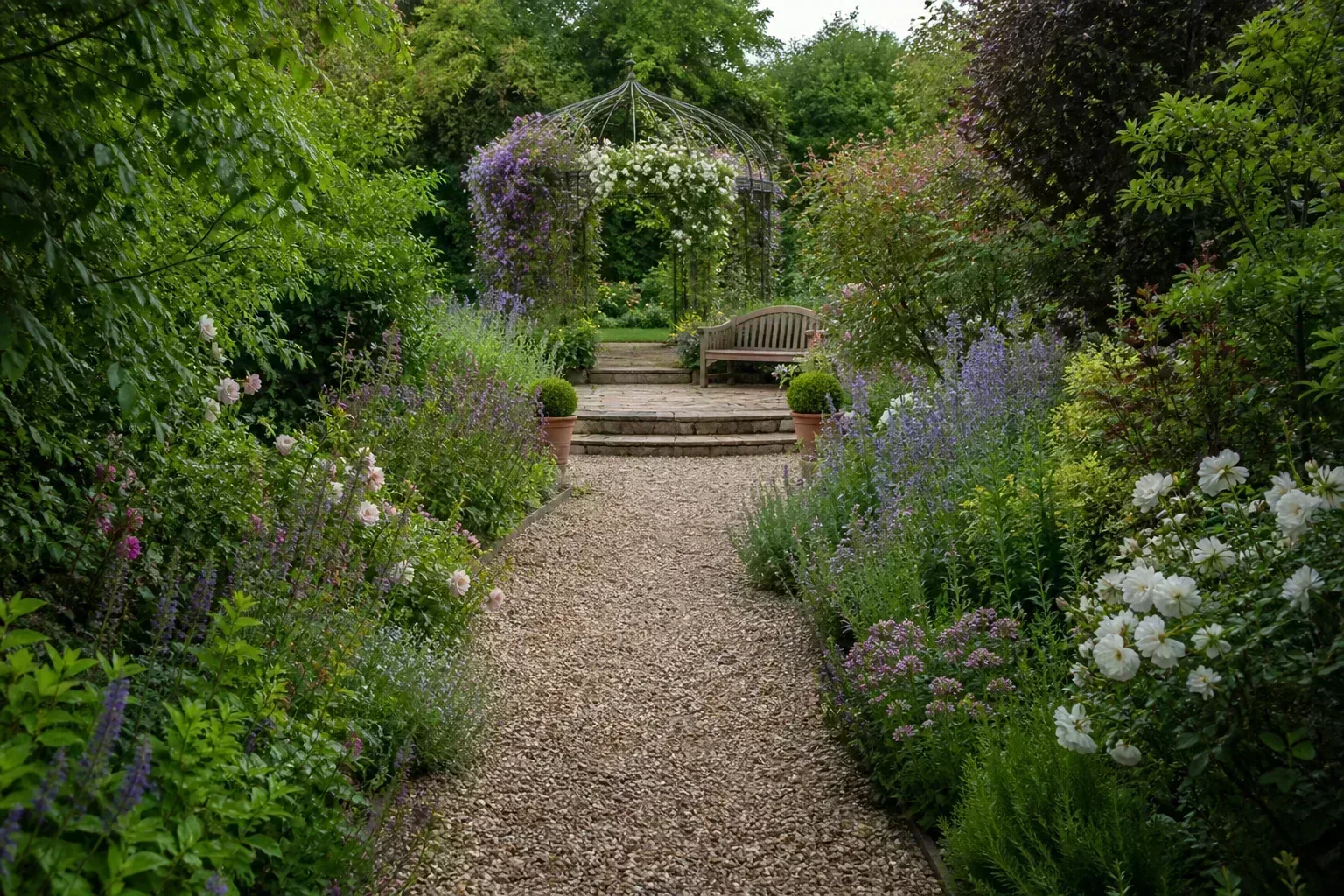
If you decorate with houseplants, olive green walls and textiles create a cohesive backdrop for foliage — but not every leaf matches every olive swatch. Yellow-olive walls make lime-green pothos and spider plants feel brighter than the room; gray-olive walls make silver succulents and eucalyptus look intentional. Repeating olive in paint and echoing it in glazed terracotta pots ties rust and orange accents to real organic texture.
Place variegated or silvery plants — satin pothos, silver philodendron, olive-toned herbs in pots — against olive when you want texture without another strong hue. Use one flowering accent in blush, burgundy, or coral to mirror textile accents. Avoid clustering too many unrelated bright greens in one olive corner; two foliage tones plus one accent flower reads curated, five competing greens reads chaotic.
Room-by-Room Pairing Shortcuts
Kitchens, bedrooms, bathrooms, and living areas
Kitchens: Olive lower cabinets pair with cream or white uppers, brass or black hardware, light wood open shelves, and rust or mustard in one accent (bar stools, pendant shades). Avoid cool bright white uppers on warm olive lowers without testing — trim mismatch shows at eye level daily.
Bedrooms: Olive walls with gray or cream bedding, wood nightstands, and blush or rust pillows stay restful. Charcoal headboard against olive reads modern; tan textiles read cabin. Keep cherry red out unless it is a single deep burgundy accent.
Bathrooms: Olive tile with white fixtures and black hardware feels current. Add cream towels and a wood stool for warmth. Patterned olive-and-blush wallpaper works in powder rooms with limited wall area.
Living areas: Olive sofa on a beige rug with cream walls and brass lighting is a long-lived formula. Rust or mustard on one chair adds energy. Gray-olive accent wall with navy sofa and cream trim reads tailored — see our sage green pairings for similar navy-and-green logic with a cooler green base.
Paint Swatches to Sample Before You Commit
Popular olive swatches are starting points, not final answers — always sample on your wall. Backwoods (Sherwin-Williams SW-7694) is a balanced earthy olive for living rooms. Oakmoss (Farrow & Ball) is dusty and elegant with cream and brass. Terrace Green (Benjamin Moore) leans deeper for cabinetry and accent walls. Secret Garden (Behr) and Basque Green (Sherwin-Williams SW-6426) suit warm, Mediterranean-leaning spaces. Plummett (Farrow & Ball) adjacent gray-olive tones pair with charcoal and blush.
Buy quart samples, paint large patches, and live with them for at least two daylight cycles before ordering gallons. Coordinate trim using the undertone test — warm olive rarely wants super-white trim. Greens with blue-gray undertones can feel colder in north light; designers often recommend yellow-based olives in dim rooms to preserve warmth (House Beautiful).
Common Pairing Mistakes and How to Fix Them
Cool bright white trim on warm olive walls makes green look dingy — switch to warm white or cream. Equal-area red and olive reads seasonal — reduce red to one accent piece. Neon pink, highlighter yellow, or cerulean blue clash with olive’s muted warmth — if you want contrast, use dusty pink, mustard, or navy instead. Yellow-beige sofa on gray-olive walls turns muddy — swap upholstery to cool gray or bridge with a neutral rug. Olive on every surface with no neutral break feels claustrophobic — apply the 60-30-10 rule. Ignoring light bulbs shifts olive more than you expect — test under your actual LEDs before blaming the accent color.
If two colors clash and you cannot replace the larger item, bridge with a neutral rug, white slipcover, or wood piece between the competing hues. Color problems are often proportion problems — shrink the offending accent to 10% or less.
Conclusion
Thirteen colors that go with olive green — white, cream, black, brown, gold, mustard, orange, rust, red, dusty pink, other greens, beige, and gray — cover nearly every mood from cottage calm to modern edge. The colors matter less than undertone matching, proportion, and lighting. Test your olive swatch against white and gray cards, anchor the room with neutrals on most surfaces, and treat bold complements as single accents rather than co-dominant walls.
Olive green rewards patience: sample paint, view it at night, pair warm accents with yellow-olive, and let wood, brass, and plants carry the organic story. Get those decisions right and olive stops feeling like a dated trend and starts feeling like the quiet backbone of a room you actually want to live in. For related palettes, compare colors that go with sage green and colors that go with mint green — the undertone logic transfers, but olive’s warmth demands earthier partners than either cooler cousin.