The Overused Coffee Table Styling Trend to Skip
The beads-on-books coffee table trend is everywhere—and that is exactly the problem. Get designer-backed swaps that feel personal, not copied.
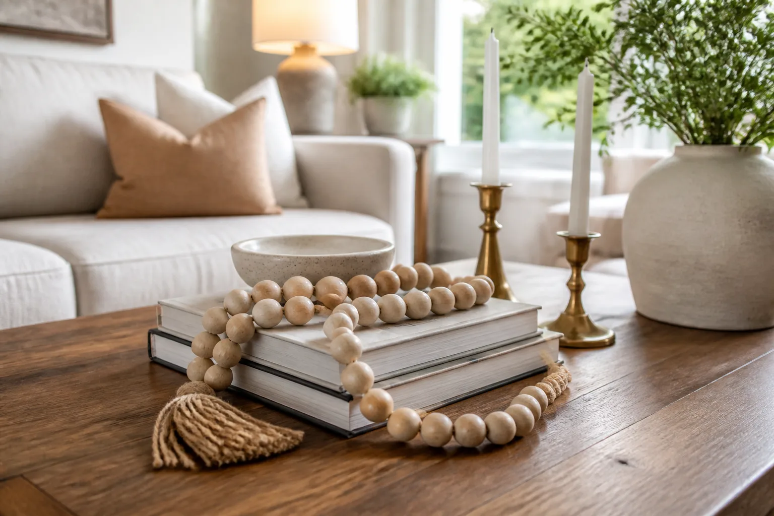
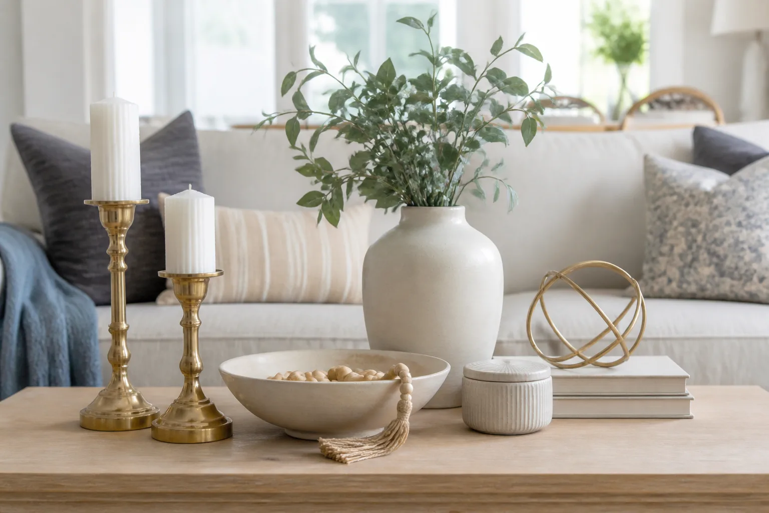
If your living room feels one accessory away from a catalog photo, check the coffee table first. The usual suspect is a string of contentment beads draped across a stack of neutral coffee-table books, often paired with brass candlesticks and a ceramic bowl that never holds anything. Leah Hook of Gray Oak Studio calls that combination a default vignette—and Jane Morgan of R. Jane Morgan Interior + Design says the beads lost their charm the moment every home store started selling the same strand.
The problem is not styling itself. Books, layers, and a sculptural object on top can make a table feel finished. The problem is copying a finished look without asking what your room, your habits, and your objects actually need. This guide explains why the beads-on-books trend went flat, how to spot when your table looks generic, and what to use instead so the surface feels collected rather than purchased as a set.
Why the Beads-on-Books Look Took Over Every Living Room
Coffee tables sit at the center of the room, which makes them both high visibility and high pressure. When you are staring at an empty surface, a photographed formula is easier to copy than building a vignette from scratch. The beads-on-books setup spread because it solved three styling problems at once: it added height, mixed organic curves with angular book edges, and looked “designed” in a single Instagram frame.
What Designers Mean by Contentment Beads
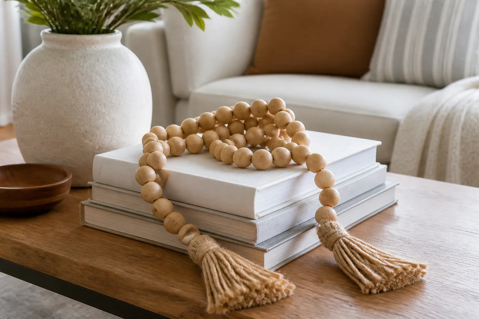
Contentment beads are long garlands of large wooden or glass beads, usually finished with tassels or knots at each end. The name comes from their calm, repetitive shape—not from any required placement rule. In practice they get looped across stacked books, pooled inside shallow bowls, or wrapped around candles on a tray. Mango-wood versions became especially common in mass-market decor lines, which is part of why the look started repeating from one living room to the next.
The Formula That Made It Feel Elevated—at First
Hook’s read on the trend is generous and precise: layers, mixed shapes, and one slightly unexpected texture can elevate a flat surface quickly. A stack of books creates a pedestal. A bead strand introduces movement. Brass candlesticks add height and warmth. Photographed together, the vignette reads intentional.
That is also why it aged fast. Once the same four elements appeared in every showroom, the arrangement stopped signaling taste and started signaling “I saw this online.” Morgan’s tell is simpler: when the same object is replicated in every home furnishing chain, it is time to move on. The beads did not fail as an idea. They failed as a shortcut everyone took at once.
How to Tell Your Coffee Table Looks Copied Instead of Collected
A collected table has objects that connect to the people using the room. A copied table has objects that connect to a trend cycle. You do not need a designer’s eye to tell the difference—you need two honest questions: where did these pieces come from, and do they earn their space on a surface you actually use?
The Retail Red Flag
If you can assemble the entire vignette from one store aisle in under ten minutes, you are looking at a display recipe, not a personal story. Morgan specifically calls out beads paired with matching brass candlesticks as a combination that now feels predictable. That does not mean those objects are ugly. It means they are no longer doing the job of making your room feel specific.
Another red flag is decoration with no function in a high-use room. Remote controls buried under a bead strand, coasters missing because the stack is “styled,” and books nobody opens all signal that the table is performing for photos instead of supporting daily life.
When the Vignette Fights the Room
Scale matters as much as taste. A tall candle cluster on a low table in a small room reads crowded. A single tiny object on a large ottoman disappears. Beads that spill over the edge of a narrow table become a snag hazard and make the surface feel busier than the rest of the room.
Color is the other common mismatch. Neutral beads on beige books in a room that already has lots of warm wood and cream can flatten the whole space. The vignette should echo your palette, not import a new one from a mood board.
Keep the Books and Layers—Ditch the Beads
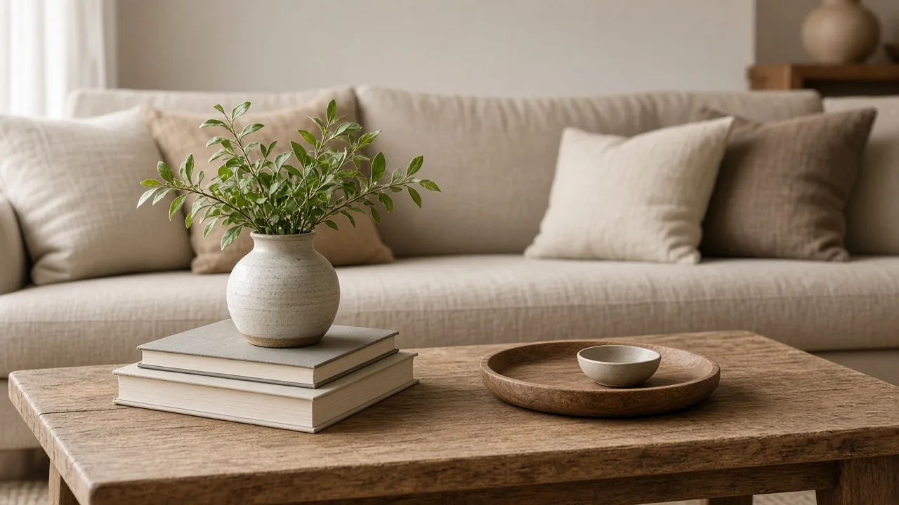
Morgan’s advice is worth keeping verbatim in spirit: there is nothing wrong with stacked books. The creative work is choosing what sits on top—and whether every object needs to come from a store at all. Hook agrees that an organic shape on angular books is a sound design move. The beads were just one option, and now they are the most common one.
What the Stack Is Actually Doing
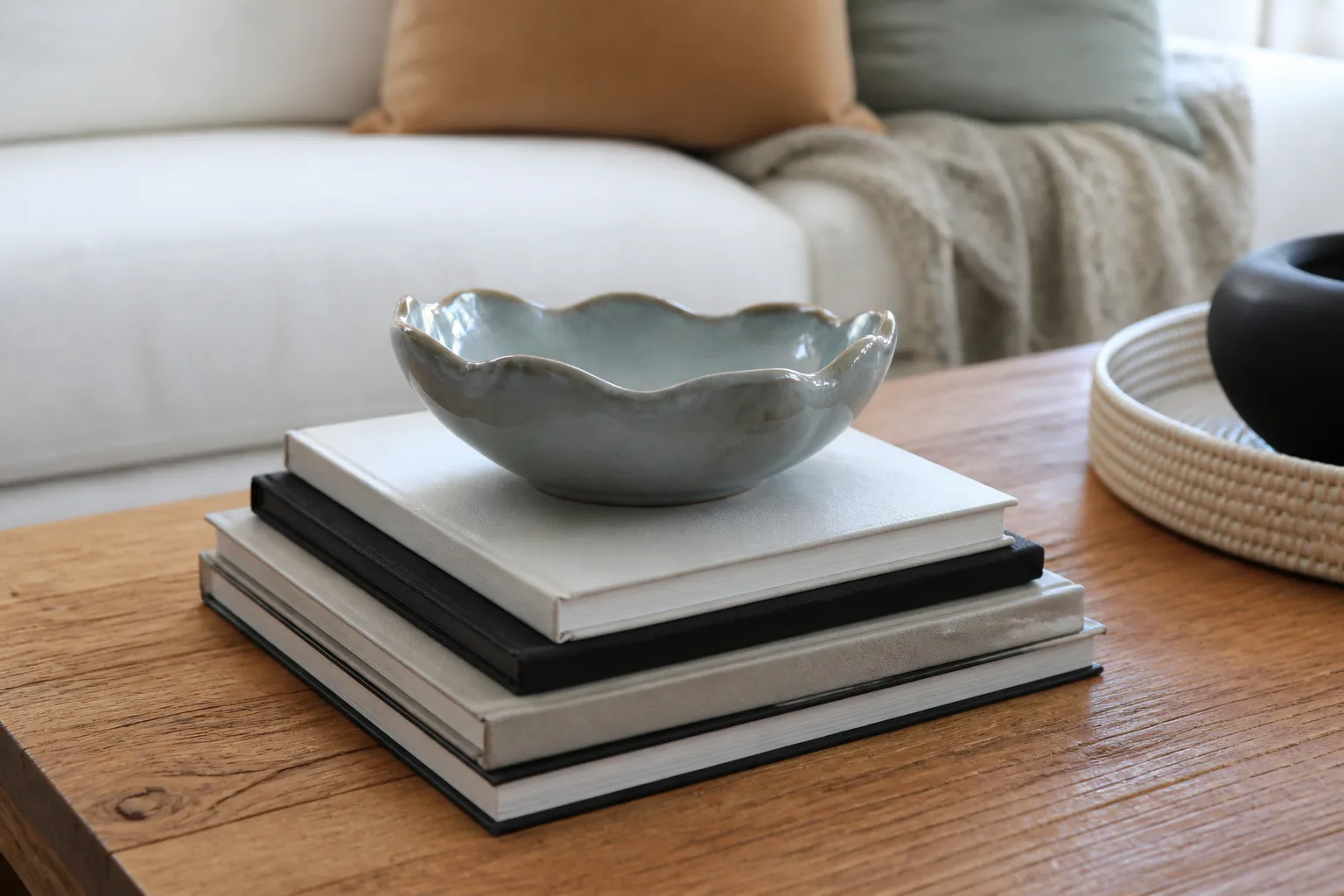
A book stack is a low, stable platform. It lifts a smaller object to eye level, creates a vertical moment on a horizontal surface, and gives the eye a place to rest. Citrineliving’s coffee-table styling guidance treats books as a foundation for objects you already love, not as props with irrelevant titles. Choose spines you would actually open, or turn books so the page edges face out for a quieter look.
The swap is simple: keep the pedestal, change the sculpture. Replace the bead loop with one object that has weight, memory, or usefulness—a bowl, a small plant in a glazed pot, a vintage box, a piece of geology, a framed photo standing on its own. One strong object usually beats three coordinated trend pieces.
A Smarter Way to Style Any Coffee Table
Before you shop, decide how the table works in your household. A family room that sees snacks, laptops, and game night needs a different setup than a formal living room that is mostly visual. The goal is a table that looks good in a wide shot and still works when someone puts a mug down.
Start With the Table’s Shape and Daily Use
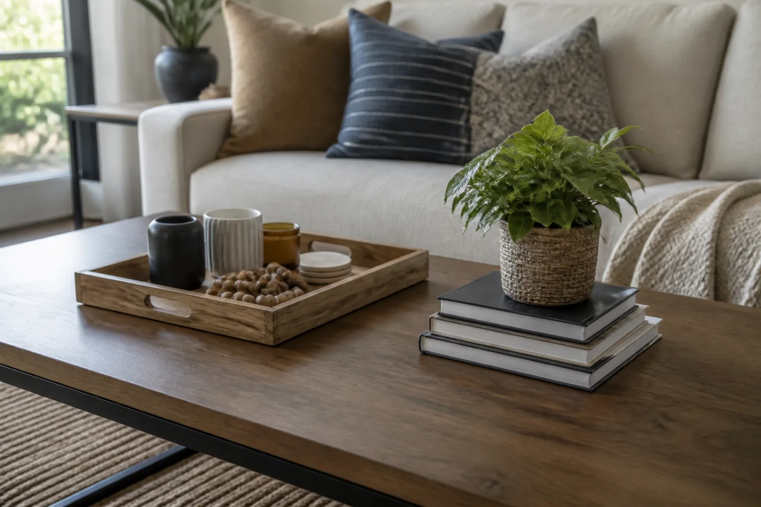
Interior designer Shea McGee told POPSUGAR that she thinks in groupings: roughly three on a round table and four to five on a rectangular one. That is a useful starting count before you add a single object. Round tables want triangular balance. Rectangular tables can handle two smaller zones—a tray on one side, a stack on the other.
Daily use should dictate what stays out. If the table is where remotes live, give them a bowl or lidded box instead of hiding function under decor. If you never light candles there, skip candlesticks entirely. Livingetc’s tabletop styling advice applies here too: a low fruit bowl, a single sculptural vase, or a well-chosen plant can carry the whole surface without a full vignette.
McGee also starts many tables with a tray. A tray corrals small objects, protects the tabletop, and makes the arrangement movable when you need the full surface back. It is one of the highest-return styling tools because it solves clutter and composition at the same time.
Build Groupings, Not Clutter
Use three layers of decision-making: anchor, height, and detail. The anchor might be a tray or a large book stack. Height comes from a vase, plant, or upright object. Detail is the small personal item—a matchbook from a trip, a single figurine, a coaster stack that actually gets used.
Citrineliving recommends grouping like items when you want a bold look, then breaking the mass with one contrasting piece so the table does not turn into a monolith. The opposite approach also works: one hero object on two books and nothing else. Both read as intentional. What fails is five medium objects with no hierarchy.
Leave negative space. If you cannot set a drink down without rearranging the display, you have crossed from styled to staged.
Nine Designer-Approved Alternatives to Beads on Books
Hook and Morgan suggest swapping beads for objects with more personality. The list below expands their ideas into decisions you can act on today, including options that cost nothing if you shop your own shelves first.
Plants. A small, sturdy houseplant in a low cachepot adds life and height without the generic craft-store look. Choose species that tolerate your room’s light and keep saucers or sealed pots so water never touches wood. Our living room plants guide covers reliable options and placement; pair it with the planter vs. pot guide if you are deciding between a decorative shell and a functional grow pot.
Statues and sculptural objects. One figurine with patina beats a trio of identical decor objects. Look for stone, ceramic, or carved wood with visible age or handwork.
Bowls. Hook’s favorite swap. The bowl matters, but the contents matter more.
Vintage ashtrays. Small, graphic, and easy to find at thrift stores—even if nobody smokes. Use them to hold keys, clips, or remotes.
Miniature oil paintings on stands. A single framed study adds color and conversation without a large wall commitment.
Silver trays and pitchers. Mixing metals is fine; mixing entire catalog sets is what dates a table. One vintage silver piece often looks richer than three matching new ones.
Items from nature. Shells, driftwood, a interesting stone, or dried seed pods connect the room to place. Keep collections tight—three shells, not thirty.
Decorative storage boxes. Lidded boxes hide remotes and chargers while still reading as decor.
Kitschy vintage color. Morgan suggests hunting for unpredictable objects like a rotary phone in hot pink or chartreuse. Humor and nostalgia read as personal in a way beads rarely do now.
Bowls With Something Personal Inside
Hook’s best bowl advice is specific: fill it with something that sparks memory—printed photos, travel postcards, even a small Lego build if that is your household. The bowl is the frame; the contents are the story. That is the opposite of beads, which are always the same no matter whose table they sit on.
Choose a bowl with an interesting rim or glaze, then edit the fill to one theme. A bowl of coasters is still a good bowl if the coasters are beautiful and get used.
Small Plants and Low Vessels
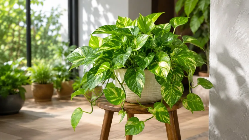
Plants work when the scale stays low and the care stays realistic. A trailing pothos in a footed pot can sit beside books; a tall fiddle-leaf fig will overpower most coffee tables. Match the vessel to the table material—matte ceramic on glass, glazed pottery on wood—and use a saucer or cachepot so condensation never marks the finish.
If your room is dry in winter, grouping a plant near other greenery helps humidity, but do not mist over open books or electronics. For broader placement ideas, see our living room plants guide.
Vintage Conversation Pieces
Morgan’s rotary-phone example is useful because it fails the mass-market test on purpose. Thrift stores, estate sales, and family attics are better sources for coffee-table objects than the decor aisle.
Our backyard decor thrift guide focuses on outdoor finds, but the same inspection mindset applies indoors: buy interesting shape and condition first, worry about finish second.
One weird vintage object often carries more personality than a full coordinated set. Let it be slightly off-palette if the form is strong.
Common Coffee Table Styling Mistakes
Buying the whole trend at once. Beads, books, brass sticks, and lidded box from the same display reads as a kit. Add one element at a time and stop when the table feels done.
Choosing books only for spine color. If the titles mean nothing to you, turn the books or swap them for ones you will actually browse.
Ignoring fire and spill risk. Lit candles on a low table with flowing fabric nearby is a safety issue, not a style issue. Unlit candles are fine; open flames need distance and attention.
Overloading a small surface. Three purposeful objects beat seven small ones. If you love collections, rotate them instead of displaying all of them at once.
Forgetting the ottoman. Large upholstered ottomans need firmer, lower arrangements. A heavy tray with soft edges protects fabric and keeps objects from sliding.
Treating plants like permanent sculptures. A declining plant on the coffee table drags the whole room down. Choose easy species and accept that sometimes the best styling move is no plant at all.
Conclusion
The overused coffee table styling trend—contentment beads draped over stacked books—is tired because it became a copy-paste recipe instead of a personal choice. The underlying ideas still work: layers, contrast between organic and angular shapes, and one object that invites conversation. You only need to swap the generic garland for something that could not belong to anyone else’s living room.
Start with how you use the table, add a tray or book stack if you need structure, then place one object with real meaning on top. Shop your home before you shop a store. When the arrangement reflects your books, your travels, your plants, or your sense of humor, the table stops looking busy and starts looking like yours.